
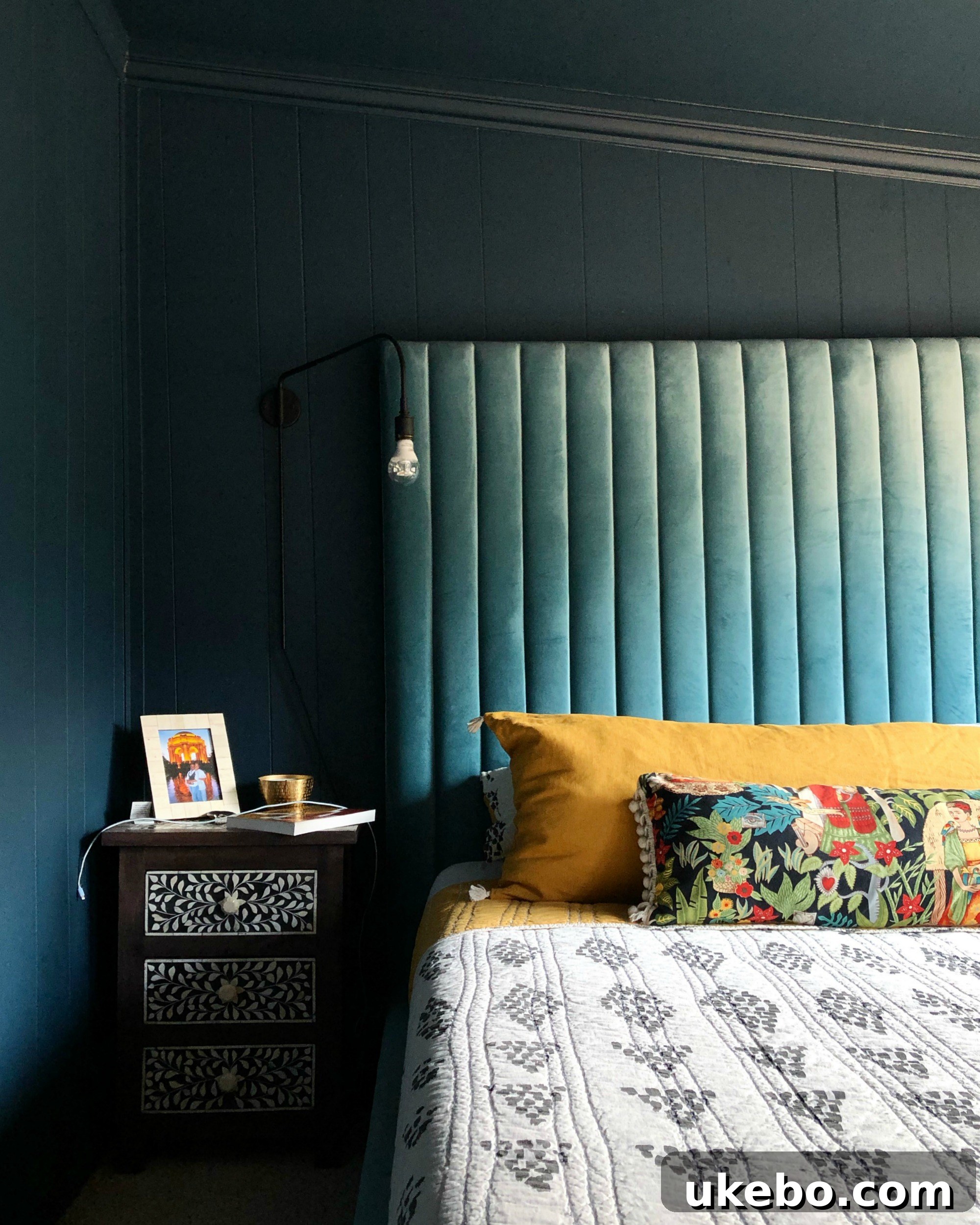
An Unexpected Transformation: Our Primary Bedroom Makeover Journey
Happy New Year, friends! As 2023 kicks off with a flurry of activity, I’m thrilled to share an exciting, albeit unplanned, project that has taken center stage in our home: the complete makeover of our primary bedroom. This journey, affectionately dubbed #projectthebombcyclonemadeusdoit, is filled with unexpected challenges, creative solutions, and a complete reimagining of a space we once thought would remain untouched for years to come.
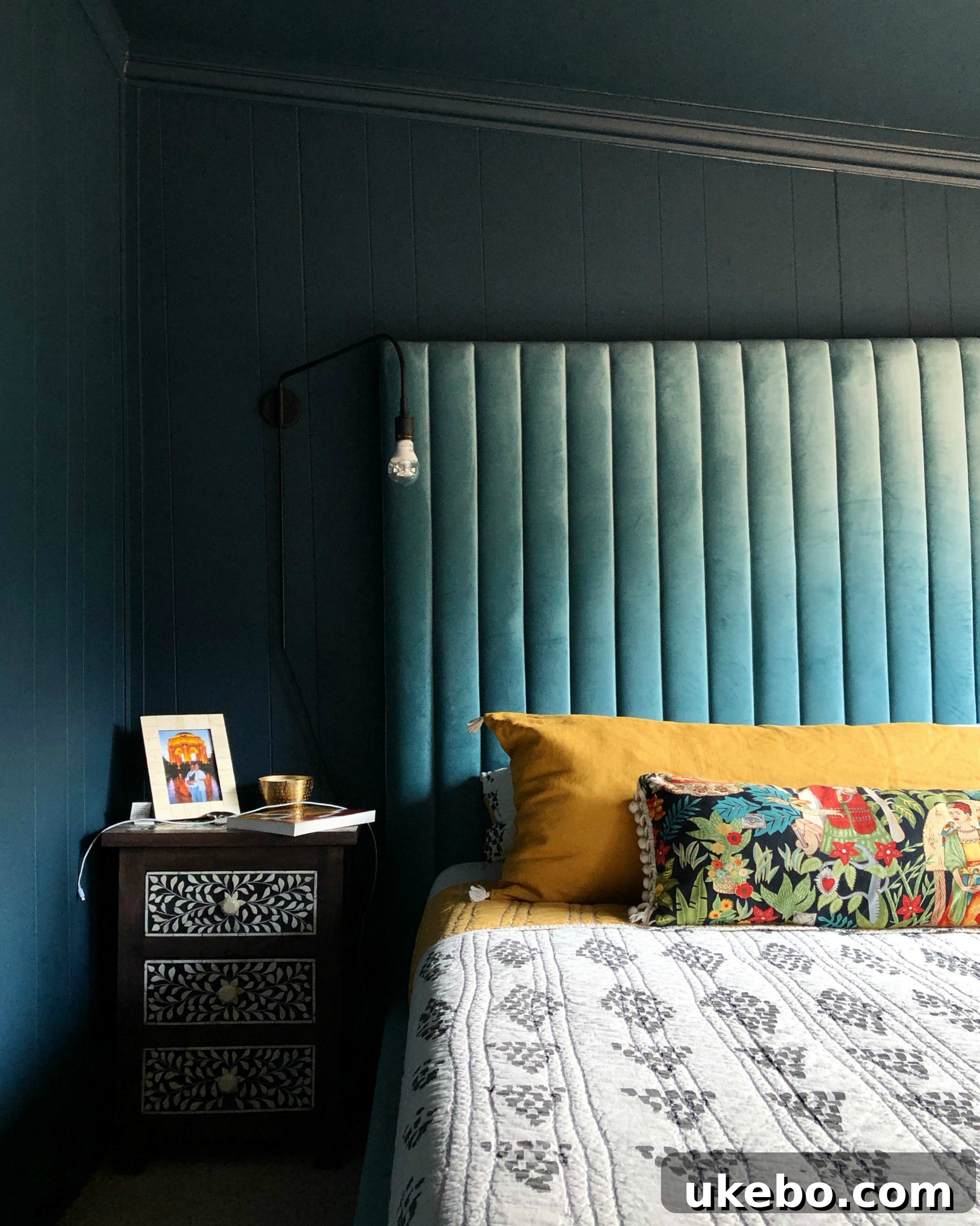
The Catalyst for Change: When Disaster Strikes Opportunity
Let’s be upfront: renovating our primary bedroom was absolutely not on our radar. In fact, we had pretty much sworn off touching this room, at least not until a hypothetical future when we might consider a formal addition to our “true” primary bedroom (currently occupied by our daughter). This particular room has always been the wild card of our home – a unique bonus space that made us fall in love with the house eight years ago. It began its life as an outdoor patio before being enclosed by previous homeowners in the 1960s or 70s, later serving as a den. For us, in our otherwise modest two-bed, one-bath house, it became our primary bedroom, allowing our daughter Bry to have the designated master, and Michael the second bedroom. It served its purpose admirably, and we saw no reason to invest time or money into its renovation. That is, until the recent bomb cyclone slammed into California, leaving behind a trail of roof damage and, crucially, water pouring down our walls during the relentless rain. What started as a disaster has now unexpectedly blossomed into the perfect opportunity for a long-overdue transformation.
A Look Back: The Evolution of Our Primary Bedroom
The Current State Before Renovation
It’s been quite some time since I’ve even touched upon our primary bedroom here on the blog. The last mention was during my 2019 Home Goals check-in, where I shared an update mid-process of painting the space a moody blue. Even then, it was more of a cosmetic refresh than a structural overhaul.
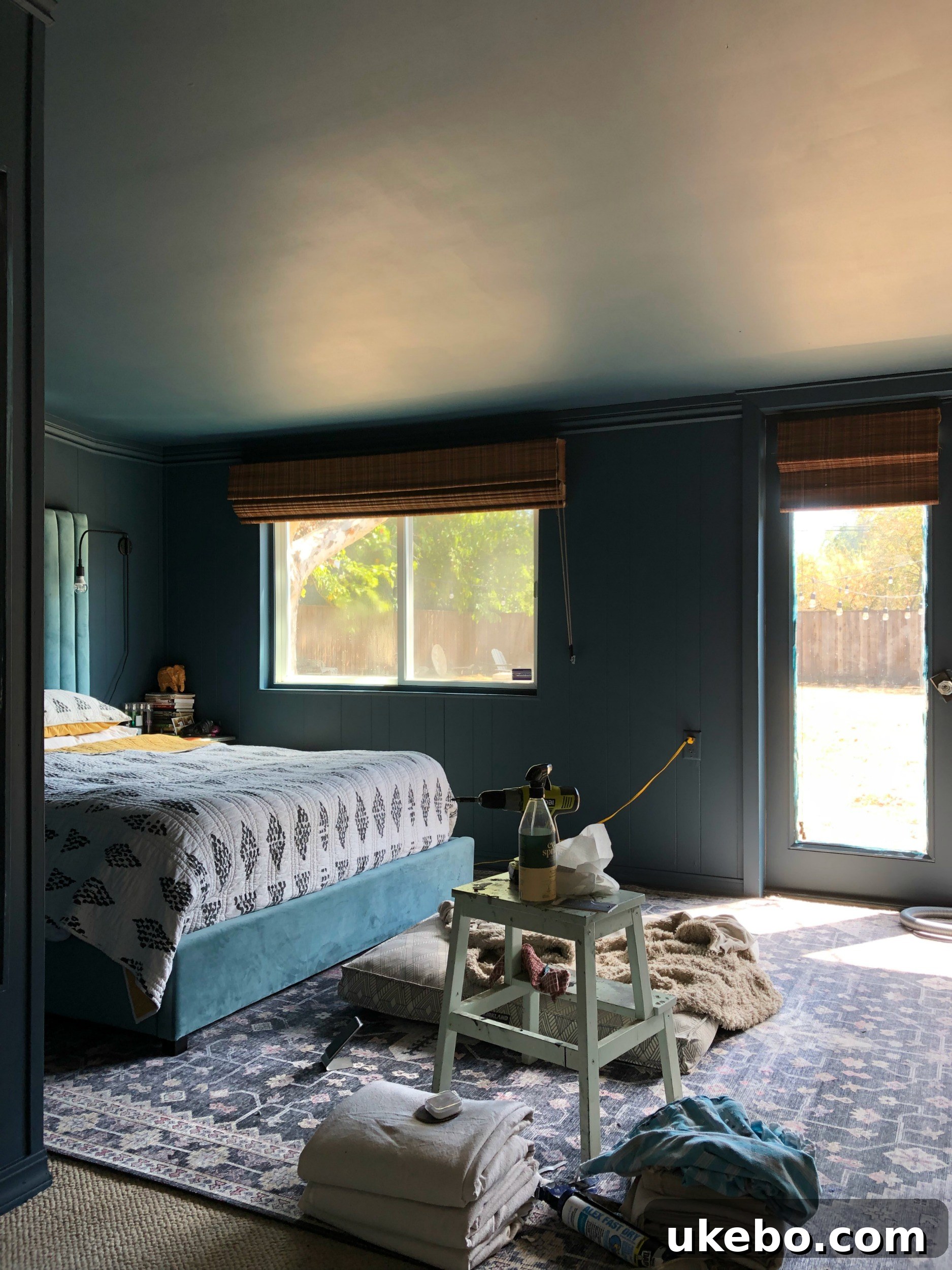
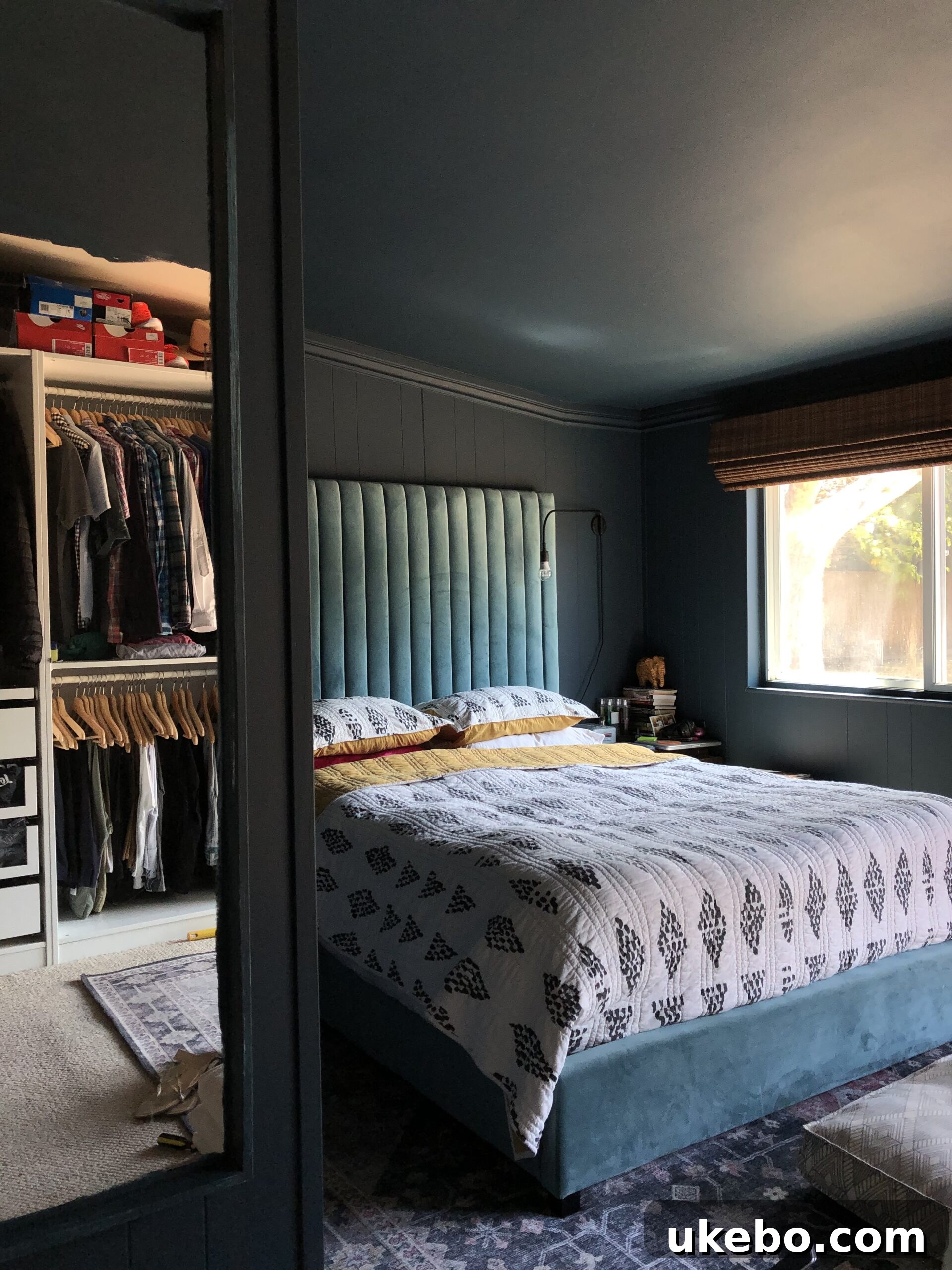
But to truly understand the extent of this renovation, we need to rewind to the very beginning. Let’s take a peek at the room as it appeared on the day we officially closed on our house. This glimpse into its original condition will provide invaluable context as we delve deeper into the renovation details.
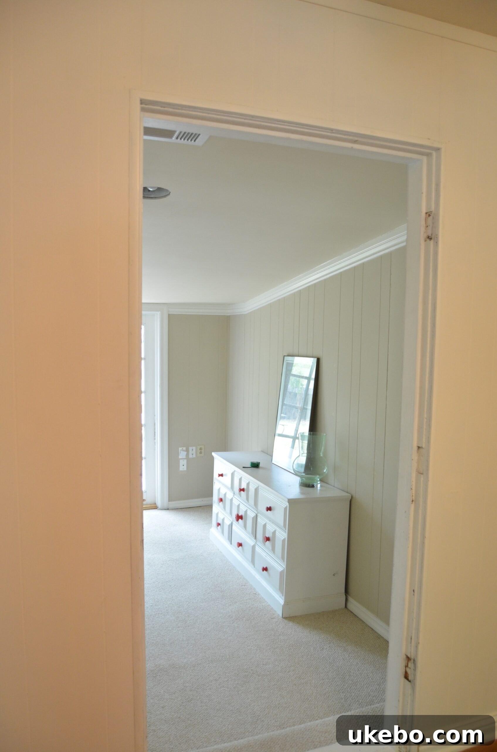
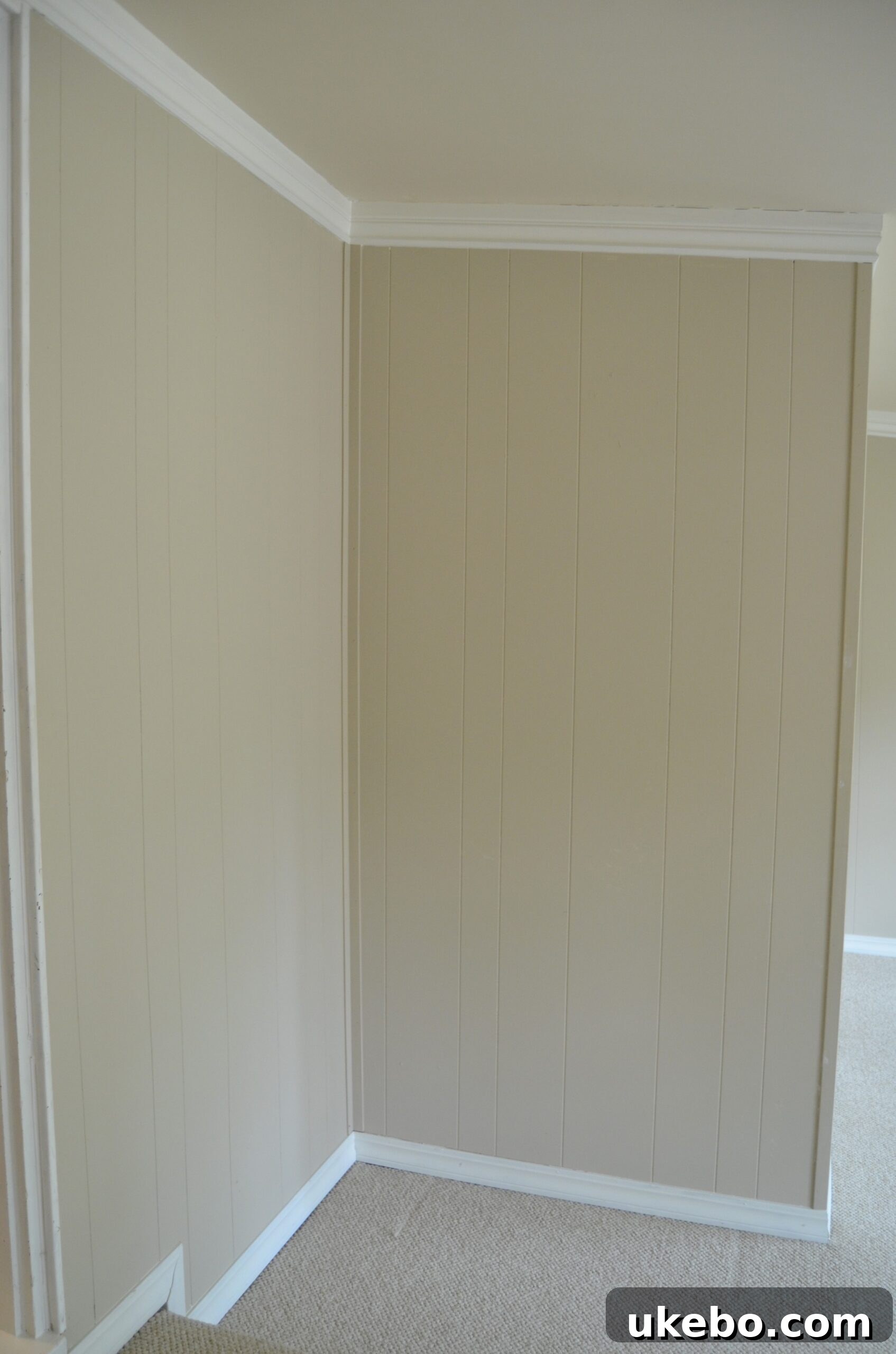
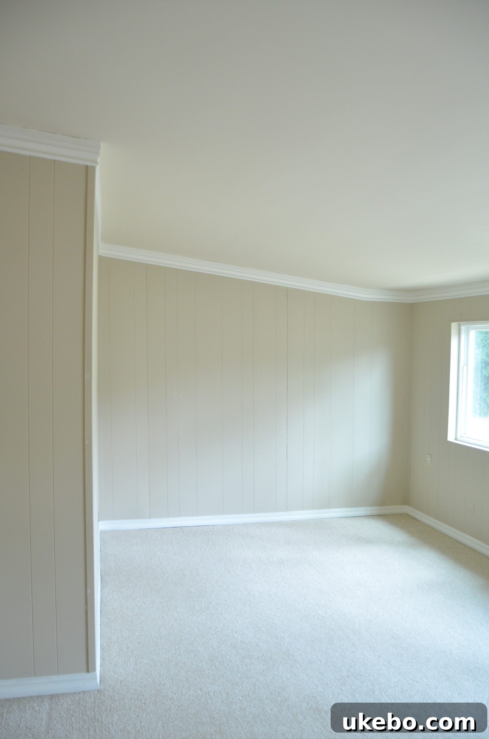
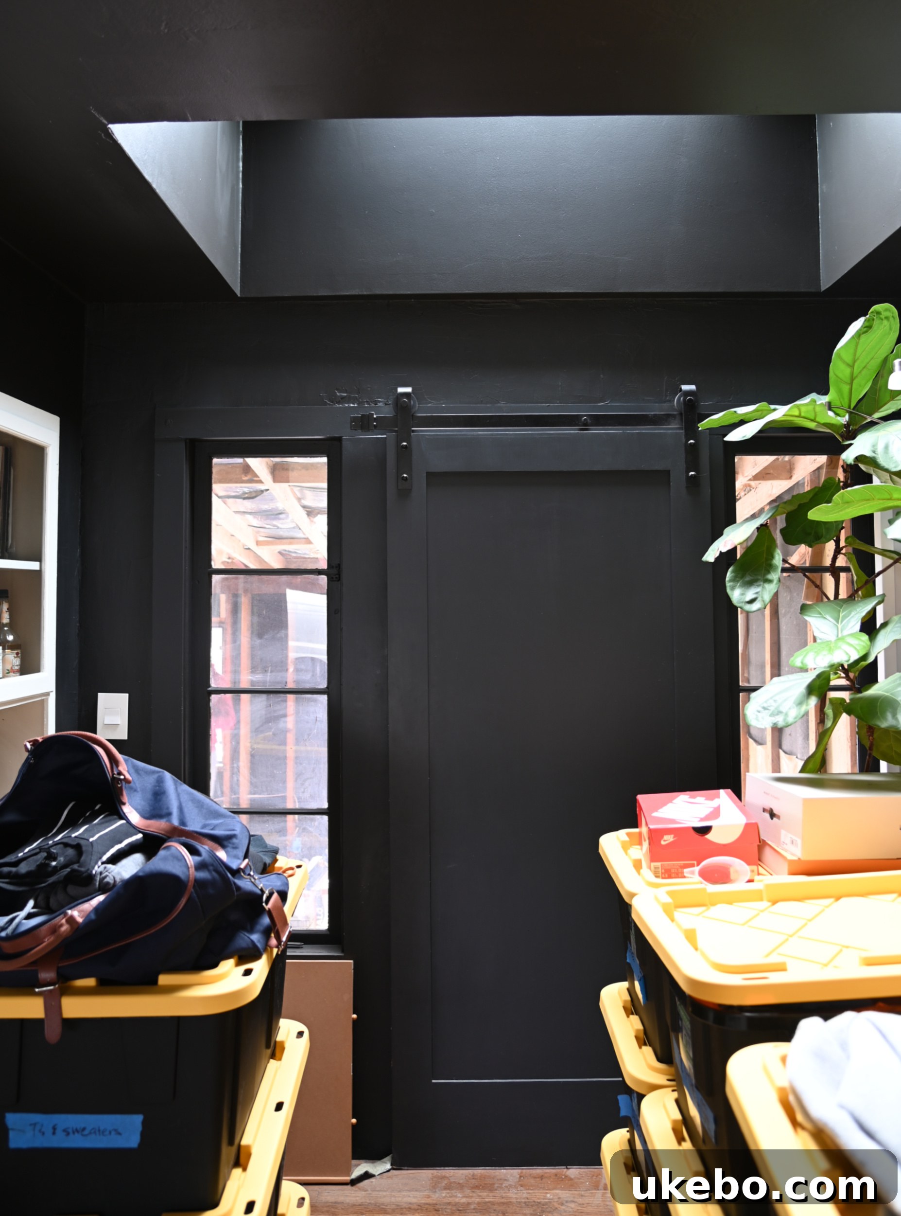
Given its location just off the original dining room, privacy was paramount. Our solution was to add a stylish barn door. To address the lack of a proper closet, we installed functional PAX wardrobes along the back wall, transforming a bonus space into a functional bedroom.
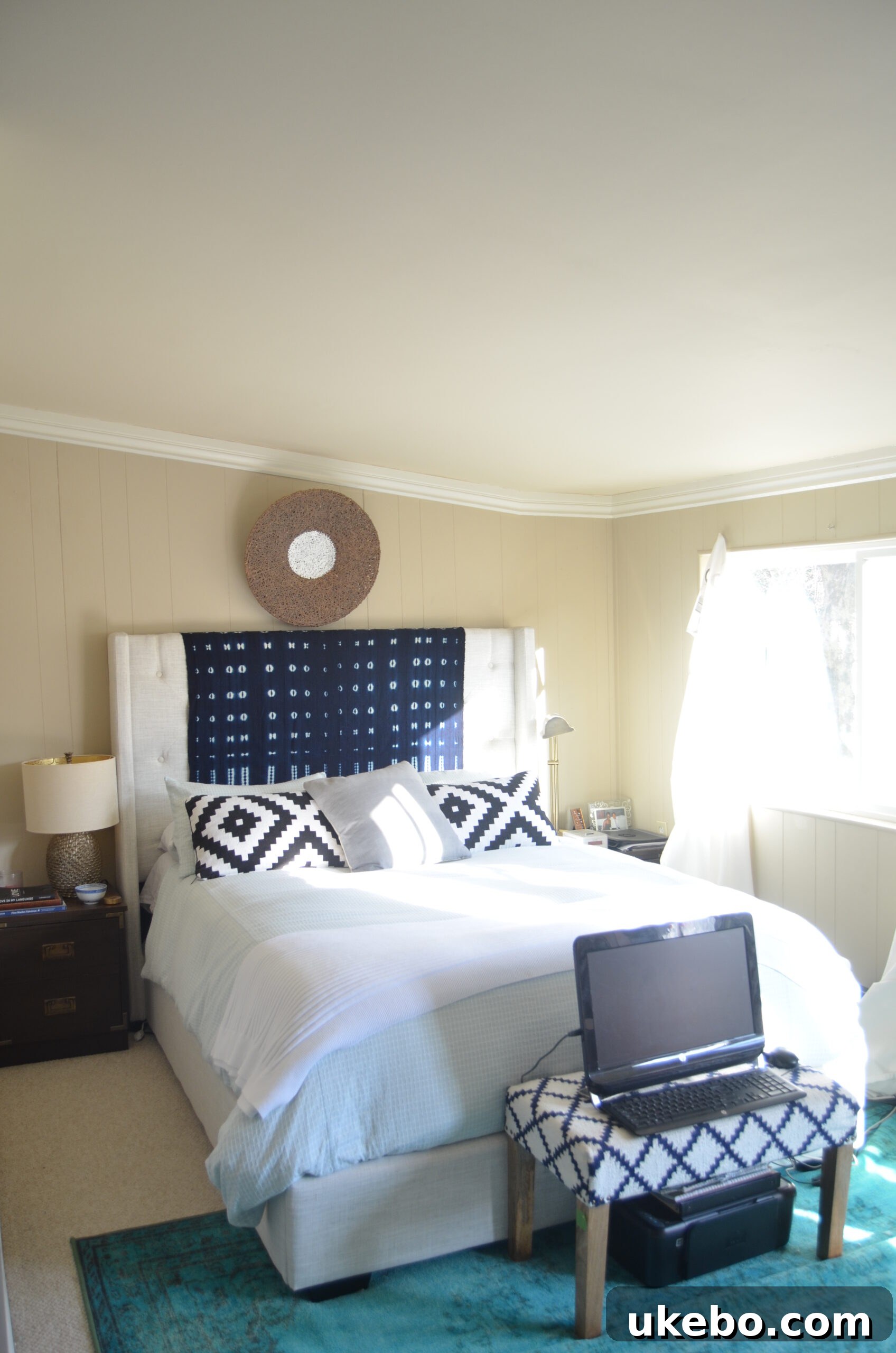
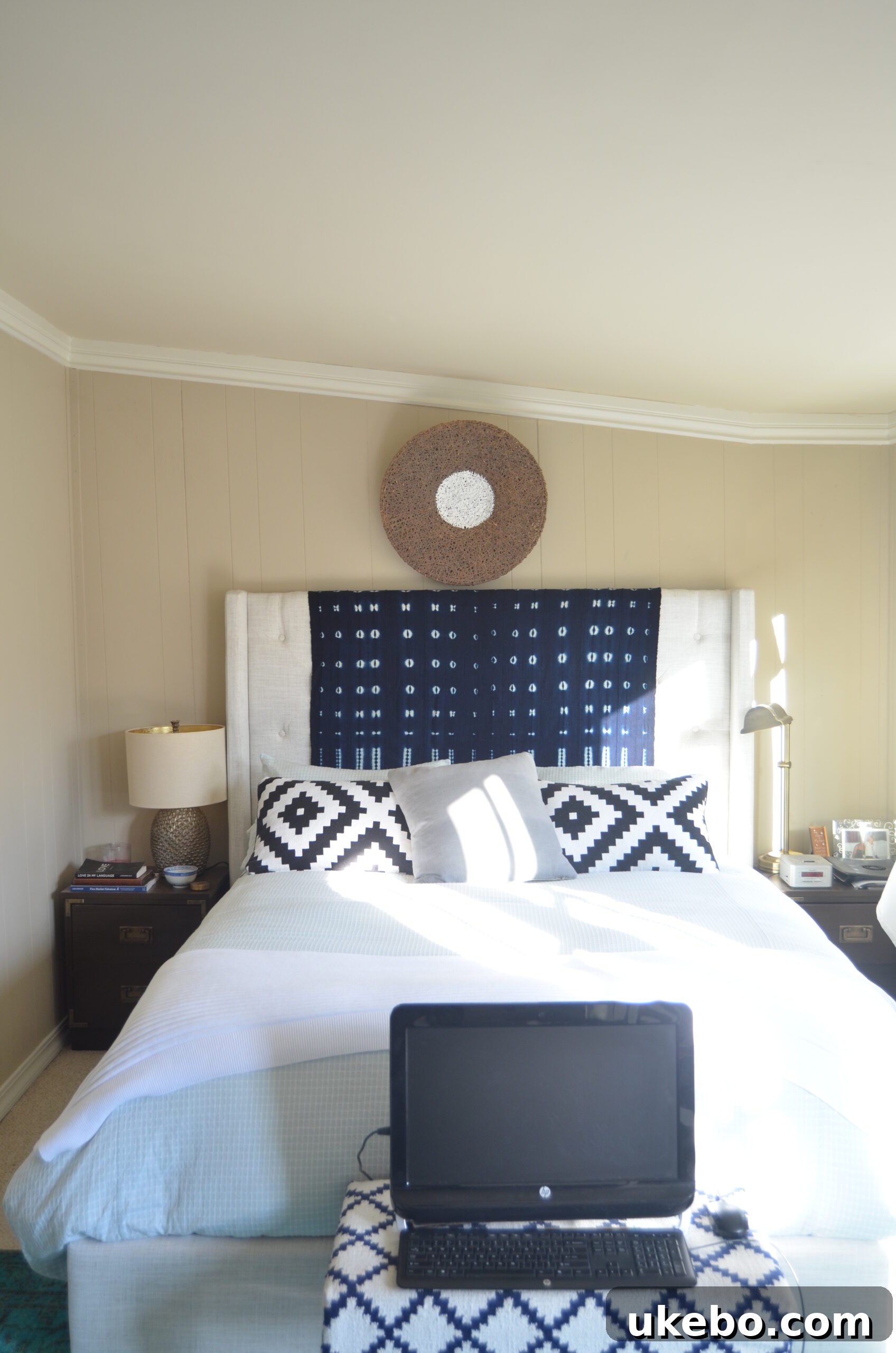
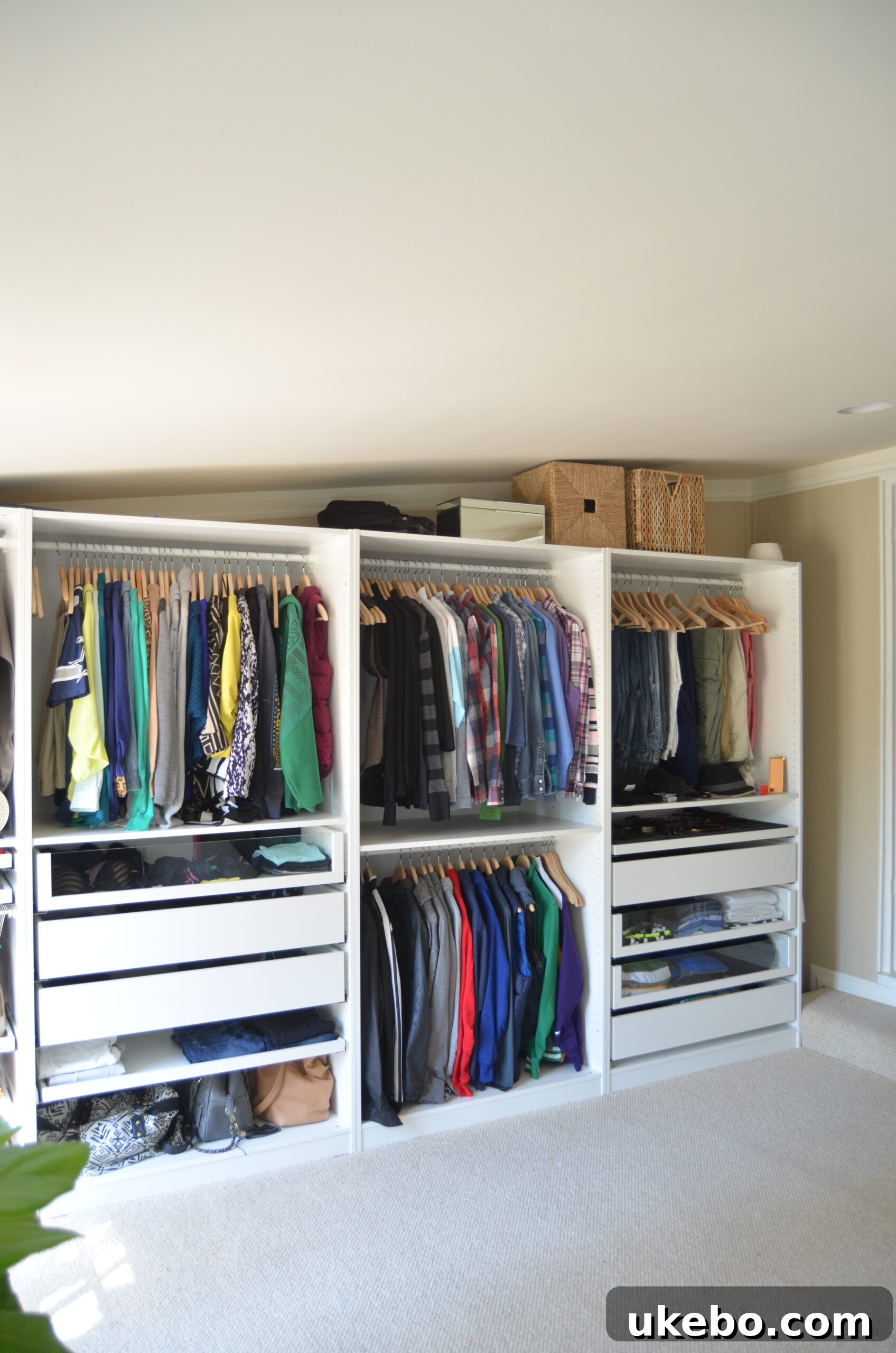
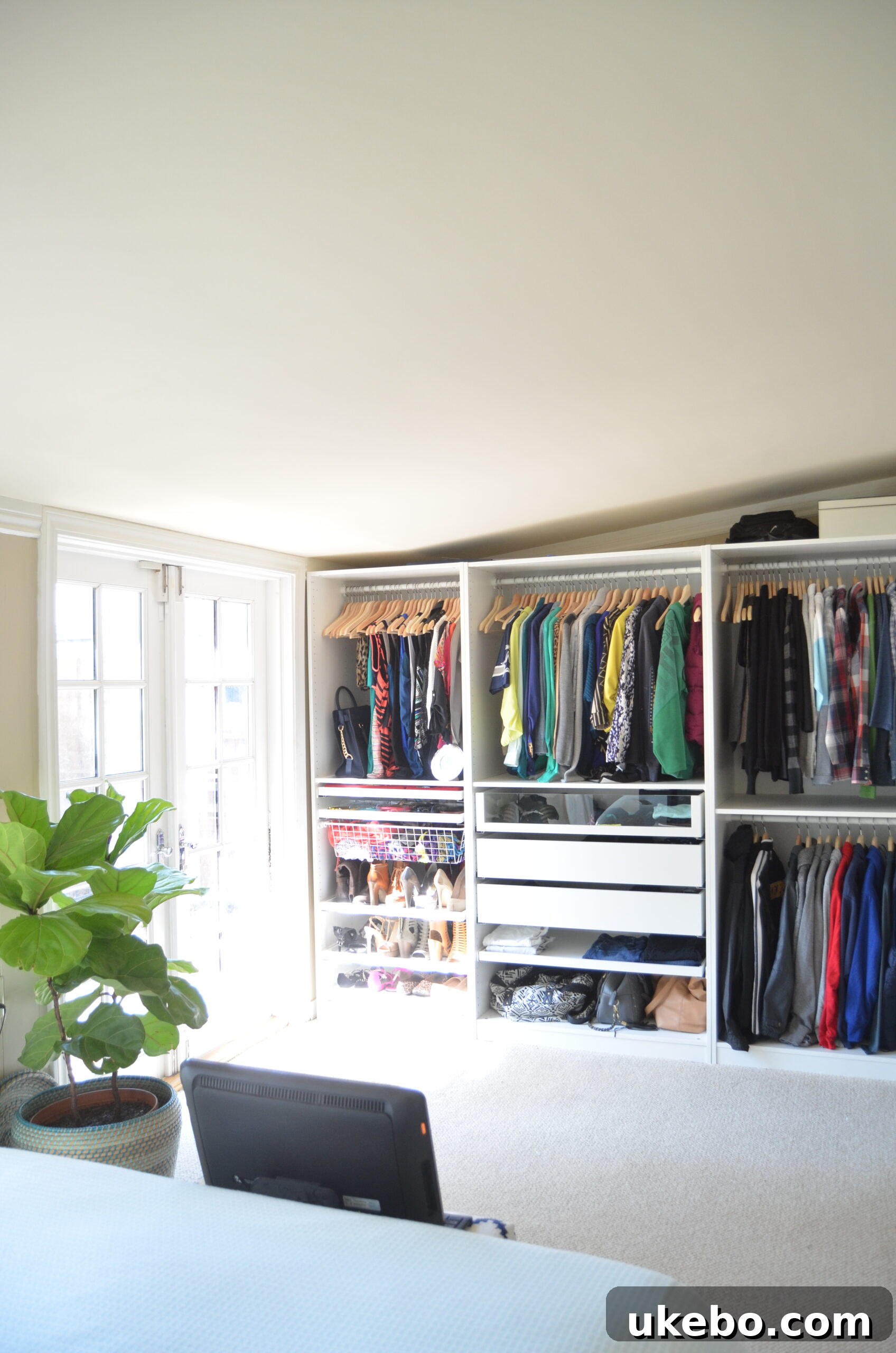
While unconventional, this setup has genuinely worked for us for eight years. I particularly adore having the French doors, offering direct, convenient access to our backyard oasis.
The Hidden Imperfections: Why We Hesitated to Renovate
Despite its functionality, the room wasn’t without its flaws – a running list of “would-be-nice-to-change” items accumulated over the years. I certainly never wished for storm damage to be the impetus for a remodel, but faced with opening walls and pulling back carpets to mitigate moisture and repair structural damage, we made a decisive choice: this was the moment to address those long-held desires for change. Our primary reluctance stemmed from the fear of opening a “can of worms.” This room, added without permits years after the original house was built, presented an enigma. Having been an outdoor patio before its enclosure in the 60s or 70s, we anticipated encountering everything from unforeseen foundation issues to lurking electrical problems, or even structural anomalies. We knew a cosmetic facelift wouldn’t suffice; a truly impactful transformation would demand significant structural work and an investment far beyond simple paint and updated decor.
Strategic Modernization: Our Plan for Structural and Non-Structural Changes
In a perfect world, the “proper” solution for this space would involve tearing it down entirely and rebuilding it from the ground up, correctly and with all necessary permits. This approach would, at minimum, grant us a consistent foundation, roofline, and ceiling height with the rest of the house. However, the sheer cost, the extensive timeline, and the inevitable displacement during such a monumental construction project were simply not appealing. We firmly believe this room isn’t a lost cause; it merely requires a fresh perspective and some intelligent reimagining. The challenge of transforming its quirks into character is something we genuinely embrace. Our goal is to make impactful changes that not only elevate the space to current building standards but also cost a mere fraction of what a complete rebuild would entail. Here’s our detailed plan:
- Farewell, Paneling and Trim: My absolute number one complaint about this room has always been the dated wall paneling. I genuinely loathe it. It’s the same paneling we’ve been systematically removing throughout our house with each new renovation project. We will be replacing every inch of it with smooth, modern drywall, instantly updating the aesthetic.
- No More Carpet: This is the sole room in our entire house still clinging to carpet, and frankly, we detest it. Our definitive plan is to replace it with beautiful hardwood flooring, creating continuity with the rest of our home. We briefly considered cork for its insulation properties or even embracing the raw concrete slab beneath, but hardwood ultimately won out for its timeless appeal and durability.
- Maximize Ceiling Height: Given the room’s unconventional attachment to the main house, we knew there were limits, but every inch counts. Our ambition was to raise the ceiling height as much as humanly possible, even if it was just a few precious inches, to alleviate the feeling of compression in certain areas.
- Eliminate Hidden Sidelites: These architectural anomalies, discovered shortly after we moved in, have been an eyesore and a source of frustration. Located behind the paneling on either side of the entry door, removing them will streamline the wall, enhance natural light flow, and allow for a more functional layout.
- Upgrade Outlets and Lighting: The existing electrical situation was woefully inadequate, featuring only one functioning outlet and a single, oddly placed recessed light that offered poor illumination. We plan a comprehensive electrical overhaul, adding numerous new outlets for modern convenience, running wiring for stylish bedside pendants, and installing strategically placed overhead lighting to brighten the entire space evenly.
- Adjust Step Width: The existing step into the room extends awkwardly beyond the width of the door, consuming valuable floor space that could be far better utilized, particularly for integrated storage solutions. Adjusting its width will improve both aesthetics and functionality.
With this meticulous plan in hand, we wasted no time and enthusiastically got to work.
Witnessing Transformation: Demolition to Rebirth
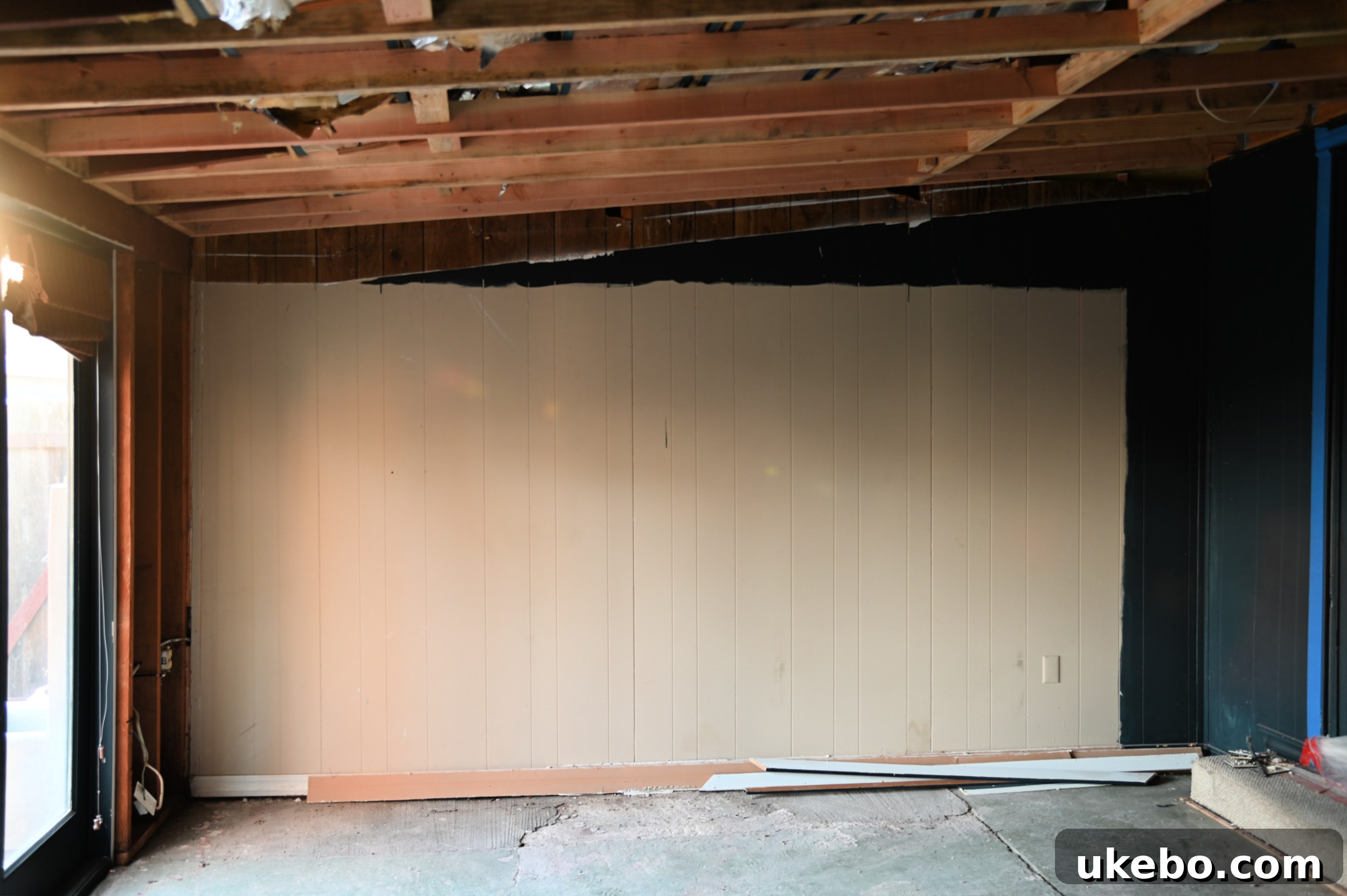
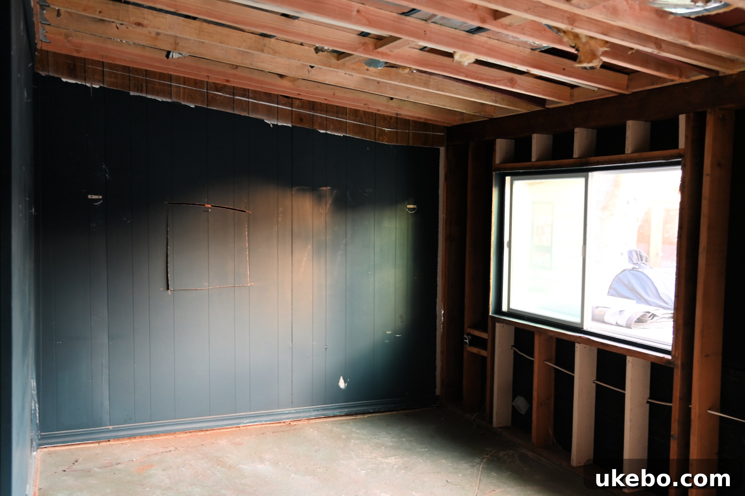
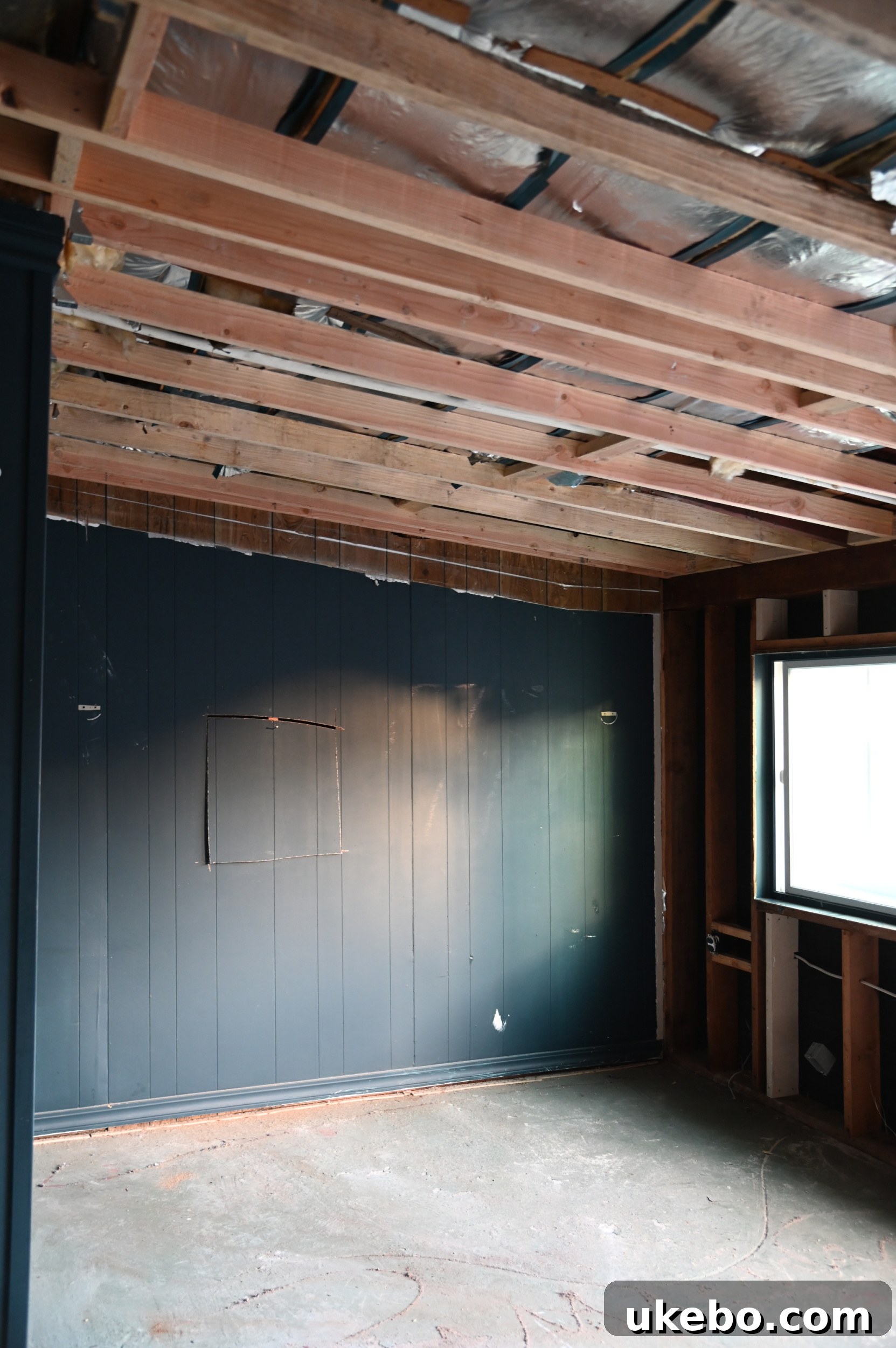
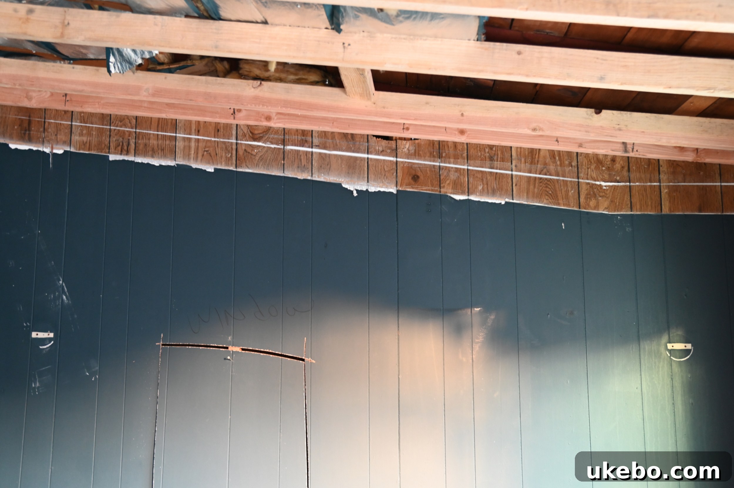
The initial phase of demolition was incredibly revealing. When our contractor inspected the ceiling, he delivered fantastic news: by “sistering” the existing joists, he could reframe the ceiling to gain an astonishing 2 to 5 inches of additional height! I literally shrieked and jumped for joy at this revelation. While it might not sound like a monumental increase, every single inch is a triumph when you’re contending with a naturally low and sloping ceiling. The visual impact is already significant; you can clearly discern the difference in height by observing the old paint line. That distinct top white line marks where the ceiling previously began. Furthermore, they expertly eliminated the awkward 90-degree angle at the lower end of the ceiling, creating a clean, continuous slope that feels far more intentional and spacious.
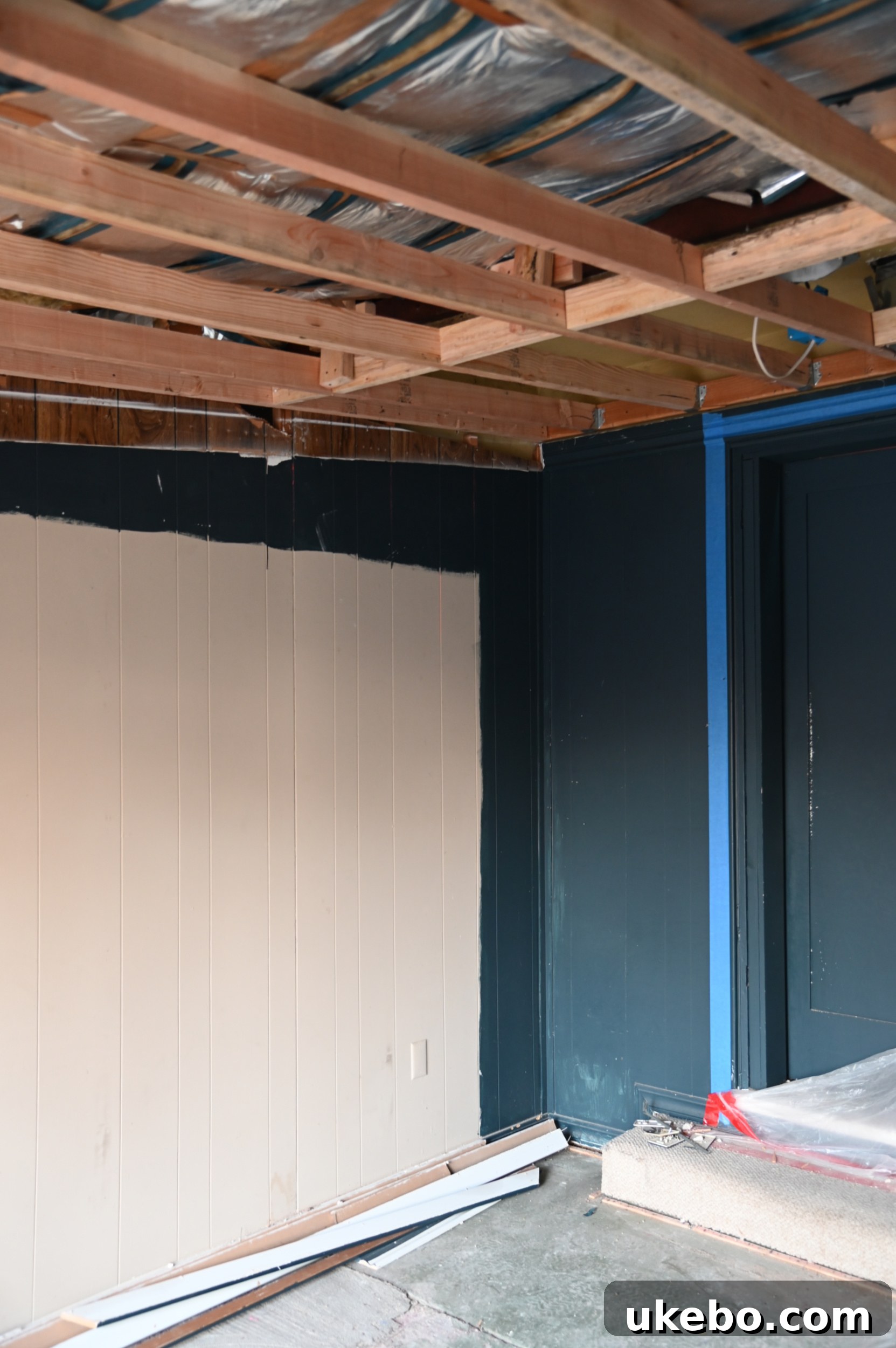
With the ceiling addressed, the dreaded paneling came down, and the walls were systematically rebuilt. This phase unveiled the true “bones” of the space, exposing previously hidden windows (of course!) and revealing that the floor would require far more extensive leveling than we had initially anticipated. It was fascinating, and a little daunting, to finally witness the original structure and its subsequent additions.
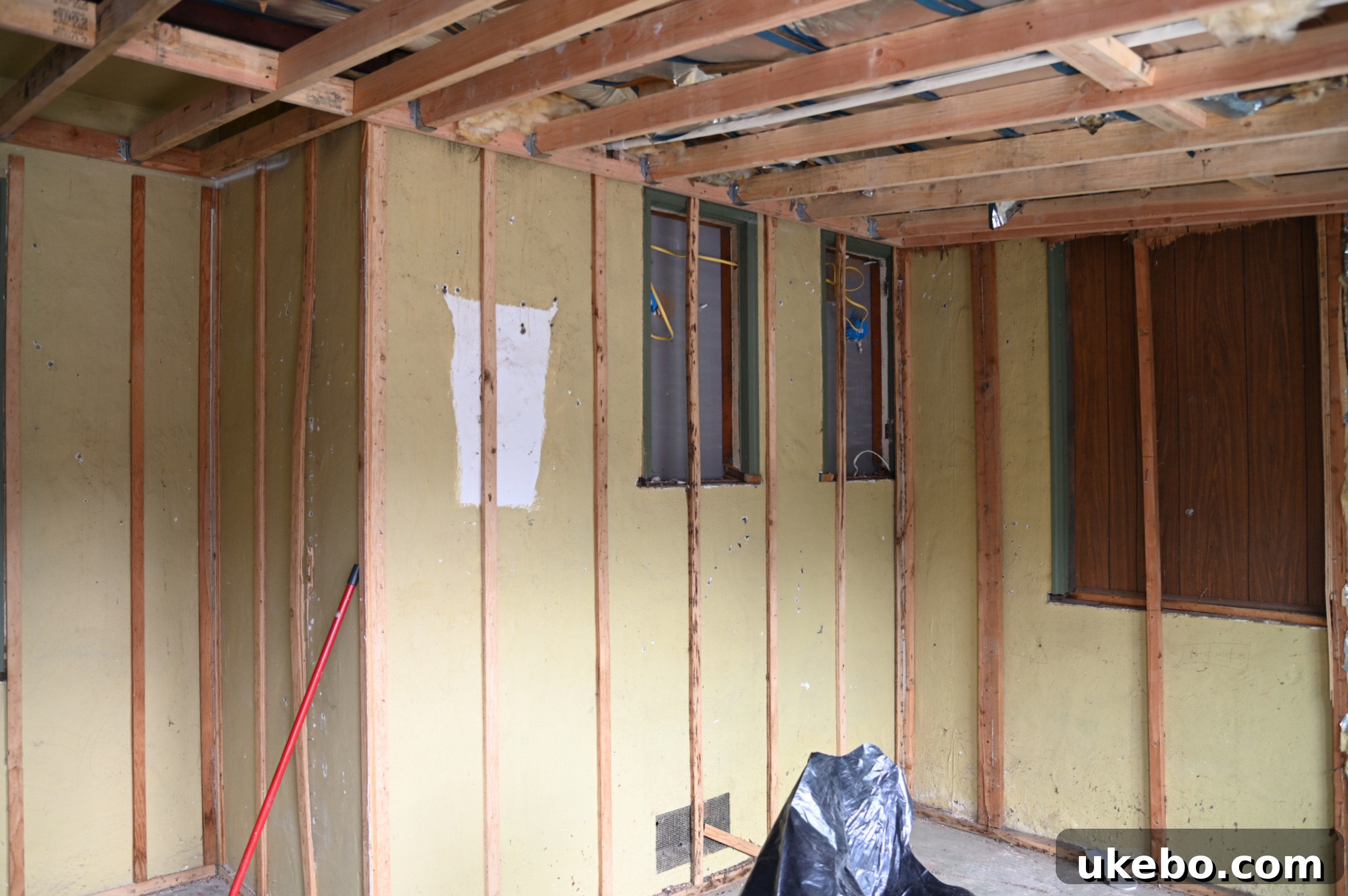
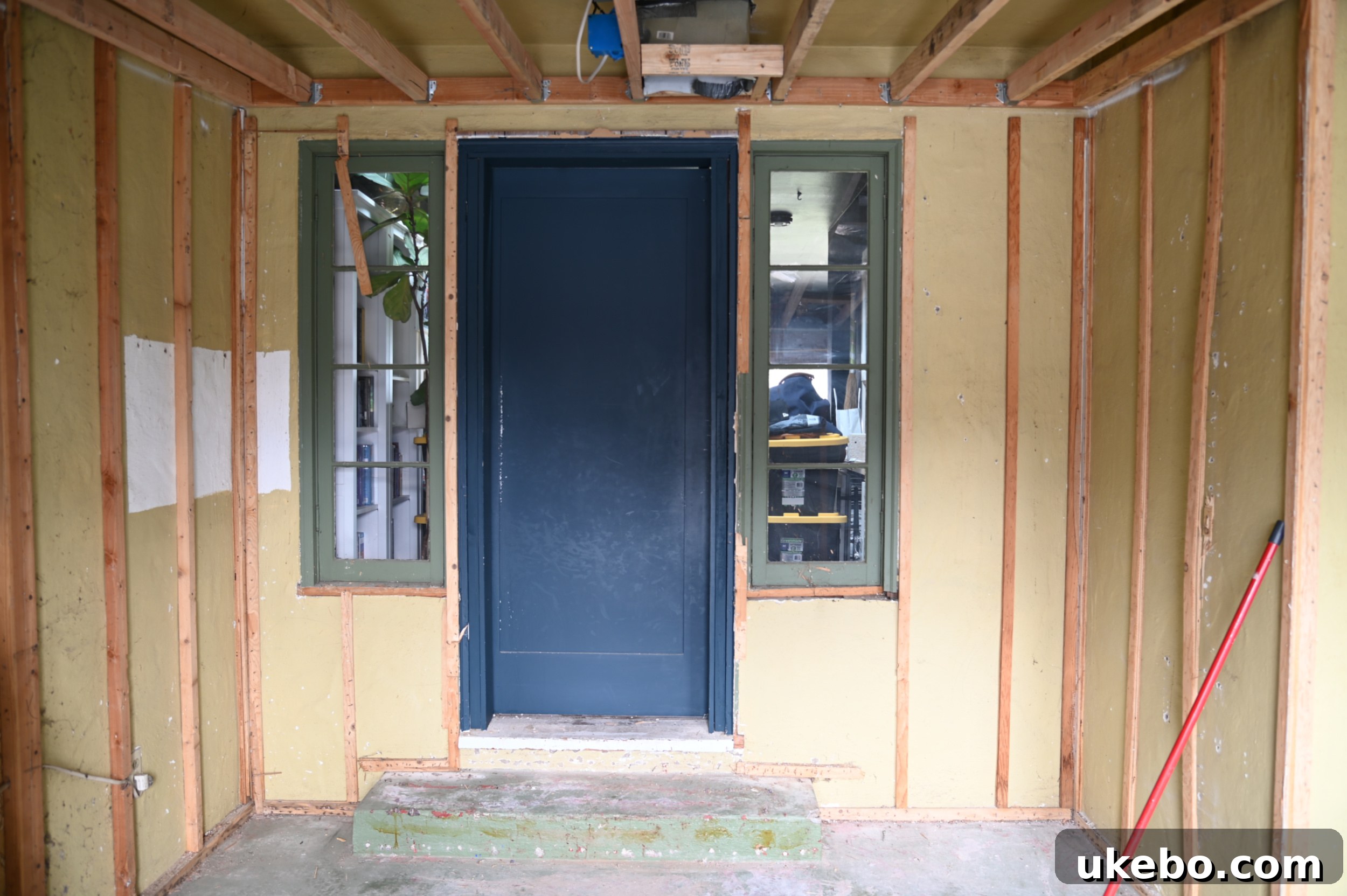
We discovered that the paneling had simply been attached to the original exterior stucco walls using thin strips of wood for nailing. This process also finally exposed the notorious sidelights that had been concealed behind the paneling on this side of the room. They had always been visible on the opposite side, and I’ve expressed my frustration with them countless times before.
Electrical & Illumination Reimagined
With all the demolition complete, the team seamlessly transitioned to restructuring for the new drywall, running the updated electrical wiring, and making the necessary stair adjustment. Naomi was particularly keen on adding overhead lights, a significant upgrade from the single, awkwardly placed recessed light we previously had, which was located just inside the room under the door and provided very poor, uneven illumination. We had supplemented with bedside wall sconces, but the light still primarily dispersed on only one side of the room. Her desire was simple: to be able to flip a switch and instantly illuminate the entire space without having to walk deep into the room. With the sidelights now gone, we could also relocate the light switch from its inconvenient position outside the room to a much more practical spot just inside. While I personally lean away from overhead lighting in bedrooms, preferring the softer, layered glow of lamps and sconces, this was a clear moment for compromise, and I was happy to concede to her request. You’ll soon understand why! Beyond the lighting, we also strategically added numerous new outlets on almost all the walls, addressing a significant functional deficiency and ensuring ample power for modern needs.
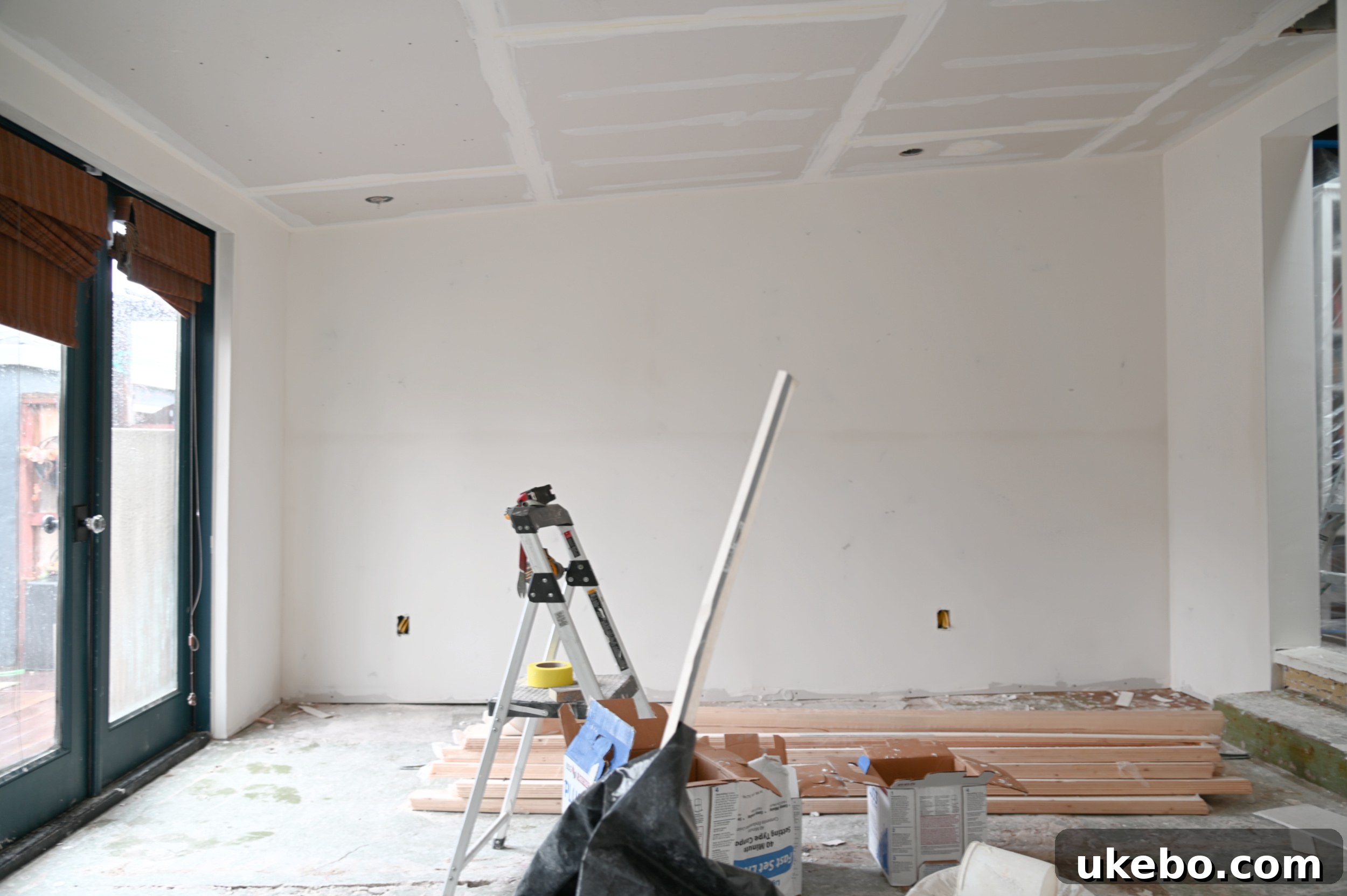
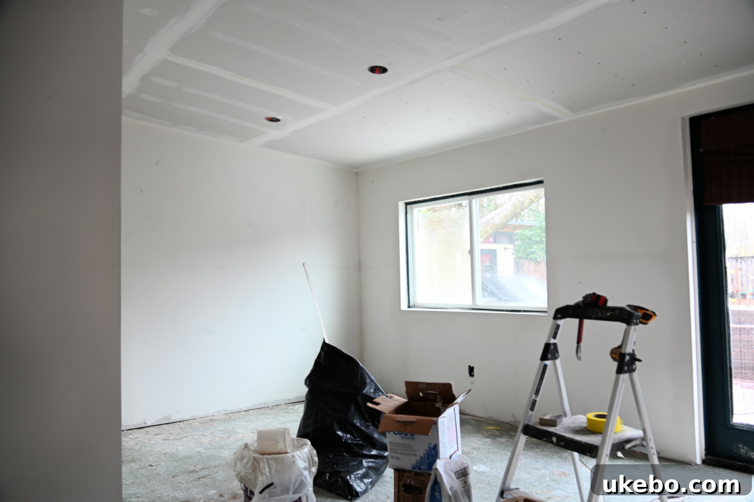
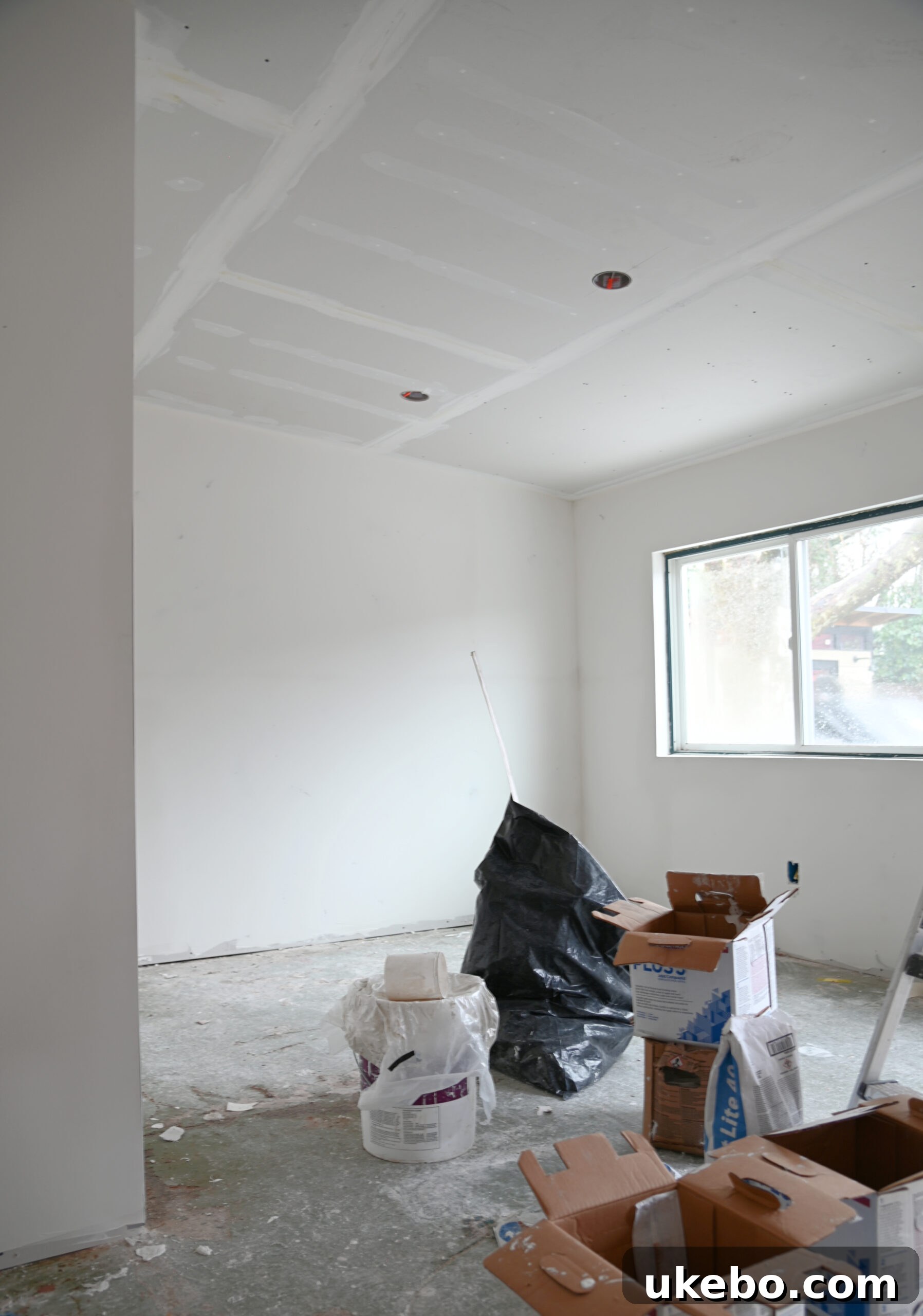
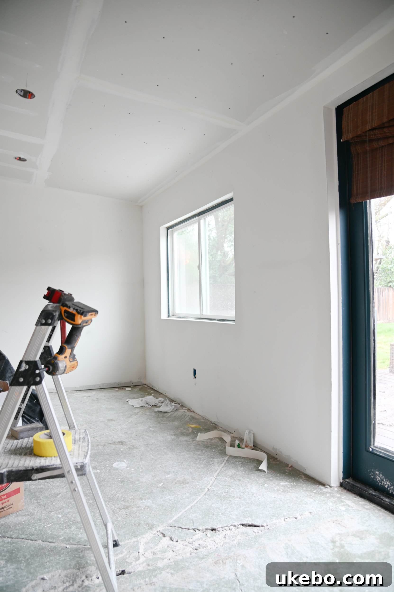
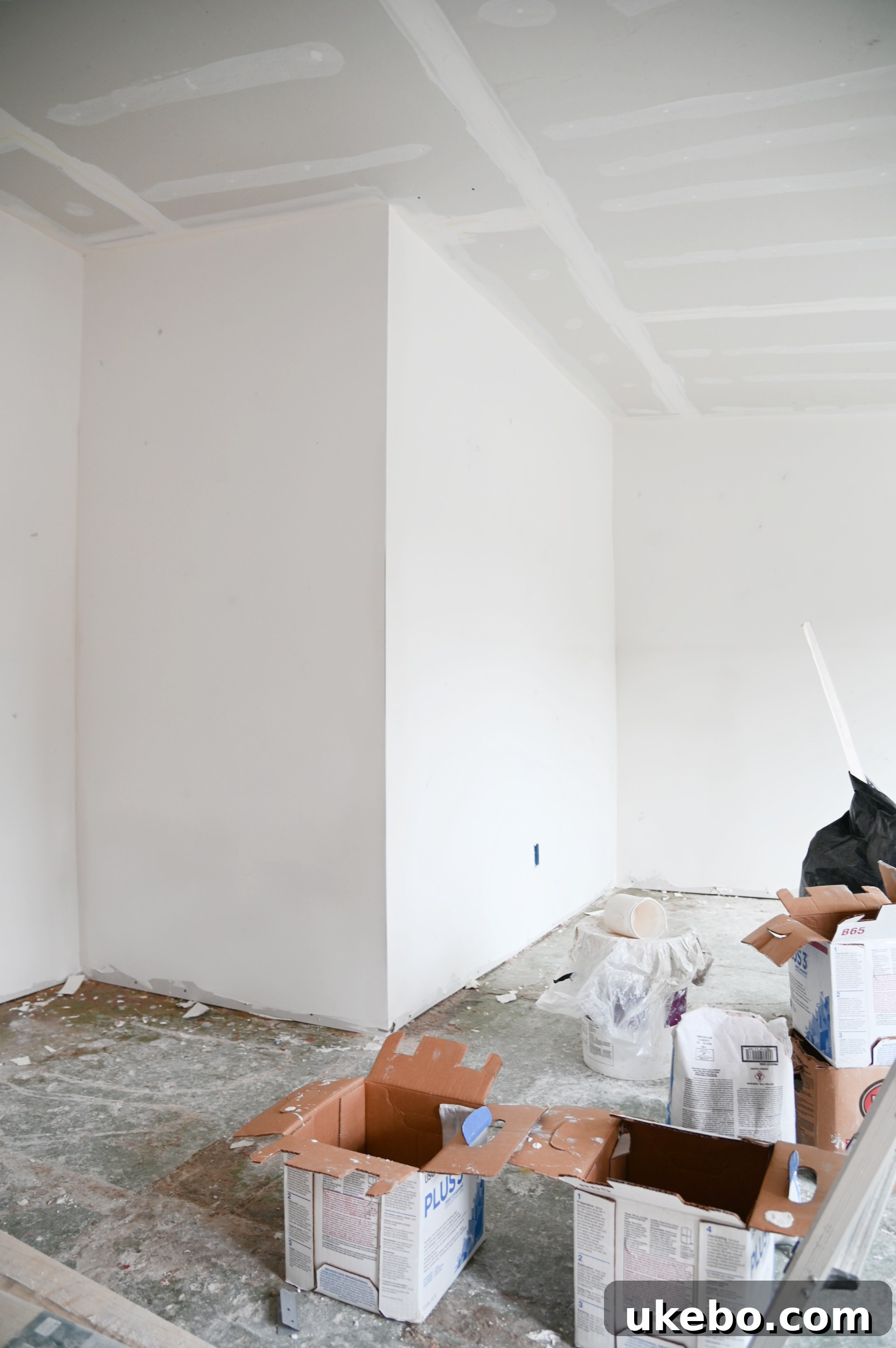
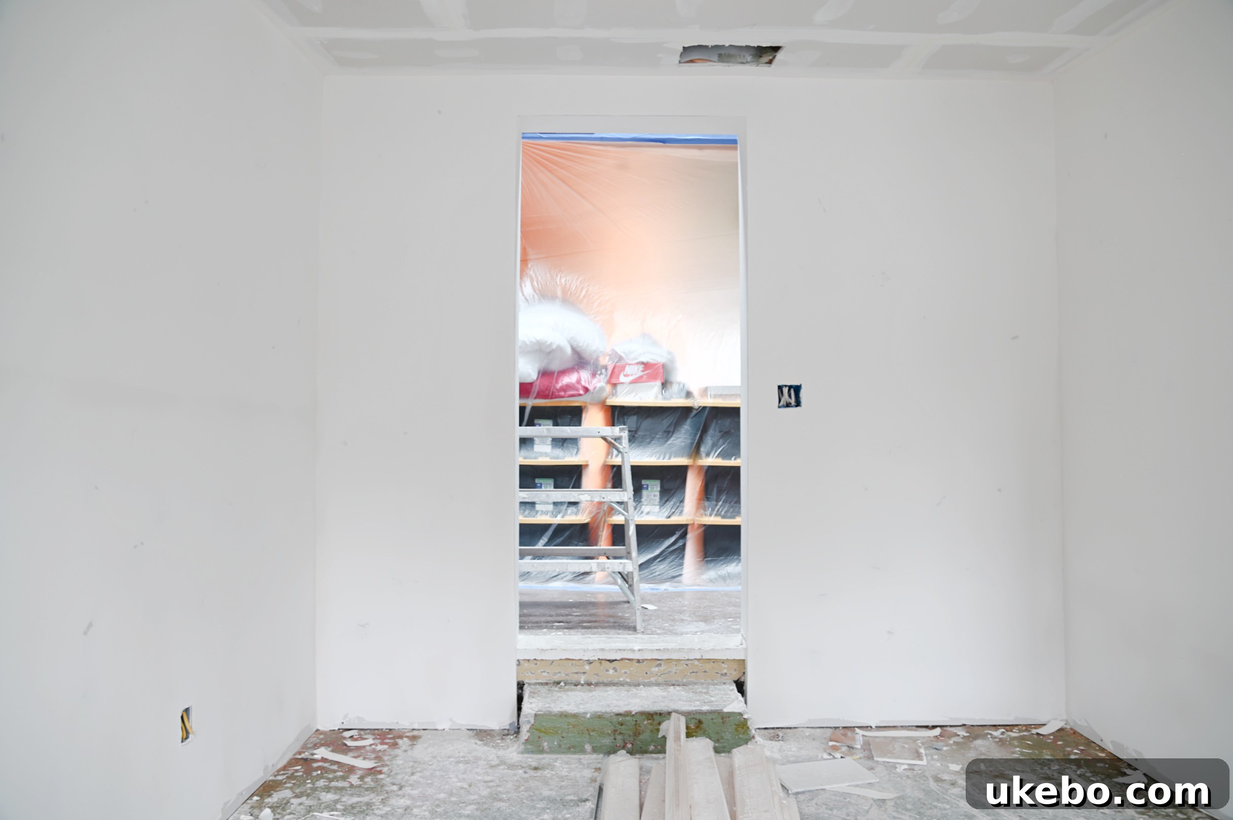
Friends, I swear this room already feels like a completely new space! Those few hard-won inches of added ceiling height miraculously make it seem as though we now have soaring 10-foot ceilings. The outdated paneling truly dated the space so significantly that even if our only accomplishment was installing drywall, it would have represented a colossal improvement. Before we delve further, I want to draw your attention to a couple of key details: the adjustment of the step’s width and the thoughtful placement of the new overhead lights. I know you’re likely curious about the rationale behind these changes, so let’s explore them in the context of our ambitious new layout.
The Power of Space Planning: Crafting a New Narrative for Our Bedroom
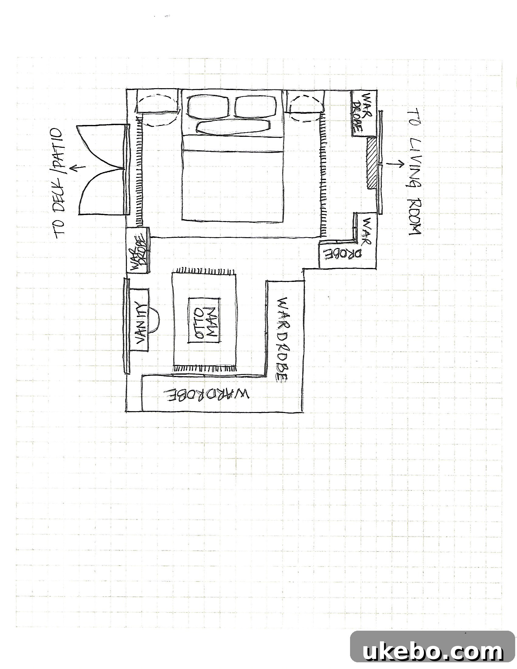
I’ve said it once, and I’ll say it a thousand times: space planning is my absolute favorite aspect of the entire design process. For me, it’s akin to solving an intricate puzzle, and when you achieve the perfect solution, the impact is profoundly transformative – both in how a space functions daily and its long-term livability. As we meticulously dismantled the room to prepare for renovations, Naomi and I began to explore a revolutionary idea: what if we completely swapped the room’s layout? This meant envisioning our bed positioned against the wall where the wardrobes previously stood, and relocating the wardrobes to the recessed area where the bed used to be. This bold shift would allow us to carve out a dedicated “dressing room” zone within the space. I was particularly excited about the potential for significantly more closet space and general storage, especially to accommodate Naomi’s ever-expanding sneaker collection. We were both incredibly enthusiastic about the possibilities this new layout presented, though my only lingering concern was whether the bed placement might feel a tad too close to the entry door. Being an old-school, “sketch it to scale on paper” kind of person, I quickly jotted down the dimensions and drew up a floorplan reflecting our vision. Here’s a glimpse of what I’m currently contemplating (for reference, the scale used here is 10″ = 1 square):
Unlocking Potential: Benefits of the Innovative Layout
I’m actually quite obsessed with this new plan! This innovative layout offers a multitude of benefits that were previously unattainable:
- Enhanced Closet Storage: This redesign enables us to integrate several additional wardrobes into the space. This means dedicated, organized storage for Naomi’s extensive sneaker collection, the addition of crucial long-hanging space for my own clothing (a feature I desperately lack currently), and an overall expansion of shoe and handbag storage for me. The existing cramped setup simply couldn’t compare.
- Expanded Nightstand Options: Our previous layout was incredibly restrictive, allowing for only about 22 inches on either side of the bed for nightstands. This severely limited our furniture choices and functional surface area. By relocating the bed to the opposite wall, we unlock a significant amount of additional space, providing the freedom to select larger, more statement-making nightstands or even integrated storage solutions.
- Eliminate Backyard Thoroughfare: This is a monumental improvement for us! The existing configuration inadvertently positioned our bedroom as the primary thoroughfare to the backyard from the main living area. Despite having direct access via the laundry room, our bedroom inexplicably became everyone’s default route. This constant intrusion into our private space was a perpetual annoyance. Moving the bed to the other side quite literally creates an access barrier, restoring the privacy and tranquility essential for a bedroom.
- Dedicated Vanity Area: While I’ve managed to carve out a very small vanity area within one of my existing wardrobes, this new layout will allow for a proper, dedicated space where I can comfortably sit to do my makeup and engage in self-care routines within the bedroom. Currently, these activities happen in the bathroom, which is fine, but in a one-bathroom household, dedicating a specific area in another part of the house will keep the bathroom much more accessible and free for its primary functions, improving overall household flow.
- Cultivating a Primary Suite Ambience: Perhaps most importantly, this new layout will fundamentally transform the feel of this room. It will transition from a “makeshift” bedroom, a space we were merely using to “tide us over,” into an intentional, thoughtfully designed primary suite that feels seamlessly integrated into our home’s overall design. It’s even conceivable that this new, highly functional layout could fundamentally alter our future plans, potentially swaying us away from embarking on the formal (and undoubtedly very expensive) primary suite addition we’ve contemplated once Bry eventually moves out and her room becomes available.
Now that we’ve meticulously ironed out the construction details and envisioned how we plan to functionally reimagine the room, it’s time to delve into the exciting (and slightly perplexing) realm of overall design direction and inspiration for this brand-new space.
The Design Crossroads: A Tale of Two Styles for Our Sanctuary
I won’t lie, friends – this space has me genuinely perplexed when it comes to design. From the outset, we made a conscious decision to embrace its inherent imperfections and the undeniable fact that it is, indeed, a quirky, unconventional addition to the original footprint of our house. The ceilings are sloped, it rests on a lower-level foundation, and technically, it’s not even a “bedroom” in the traditional sense. Therefore, instead of futilely attempting to force it to “match” the rest of the house, we opted to celebrate its individuality in terms of design and aesthetic. I, for one, don’t subscribe to the rigid “every room in the house must visually connect to the other” rule anyway. Each room in our home is its own unique moment, boasts its own distinct color story, and aims to evoke an emotion specific to that space upon entry. Carrying that same energy into the new bedroom is a no-brainer. HOWEVER, what has me utterly perplexed is that I find myself deeply drawn to two very different, almost conflicting, design directions for this room.
Direction One: Muted, Textural, Wabi-Sabi Minimalism
The first design aesthetic represents a notable departure from my typical maximalist leanings. It’s a vision of muted tones, rich textures, embodying a serene wabi-sabi philosophy, Japanese-minimalist principles, and a distinct Balinese-esque vibe. I know that sounds like a complex mish-mash, a lot to unpack, but bear with me. While I’d still want it to retain a certain moodiness – because, well, that’s just Shavonda! – it would be significantly pared back and undeniably minimal. The emphasis wouldn’t be on overt decoration or embellishment, but rather on an abundance of tactile texture achieved through carefully chosen linens, plush rugs, woven rattan, natural fibers, and rustic, organic materials. It’s also a look that’s predominantly monochromatic and, dare I say, neutral. I mean, who even is she?! Here are a few examples that deeply resonate with this particular aesthetic:
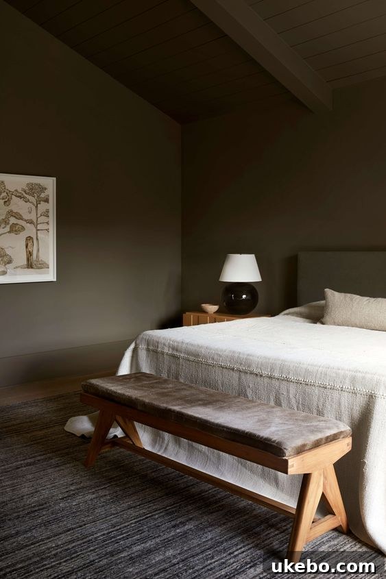
credit
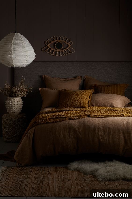
credit
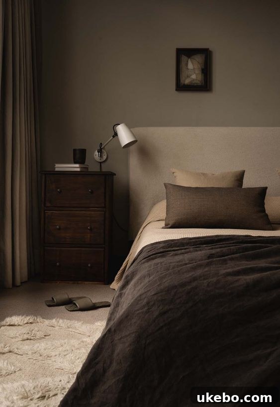
credit
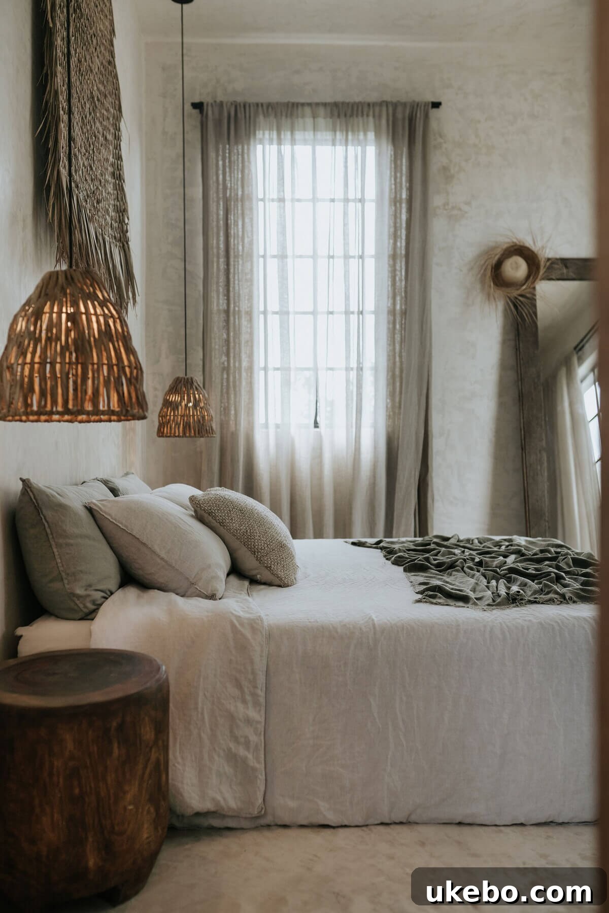
credit
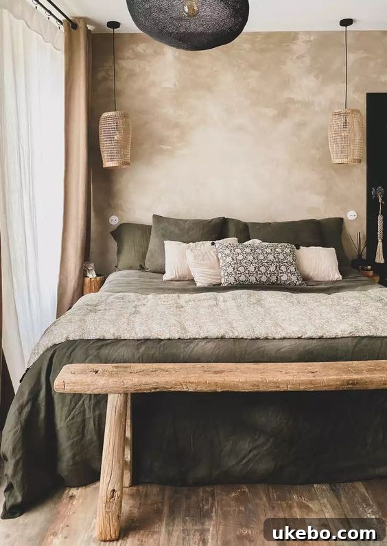
credit
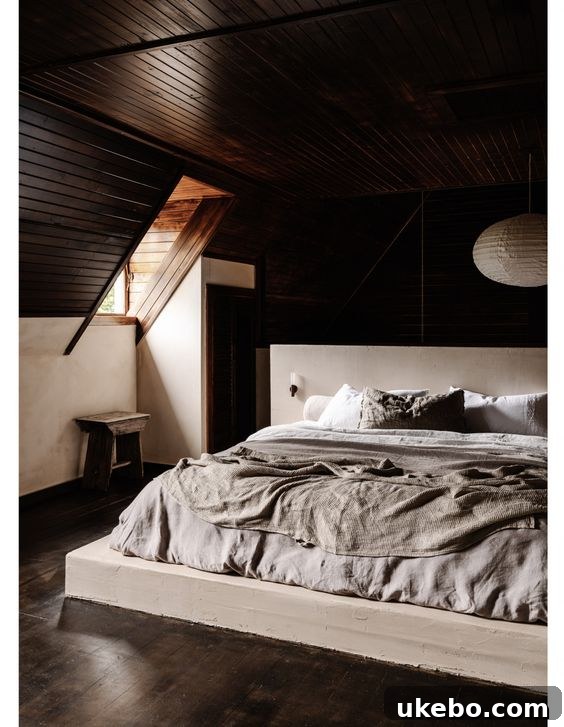
credit
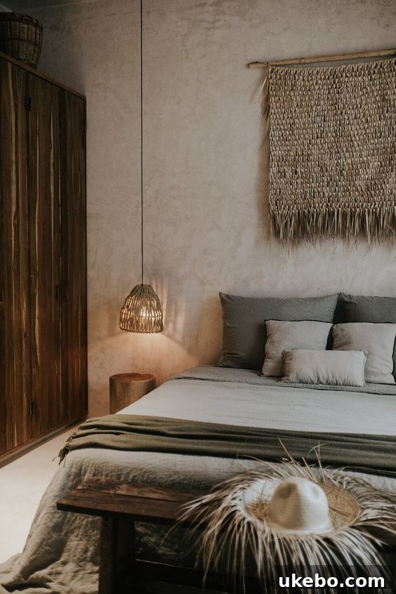
credit
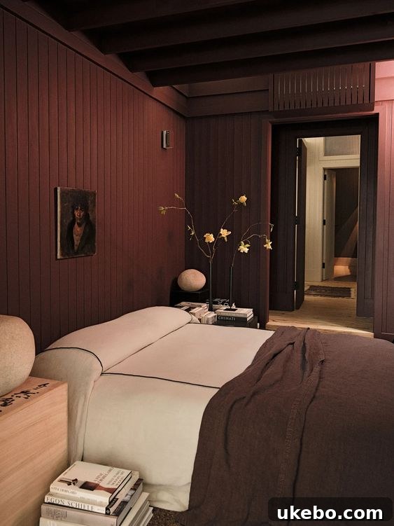
credit
Colin’s room, in particular, offers an excellent example of successful bed placement adjacent to an entryway, addressing my earlier concern.
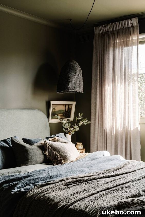
credit
This minimalist-inspired vibe feels incredibly well-suited for a space with sloped ceilings, transforming what might be seen as an imperfection into a unique architectural feature. However, this direction is a significant departure from my innate aesthetic inclinations, which brings me to the other compelling direction I’m currently considering.
Direction Two: Visually Layered and Eclectic Maximalism (More “Me”)
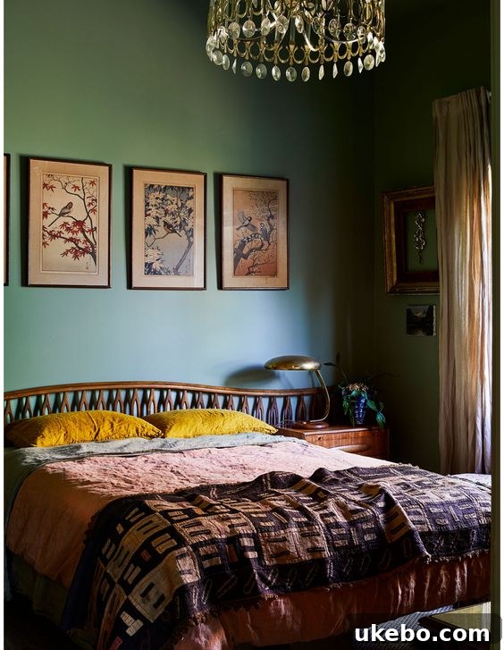
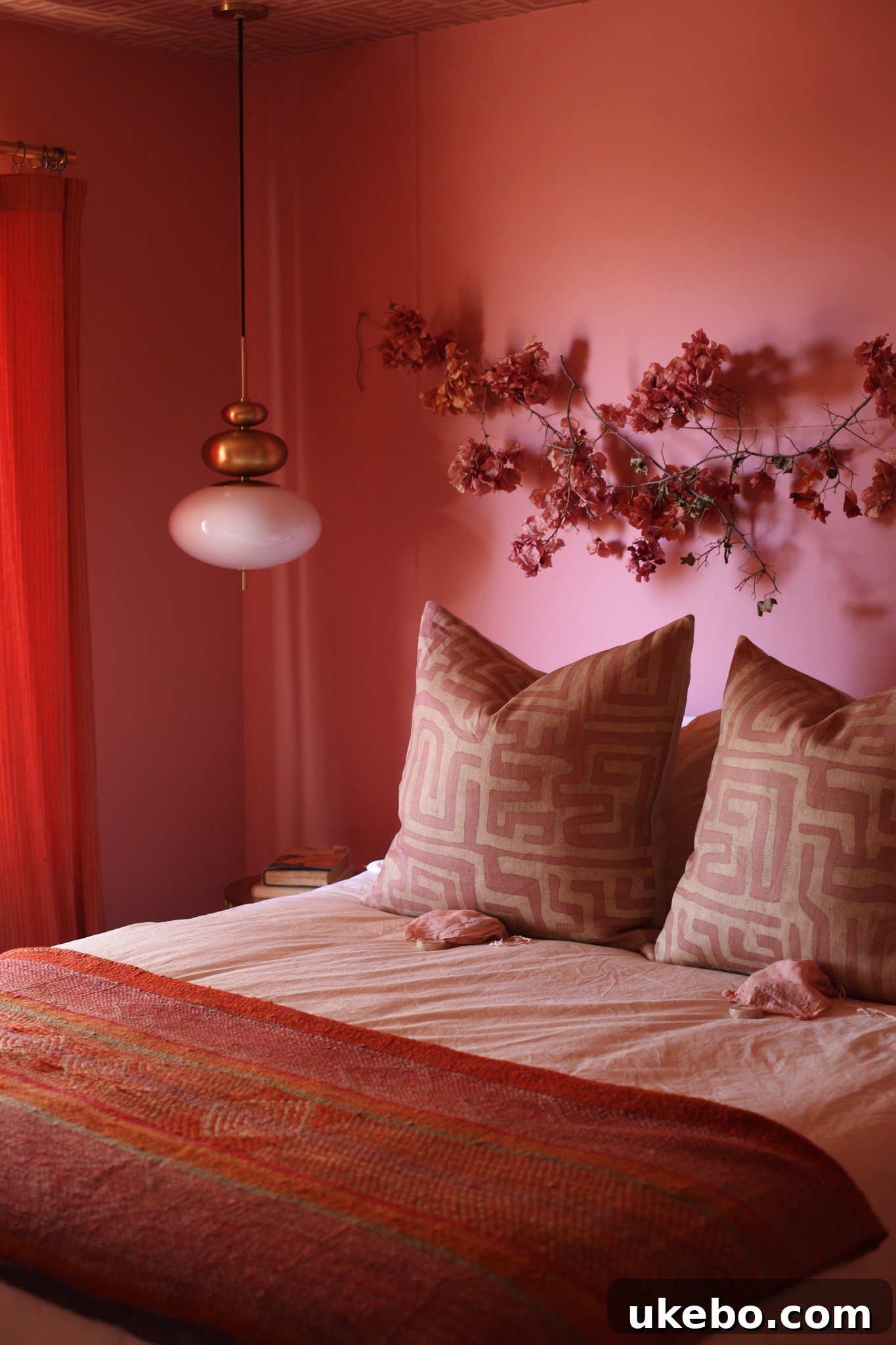
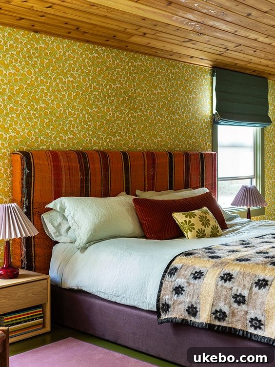
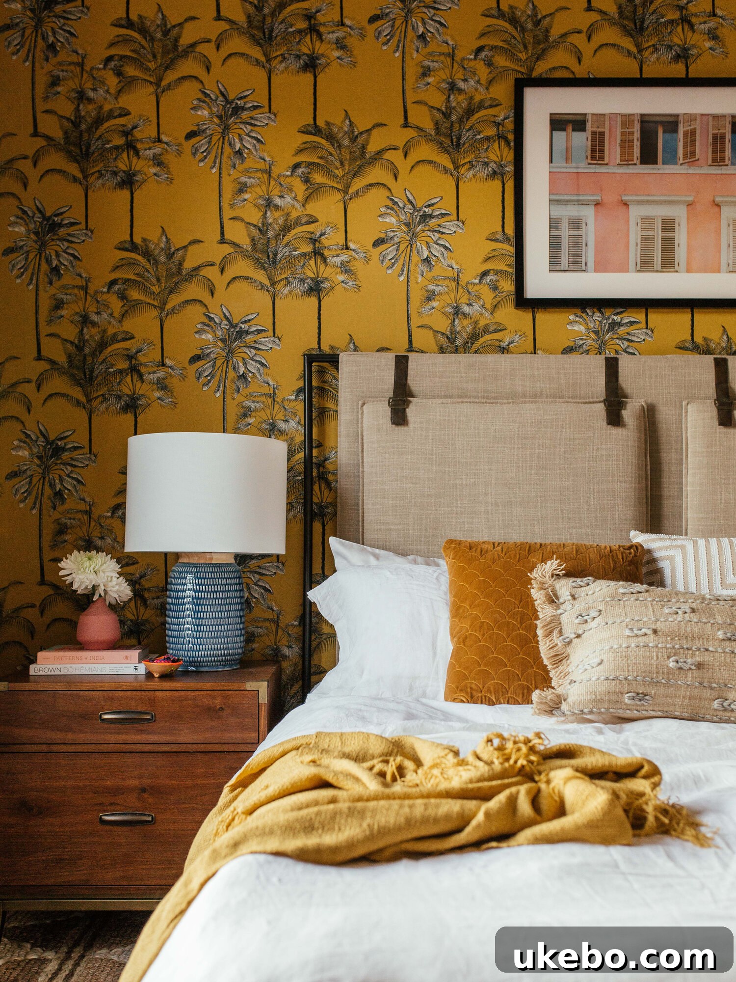
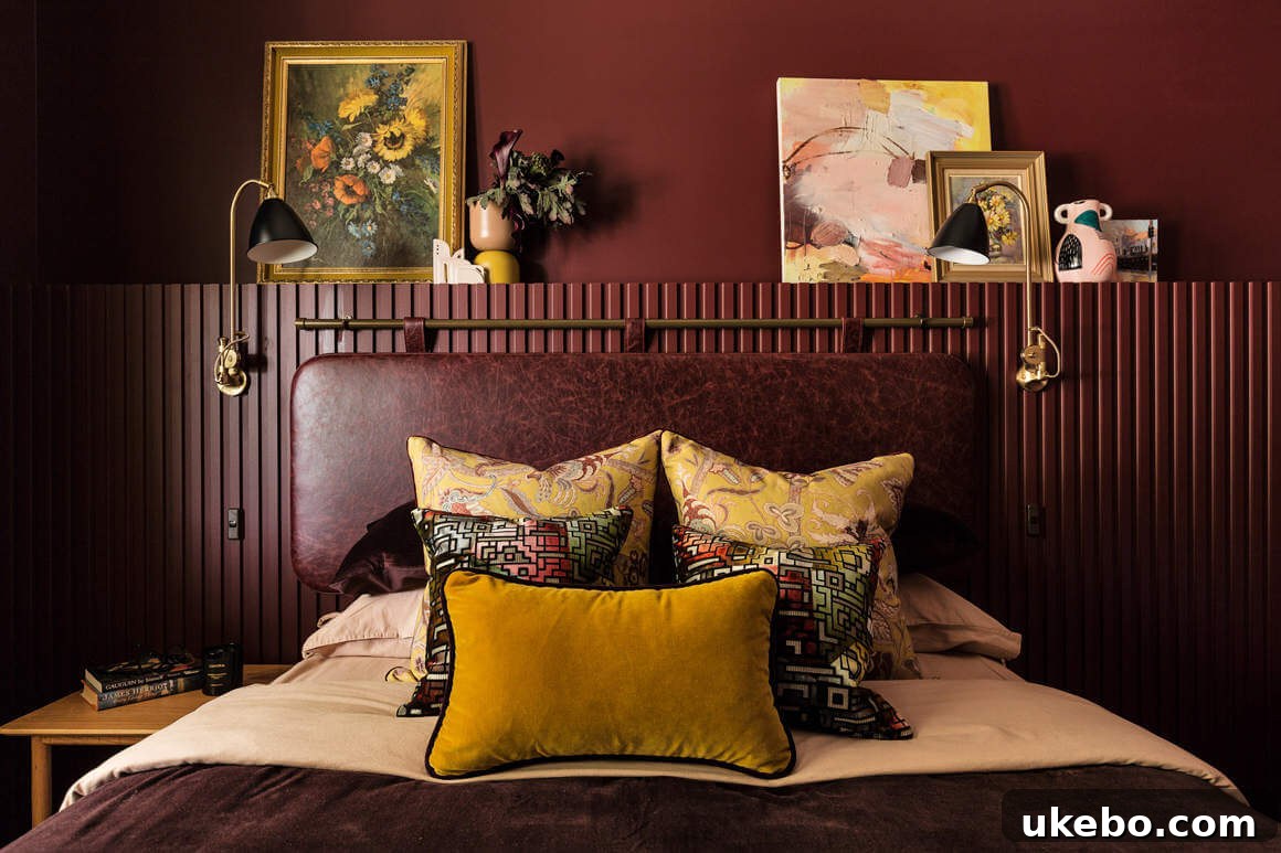
This second direction is still undeniably moody, a signature element of my style, but it embraces a more visually layered and richly eclectic approach. This is much more “me” – a curated collection of objects, colors, and textures that tell a story. It’s vibrant, personal, and full of character. Something akin to these inspiring spaces:
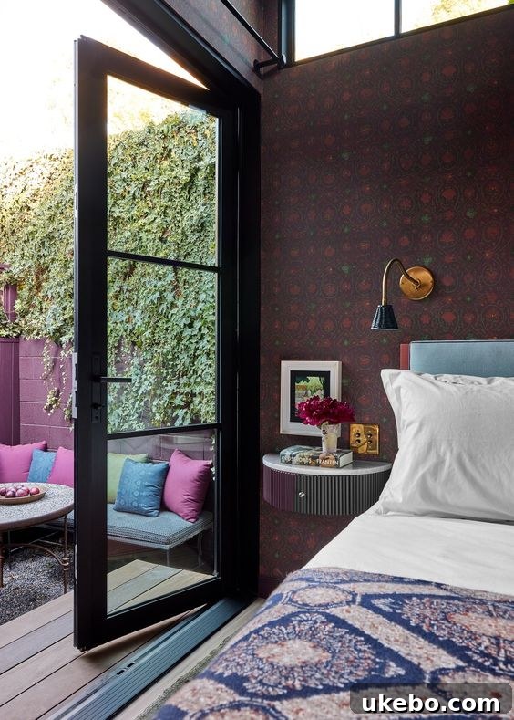
credit
I am high-key obsessed with Sarah Paulson’s tiny home, and this bedroom in particular. I adore the color story she’s created here, and how incredibly smart is that floating nightstand solution in such a compact space!
credit
credit
credit
credit
credit
So yes, there lies the delightful dilemma. Also, I feel it would be a seriously missed opportunity if I didn’t incorporate some fabulous wallpaper into this space, wouldn’t you agree? Every single room in our house boasts a memorable wallpaper moment, and this newly revitalized space absolutely deserves one too! As of now, I still haven’t definitively settled on the overall design direction. I suspect I might ultimately land on a harmonious blend that thoughtfully combines elements from both styles, creating something truly unique. However, one detail I am absolutely certain about: I will be incorporating chocolate brown. I’ve harbored a long-standing desire to design a room centered around this rich, sophisticated hue, and I’m incredibly excited about making that vision a reality in our new primary bedroom.
What’s Next: The Design Unveiling and Further Progress
Alright, friends, that’s all for this extensive update. I know this was a particularly long post, packed with a ton of information, so thank you sincerely for sticking with me through every detail. My goal is to finalize the design direction over the upcoming weekend, and next week, I’ll be eagerly sharing the complete design plan and an inspiring mood board that brings our vision to life. Additionally, I’ll be providing an in-depth look at our innovative closet plan and even more progress pictures showcasing the ongoing work in the bedroom. For real-time updates and behind-the-scenes glimpses, make sure you’re following me on Instagram, where I’m sharing every step of this renovation journey. You can also find the entire renovation process saved in a dedicated highlight on my profile.
Until next time, friends!