
This post is sponsored by Sherwin-Williams®. All opinions are my own.
Embrace the Brilliance: My Top 5 Sherwin-Williams Jewel Tones for a Vibrant Home
Hello, fellow design enthusiasts!
Lately, my social media feeds have been buzzing with an exciting conversation: what design elements are people most thrilled about in interiors this year? And the overwhelming consensus has been crystal clear: COLOR, COLOR, COLOR! As a dedicated admirer of all things vibrant and colorful, it truly makes my heart sing to witness this widespread enthusiasm. It signals a delightful shift away from the predominantly neutral palettes of recent years and a powerful move towards embracing rich, expressive hues in our homes.
We’re not just talking about a subtle hint of color, either. The response I’m hearing is an emphatic desire for bold splashes of color, deep, saturated shades used as foundational elements, and even layers upon layers of dynamic tones. Specifically, jewel tones have captured our collective imagination. These opulent, highly saturated colors, inspired by precious gems, have an incredible ability to transform any space into something truly special and luxurious. Last year, I shared my favorite moody paint colors (and still receive weekly messages from those inspired to embrace a darker palette!). This year, I thought it would be even more fun to dive into another round-up, dedicating our focus to my absolute favorite jewel tones from the extensive Sherwin-Williams fan deck, complete with inspiring visuals that perfectly channel their breathtaking beauty and impact.
Let’s unlock the transformative power of color, one exquisite jewel tone at a time!
1. Shamrock SW6454: The Essence of Lush Emerald
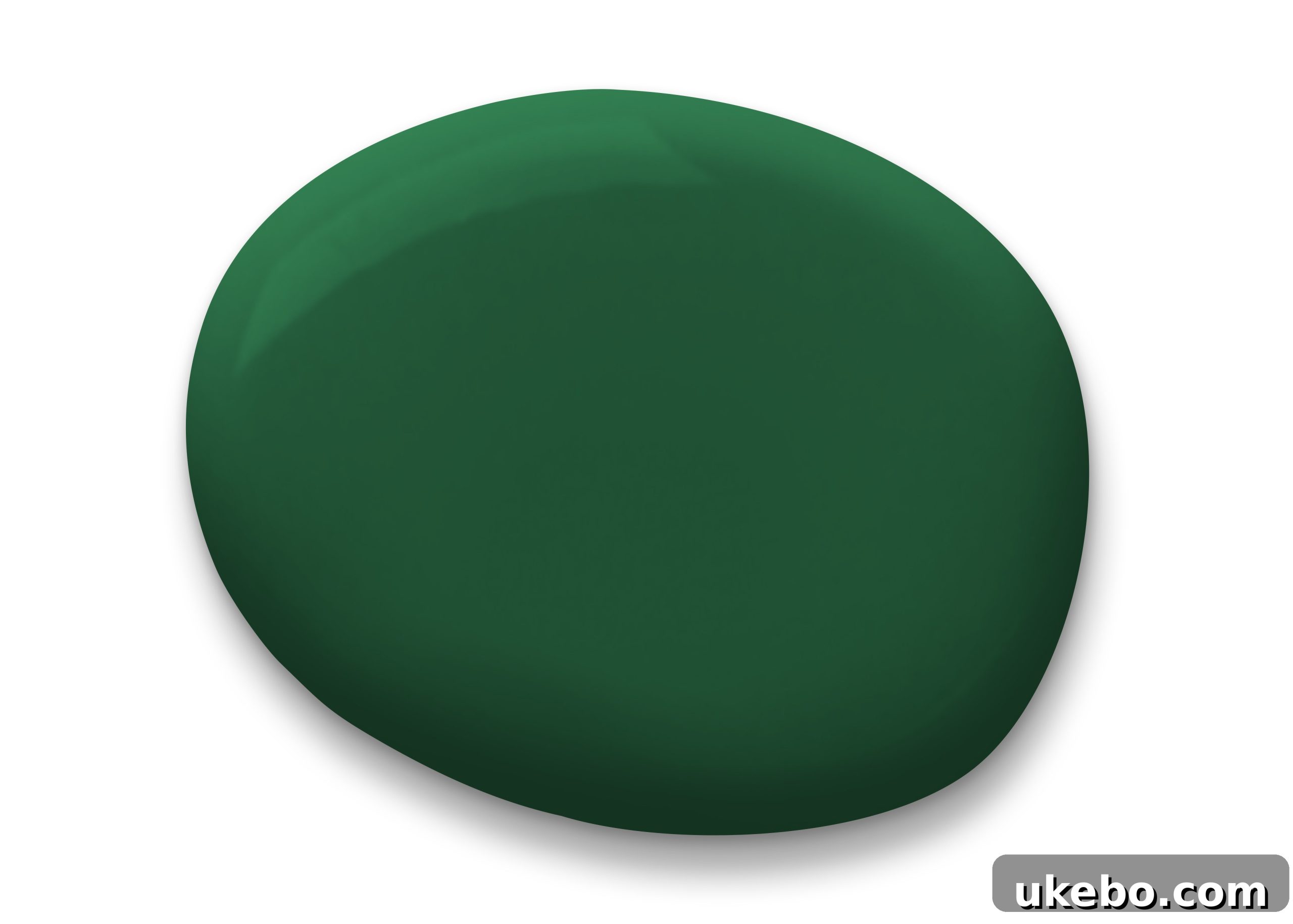
For anyone who follows my design journey, it’s no secret that emerald green holds a very special place in my heart – it’s undeniably MY color! As a May baby, emerald is quite literally my birthstone, intrinsically woven into my life’s story. This magnificent shade, reminiscent of verdant nature, lush growth, and vibrant life, brings an unparalleled sense of luxury and depth to any interior. Whether you choose to envelop an entire wall in its rich embrace, update kitchen cabinets with a touch of sophistication, or incorporate it through plush upholstery, Shamrock SW6454 consistently delivers a feeling of thoughtful design and opulence. It’s a color that makes a statement without shouting, exuding a timeless elegance that feels both grounded and lavish.
And let’s not forget the simplest way to infuse this jewel tone: PLANTS! If painting feels too daunting, simply fill your space with an abundance of flourishing green plants to echo the lushness of Shamrock. One of my favorite examples of this jewel-like green in action is Justina Blakeney’s kitchen, a space that perfectly embodies eclectic charm and vibrant energy, where green acts as a refreshing anchor.
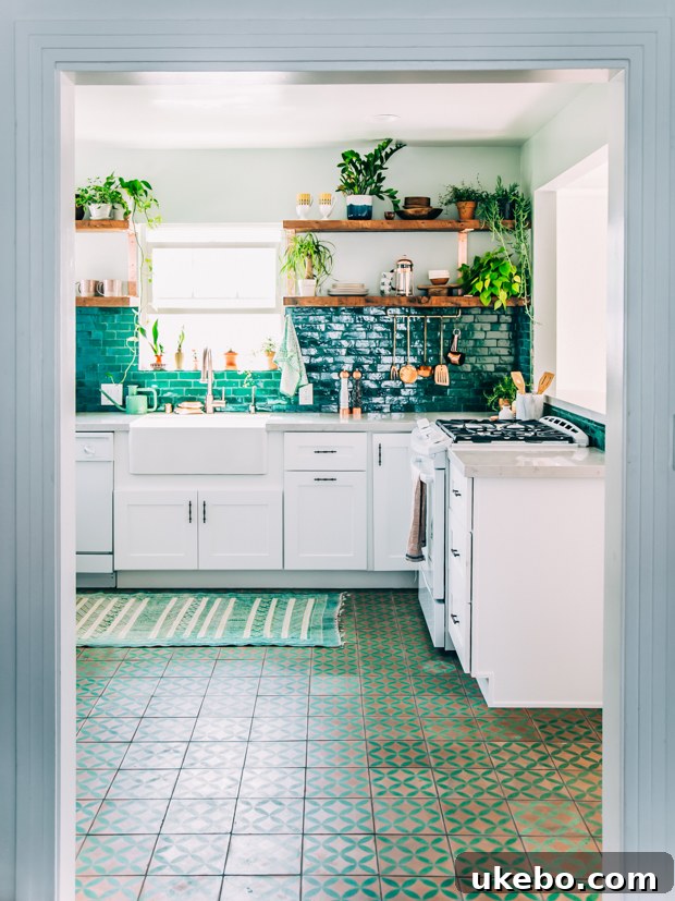
via Justina Blakeney
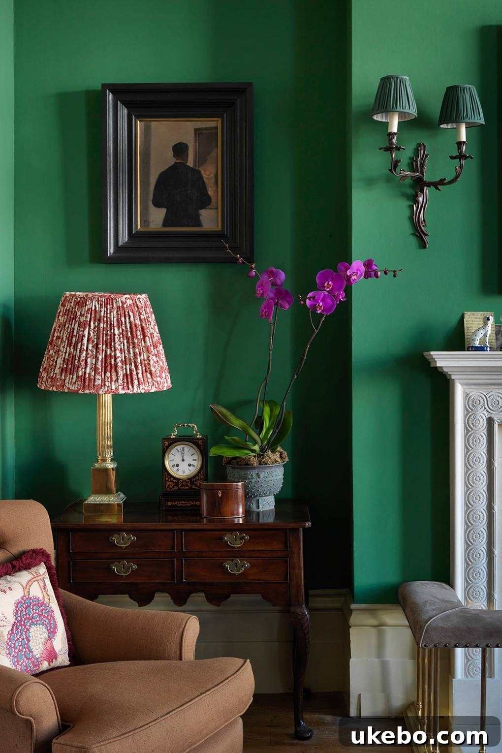
I am also incredibly drawn to the masterful styling and decoration of this home by Gavin Houghton. His approach not only highlights the striking visual appeal of emerald green but also brilliantly demonstrates its versatility. This captivating hue proves itself to be an exceptional companion to a myriad of other colors, from vibrant corals to soft pastels, showcasing its remarkable ability to create harmonious and dynamic palettes. Shamrock is truly a chameleon among jewel tones, adapting to and elevating various design schemes with grace and impact.
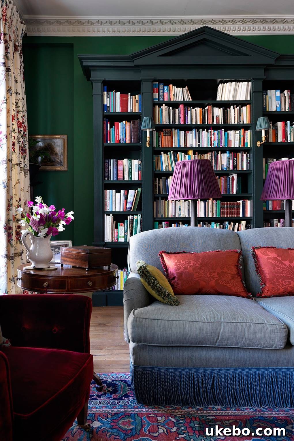
2. Frambroise SW6566: A Daring Splash of Magenta
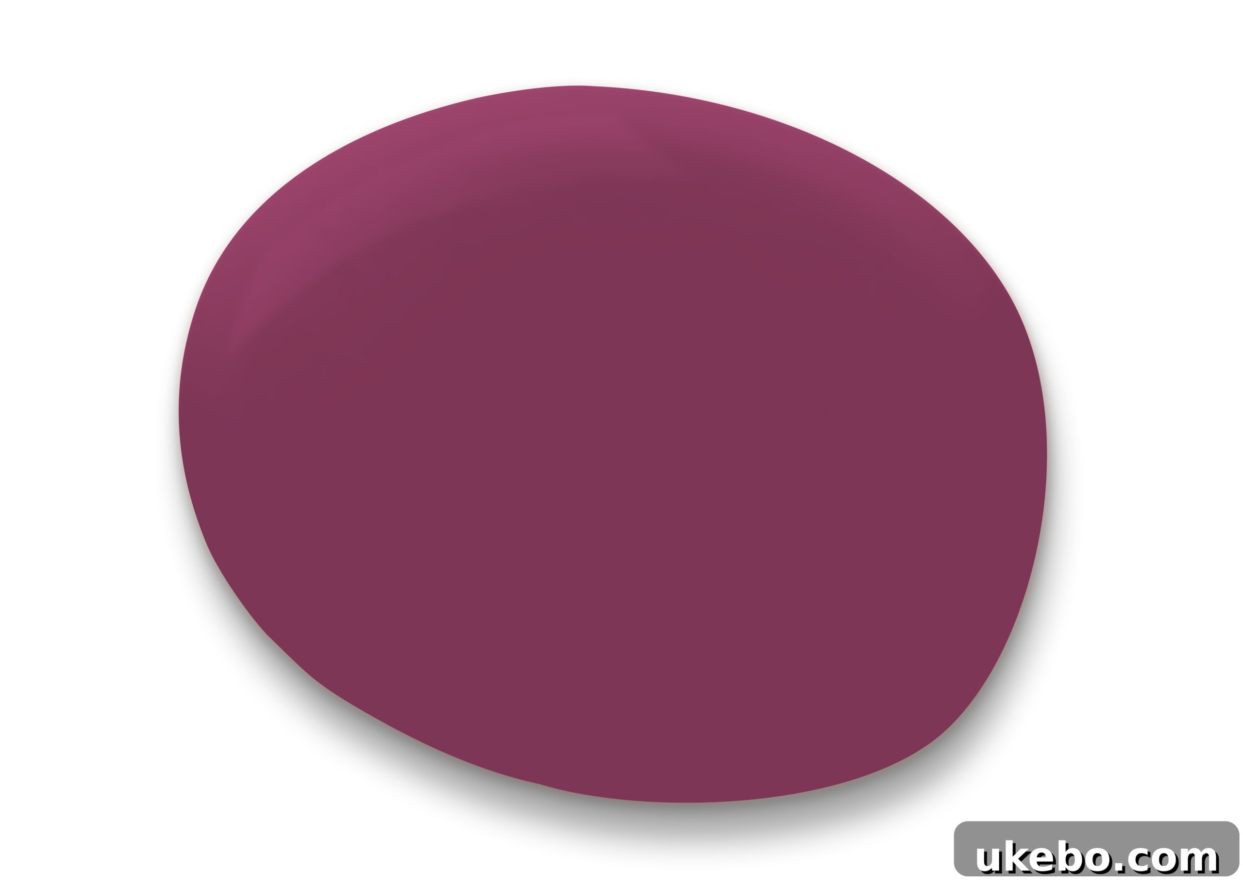
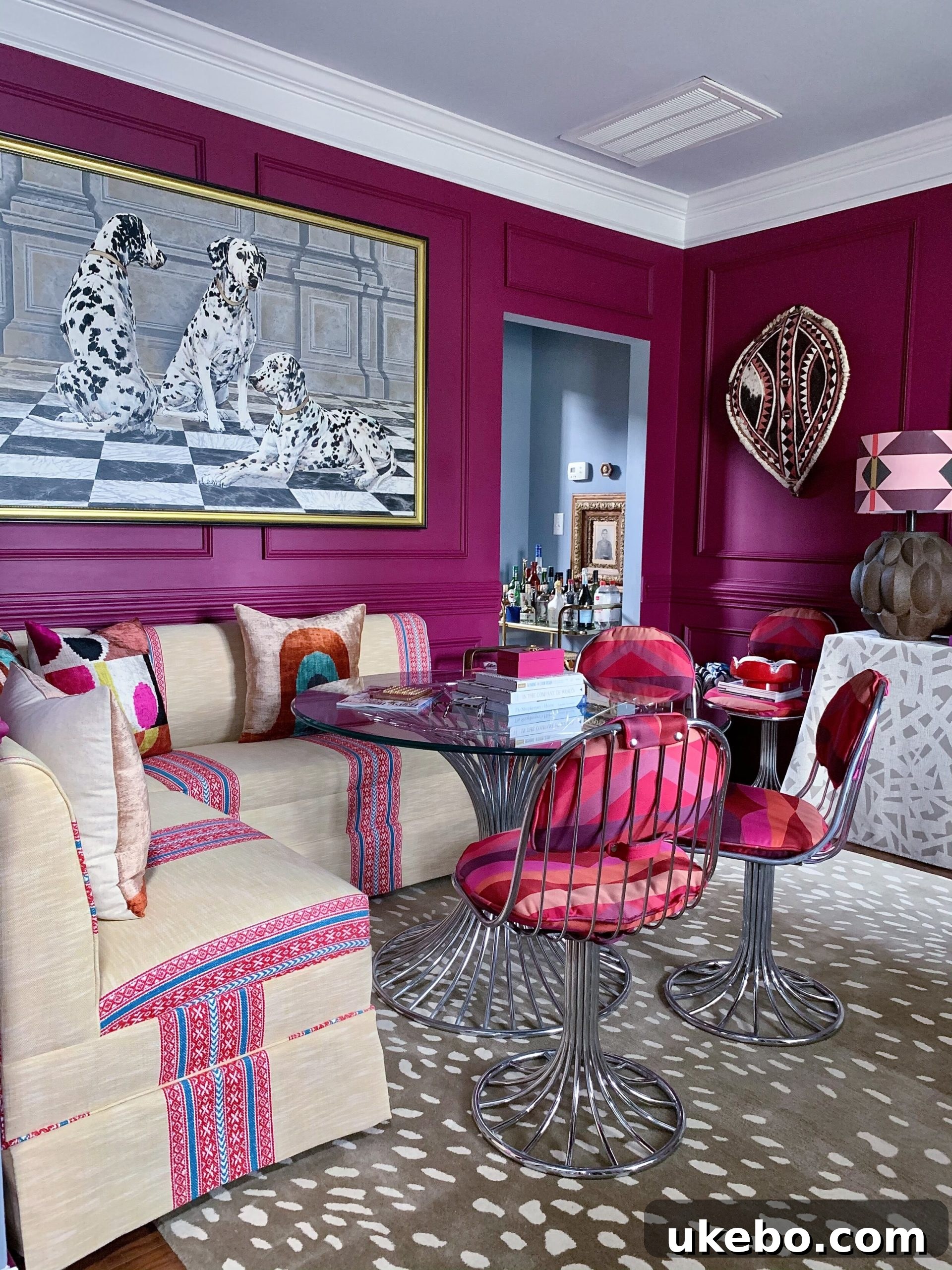
When the conversation turns to jewel tones, a luscious magenta invariably springs to mind and consistently lands at the very top of my list. And when I say this is a good one, believe me when I tell you: THIS. IS. A. GOOD. ONE. Frambroise SW6566 is the ultimate choice if you’re seeking a color that truly commands attention and delivers an unforgettable visual punch. The first time I encountered this captivating shade, it quite literally stopped me in my tracks, and it has remained a firm favorite ever since. It’s a color that exudes confidence, playfulness, and a sophisticated edge, making it perfect for those ready to make a bold statement in their home decor.
I recently had the pleasure of seeing Frambroise used by my talented friend, Ariene, in her vibrant office space, and oh my gracious! It is absolutely dreamy and incredibly inspiring. This rich magenta creates the perfect backdrop for a creative workspace, stimulating imagination and fostering a dynamic environment. Imagine a Frambroise accent wall in a living room, bringing an unexpected jolt of energy, or perhaps as a bold statement on a piece of furniture, instantly elevating its character. This color is not just paint; it’s an invitation to inject passion and personality into your surroundings, offering a blend of warmth and vibrancy that is truly unparalleled.

3. Oceanside SW6496: A Dive into Deep Teal Serenity
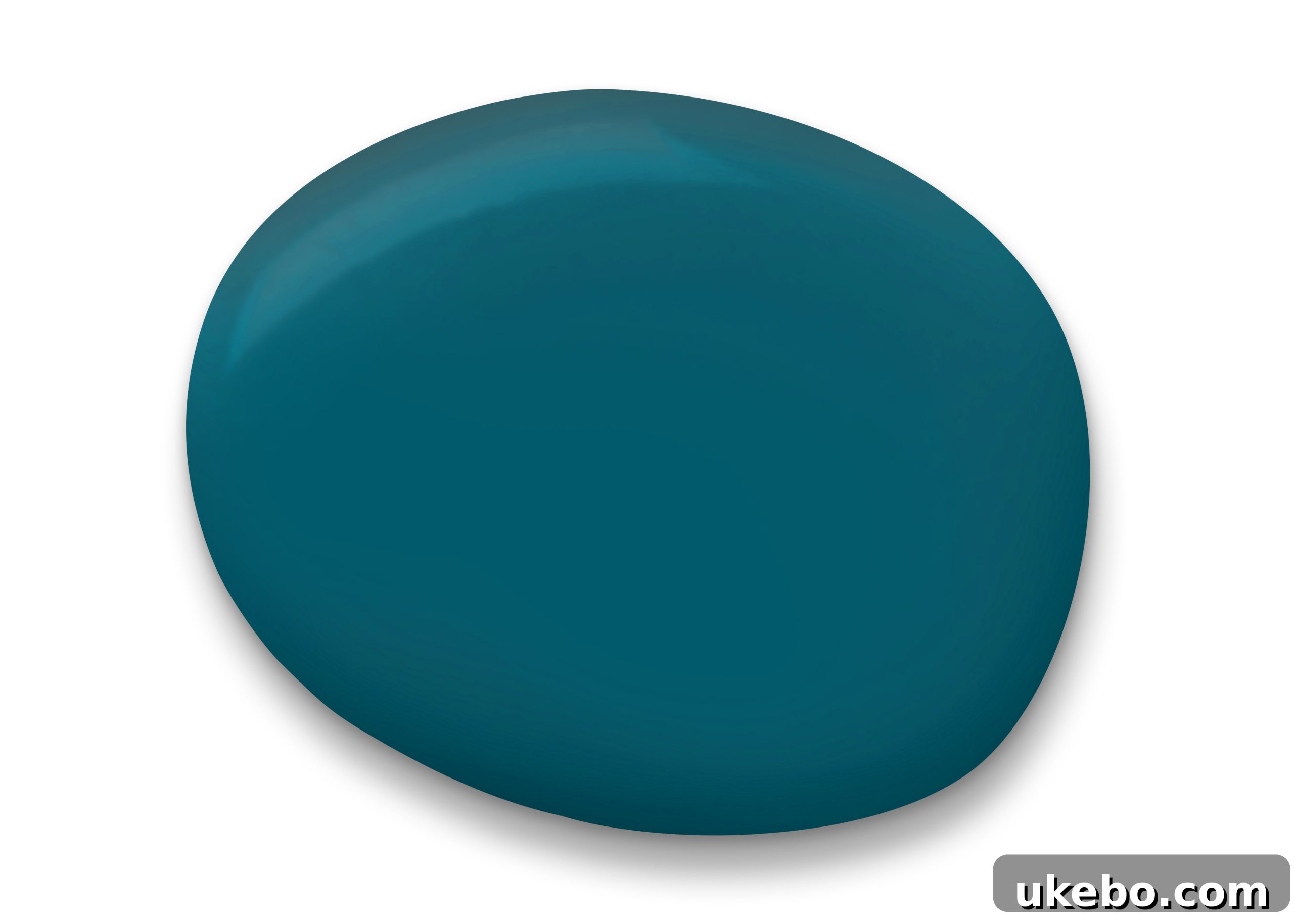
Oceanside SW6496 was famously chosen as the Sherwin-Williams Color of the Year in 2018, and for excellent reason. Even years later, I find myself completely captivated by its profound depth and versatility. This majestic peacock/teal jewel of a color immediately transports me to exotic, sun-drenched locales. I envision the crystalline Caribbean waters, feel the refreshing touch of salty breezes, bask in warm sunshine, and picture endless stretches of soft sand – all the elements of relaxation and escape we’ve collectively craved after spending so much time confined to our homes. Beyond a beach getaway, Oceanside also evokes the vibrant tapestries and intricate artistry of Morocco or India, making it a truly global hue.
Oceanside inherently invites the dynamic energy and invigorating vibrancy of a cherished vacation into your home. It’s a color that stimulates the senses and promotes a sense of tranquility, all at once. So, even if your immediate plans don’t include a luxurious beach retreat or a bohemian excursion, you can effortlessly infuse the essence of those dreamy vibes into your living space with this truly gorgeous color. Consider it for a feature wall in a bedroom to create a serene sanctuary, or perhaps in a bathroom to mimic a spa-like oasis. It pairs beautifully with natural wood tones, crisp whites, and even hints of gold or brass, enhancing its inherent richness. Oceanside is more than just a paint color; it’s a portal to a more relaxed and inspiring state of mind.
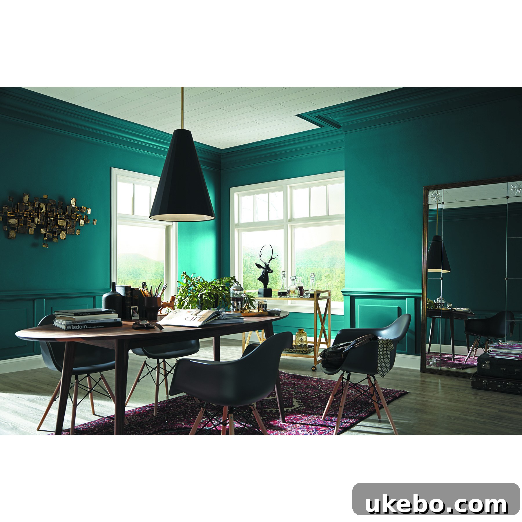
via: Sherwin-Williams
4. Yarrow SW6669: The Golden Hour in a Can
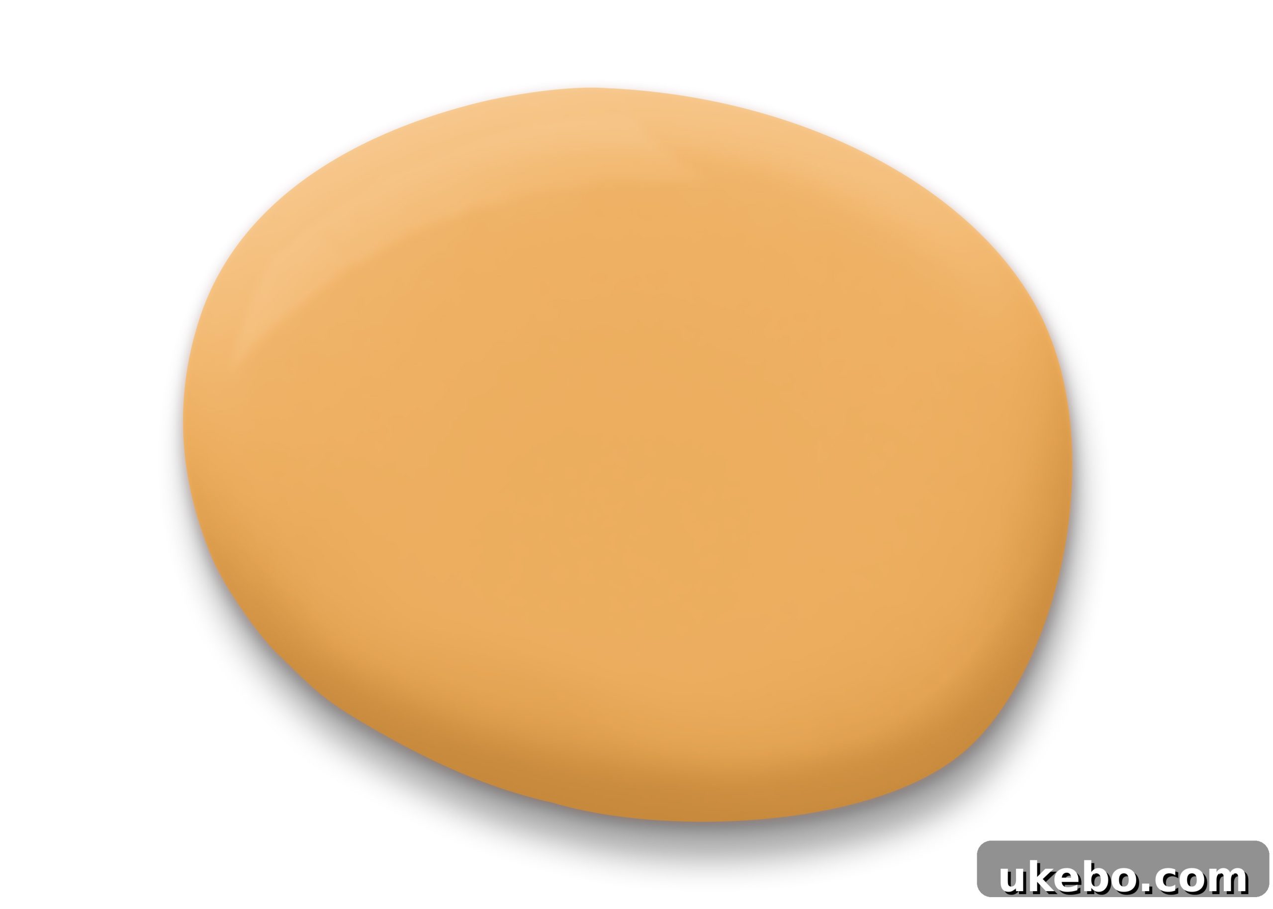
Raise your hand if you’re currently experiencing a serious love affair with marigold! You are definitely in excellent company, because your girl is absolutely head over heels. I simply cannot get enough of all the rich, jewel-inspired shades of yellow that are trending. Yarrow SW6669 is a prime example of this captivating trend. It’s a color that instantly brings a smile to my face, and I find myself gravitating towards it at every opportunity, from my carefully curated wardrobe selections to the thoughtful details in my home decor. This radiant hue evokes images of breathtaking golden hour sunsets, the comforting warmth of the sun on my face, endless fields of vibrant sunflowers, and the aromatic richness of flavorful spices.
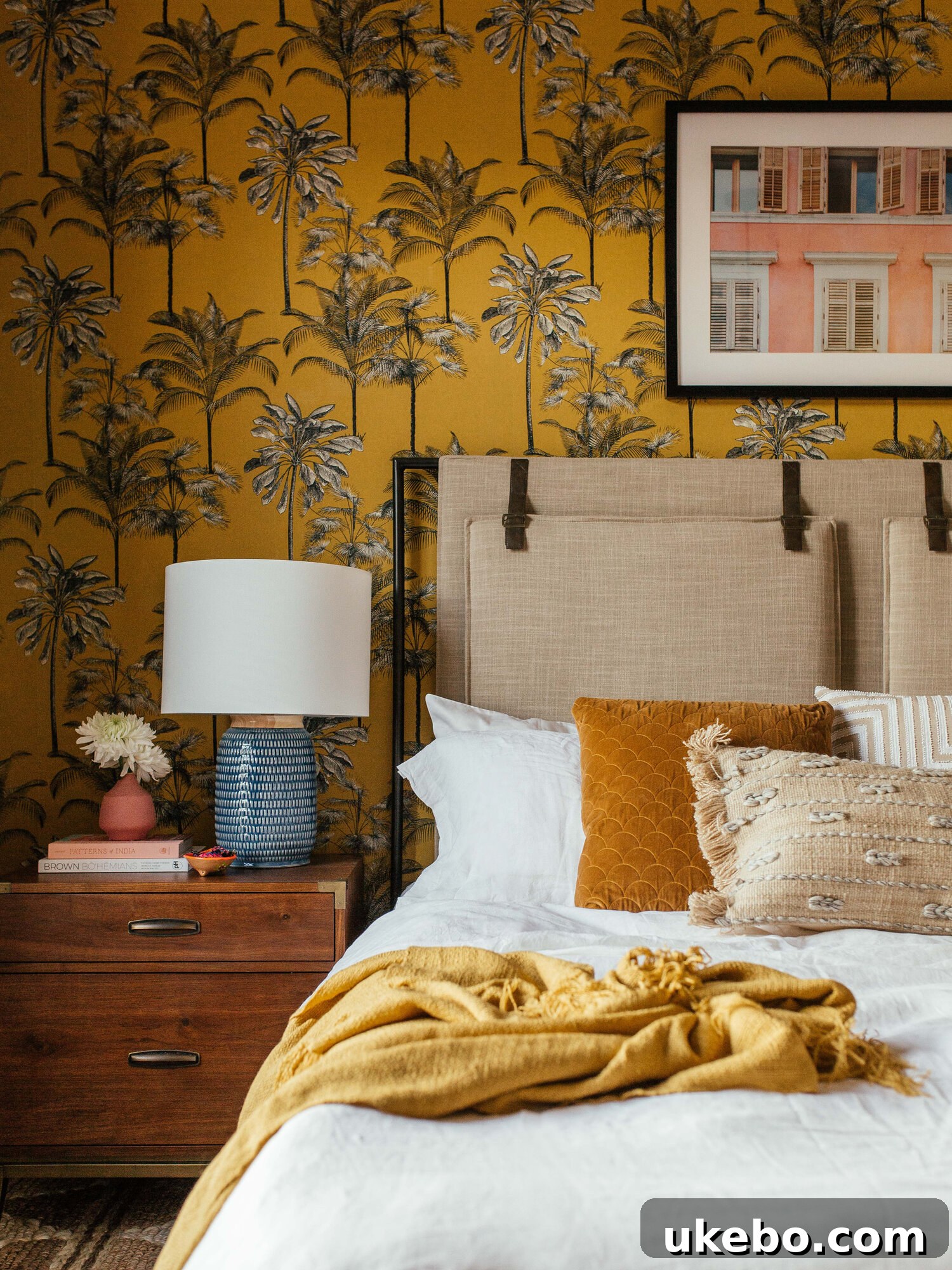
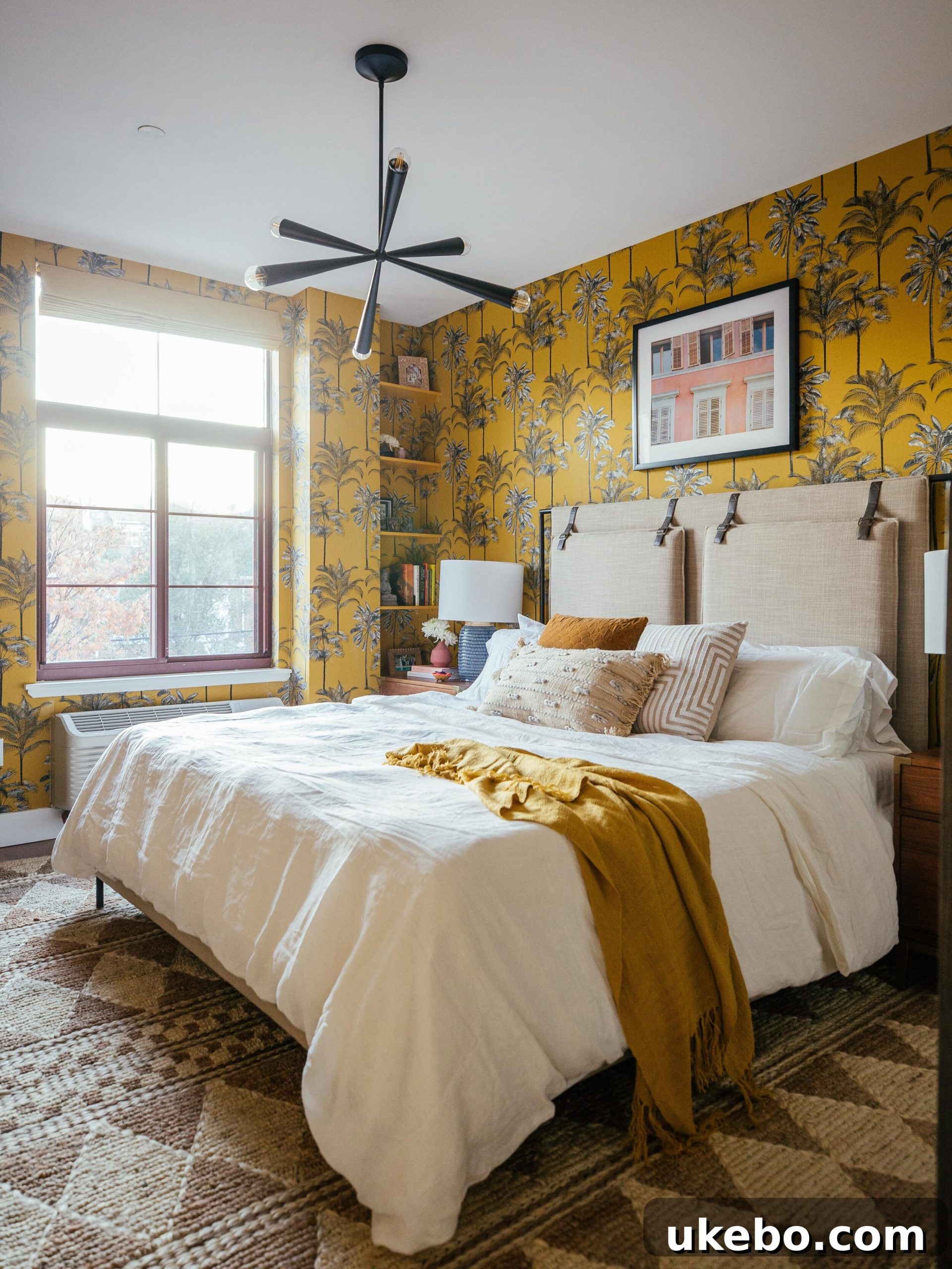
Yarrow is remarkably easy to incorporate into any space, even as just an accent through carefully chosen art pieces or statement furniture, making a significant impact without overwhelming. Its inherent warmth and cheerfulness pair exceptionally well with a wide spectrum of other colors, from deep blues and greens to soft grays and crisp whites. I am actually planning to use this luminous color in our own home in a major way this year, and I simply cannot wait to unveil it! My incredibly talented friend and design genius, Dabito, utilized a stunning golden yellow wallpaper in a recent bedroom makeover, and the results are SO INCREDIBLE. It’s a testament to the power of a vibrant yellow to transform a room into a truly inviting and joyous sanctuary. I’ll undoubtedly be referring back to his inspired work again and again as I bring Yarrow into my own space.
5. Urbane Bronze SW7048: The Understated Gem of Neutrals
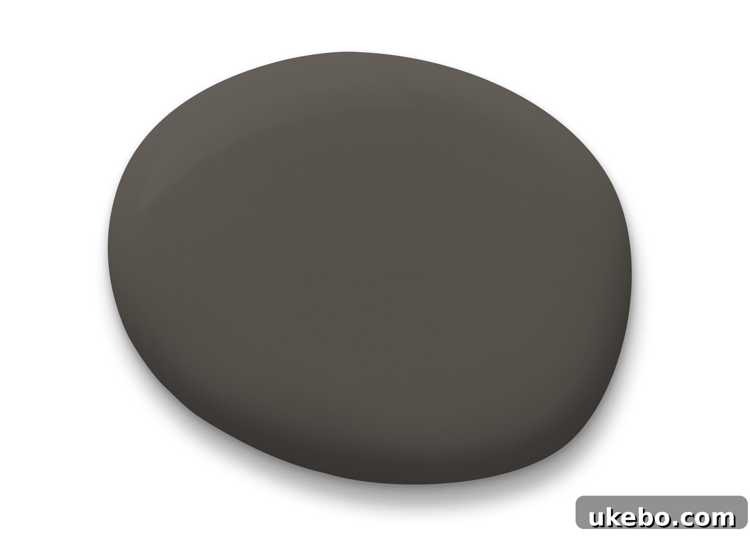
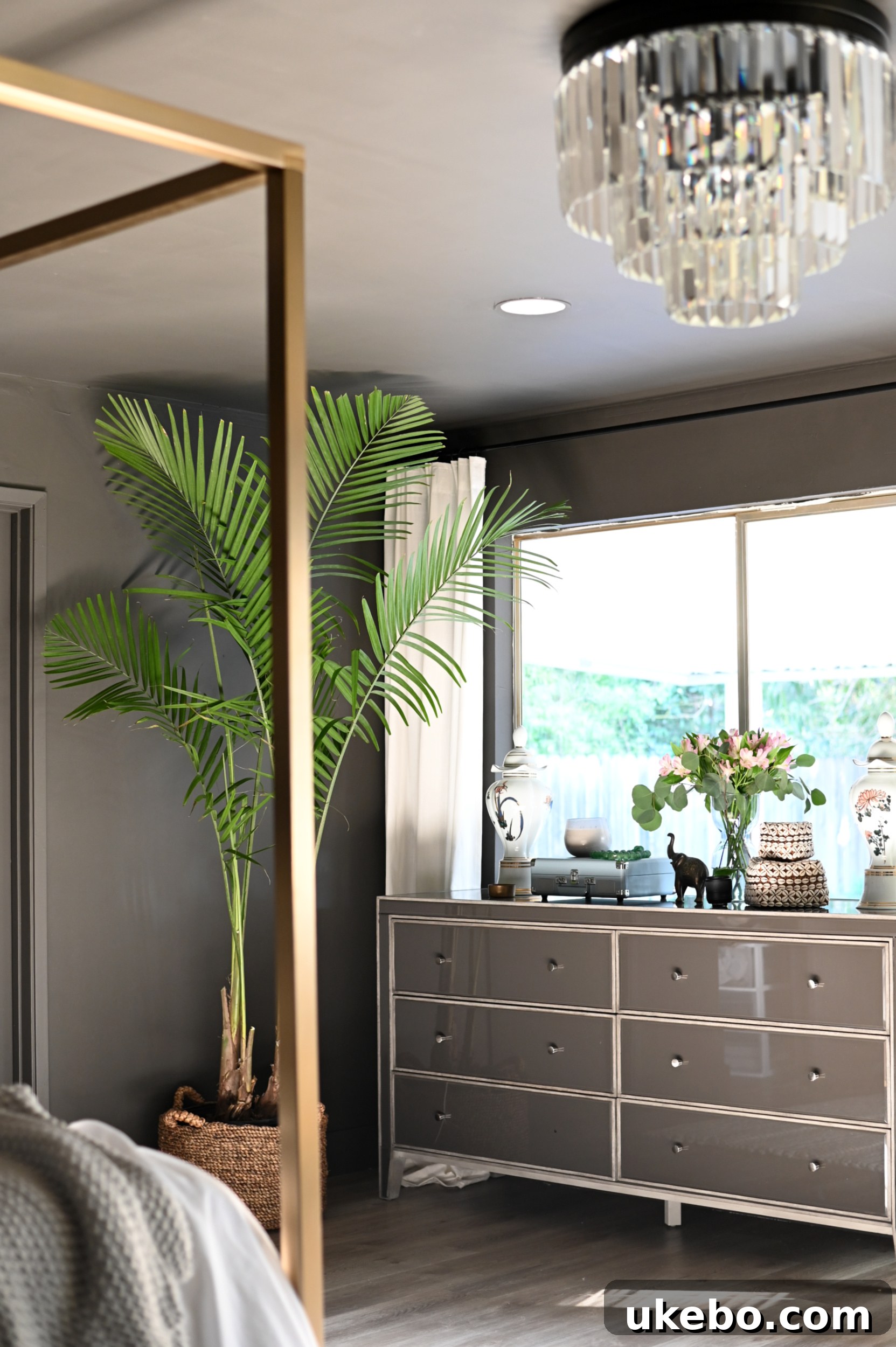
Now, I know some of you might be thinking, “Urbane Bronze with jewel tones?! Hmmm…” And yes, I absolutely had to include it! I’m firmly placing Urbane Bronze SW7048 within the realm of jewel tones because of its rich, inky quality, reminiscent of raw graphite or a deeply burnished metallic gem. Just like a precious mineral, this sophisticated color possesses an incredible transformative quality, appearing subtly different and wonderfully complex in various lighting conditions and contexts. It’s the ultimate kind of neutral, offering profound depth and warmth without being overtly colorful. This chameleon-like adaptability allows it to effortlessly complement and enhance nearly every other color in the spectrum, making it an incredibly versatile choice for any home.
Furthermore, Urbane Bronze holds the esteemed title of Sherwin-Williams’ 2021 Color of the Year, and my investment in its timeless appeal remains as deep and unwavering as ever. It provides a grounding, foundational presence that allows bolder jewel tones to truly sing. So many of you have already embraced this elegant hue in your homes in recent months, especially after I showcased my sister’s bedroom makeover featuring Urbane Bronze, and seeing your transformations brings such immense joy to my heart. It’s a testament to the power of a deep, sophisticated neutral to create a sanctuary of calm and style, proving that even a subtle choice can be a jewel in its own right.
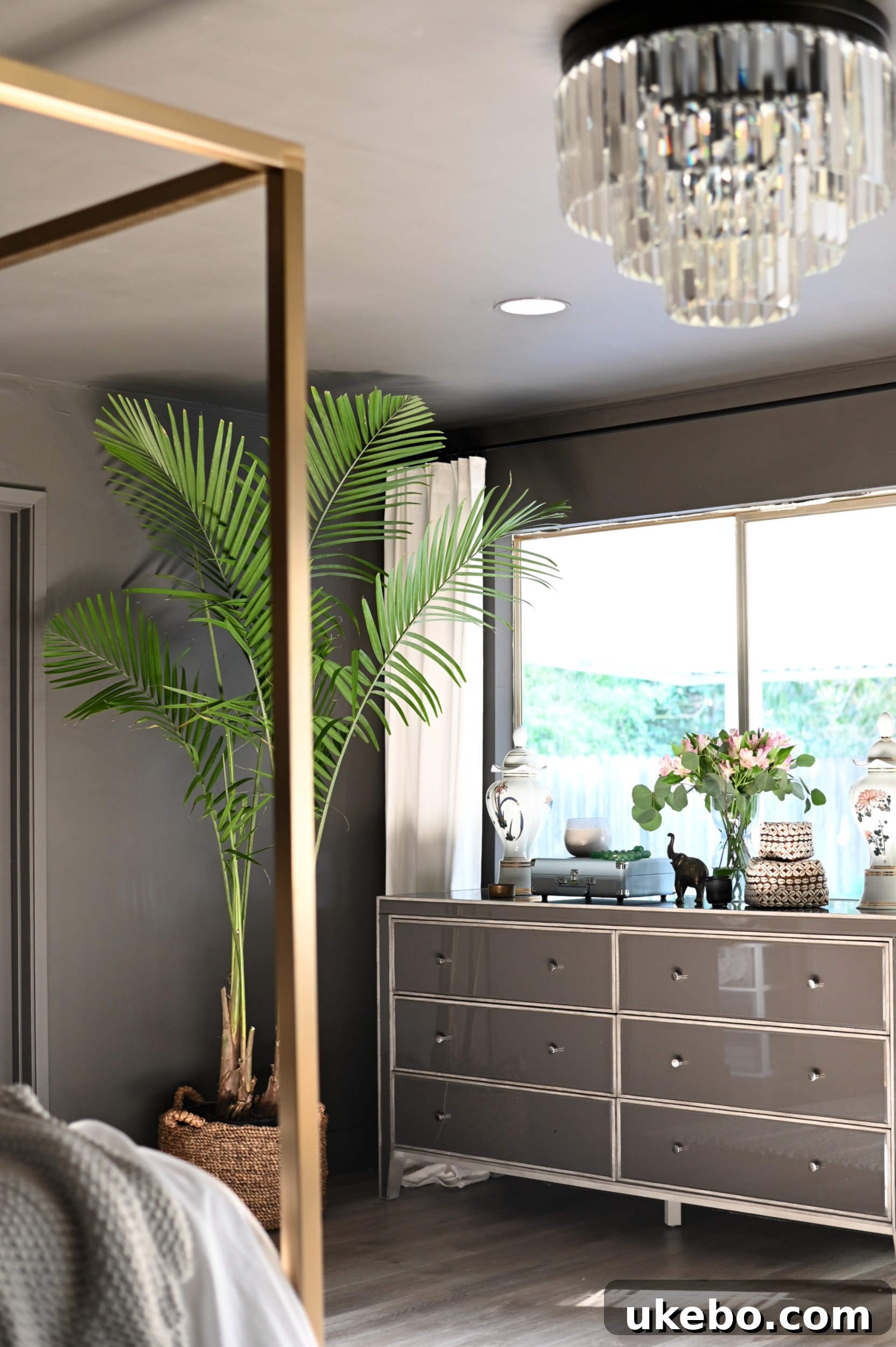
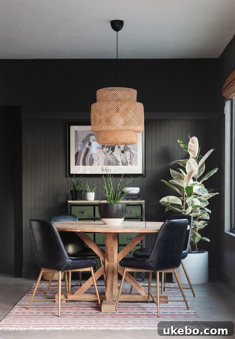
via Vintage Revivals
Tips for Incorporating Bold Jewel Tones into Your Home
Feeling inspired but a little hesitant? Here are a few tips to confidently bring these magnificent jewel tones into your living spaces:
- Start Small: If a whole room feels too daunting, begin with an accent wall, a piece of furniture, or even smaller decorative elements like throw pillows, artwork, or ceramics.
- Test, Test, Test: Lighting dramatically affects how a color appears. Always order paint chips or peel-and-stick samples (available for select Sherwin-Williams colors) to see how the color interacts with your home’s natural and artificial light throughout the day.
- Balance is Key: Jewel tones truly shine when balanced with complementary neutrals. Think warm whites, soft grays, rich browns, or even Urbane Bronze, to provide a sophisticated backdrop and allow your chosen jewel tone to pop.
- Consider the Mood: Each color evokes a different emotion. Emerald greens bring tranquility, magentas spark creativity, teals offer serenity, and golden yellows inspire joy. Choose the color that aligns with the feeling you want to create in that specific room.
- Layer Textures: Enhance the luxurious feel of jewel tones by layering different textures – velvet, silk, linen, wood, and metallics. This adds depth and sophistication to your design.
Alright friends! There you have it – my top five Sherwin-Williams jewel tone picks, meticulously chosen for their ability to infuse your spaces with juicy, vibrant, and utterly crave-able color this year. What are your initial thoughts? Are any of these stunning hues calling your name for a place in your home? I’m always eager to hear your design visions and experiences!
For those ready to take a closer look and experience these colors firsthand, remember that paint chips can be conveniently ordered online for free delivery at swsamples.com. Additionally, Sherwin-Williams offers mess-free, peel-and-stick samples in select colors. These are removable and repositionable, making it incredibly easy to move them from room to room, or wall to wall, to find the perfect spot. No mess, no dry time – just peel and stick and instantly envision the transformation!
I simply cannot wait to show all of you how Yarrow SW6669 makes its grand appearance in our home. Stay tuned for that exciting reveal, and until next time, happy decorating!