
This post is in partnership with Sherwin-Williams.
Hello design enthusiasts and friends!
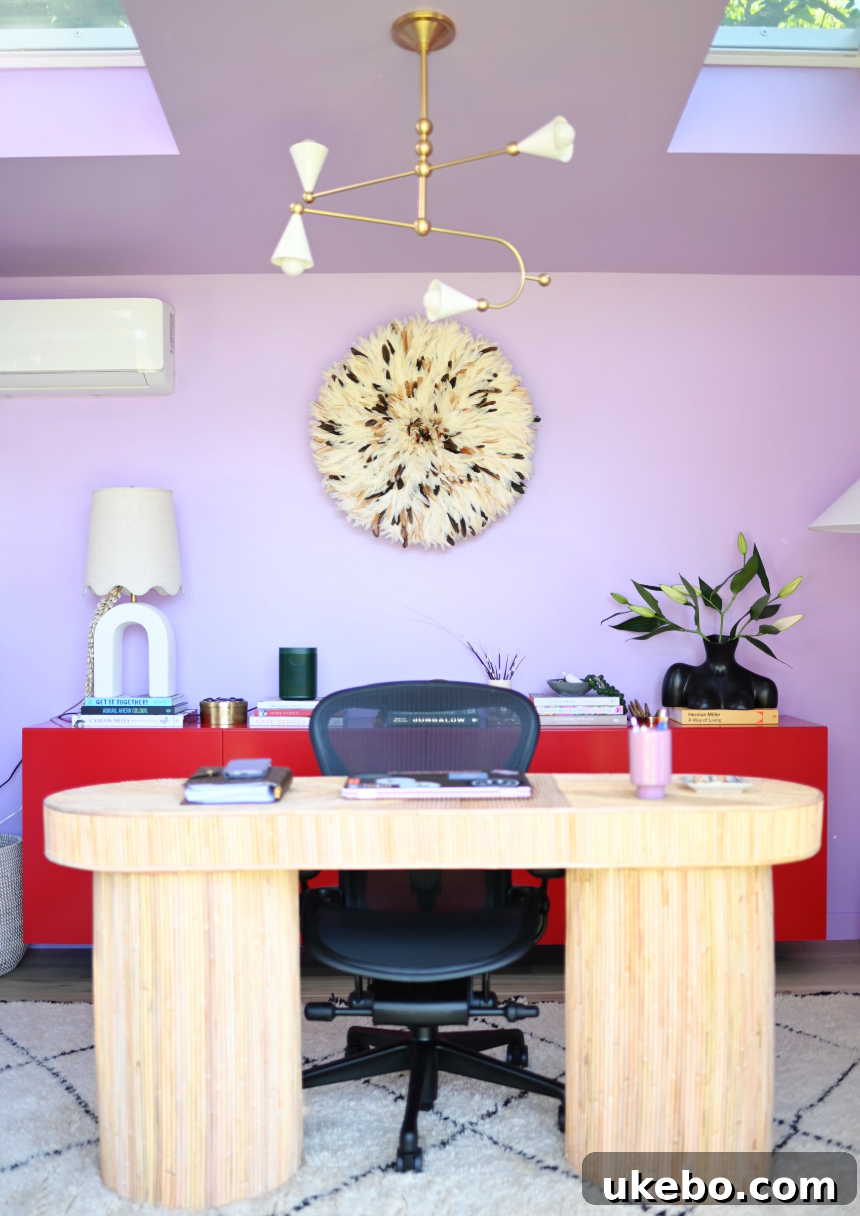
It’s finally here! I can hardly believe I’m typing this, but I officially have an office studio! The journey to this incredible space has been a whirlwind, filled with planning, dreaming, and a dash of delightful chaos. While I promise to share all the behind-the-scenes details of its creation in an upcoming post – trust me, there’s a story to tell – today, we’re diving straight into the most exciting part: the finished interior! For now, it’s complete, and I am beyond thrilled to pull back the curtain and invite you inside my new creative sanctuary.
So, without further ado, let’s take a grand tour of the office studio, shall we?
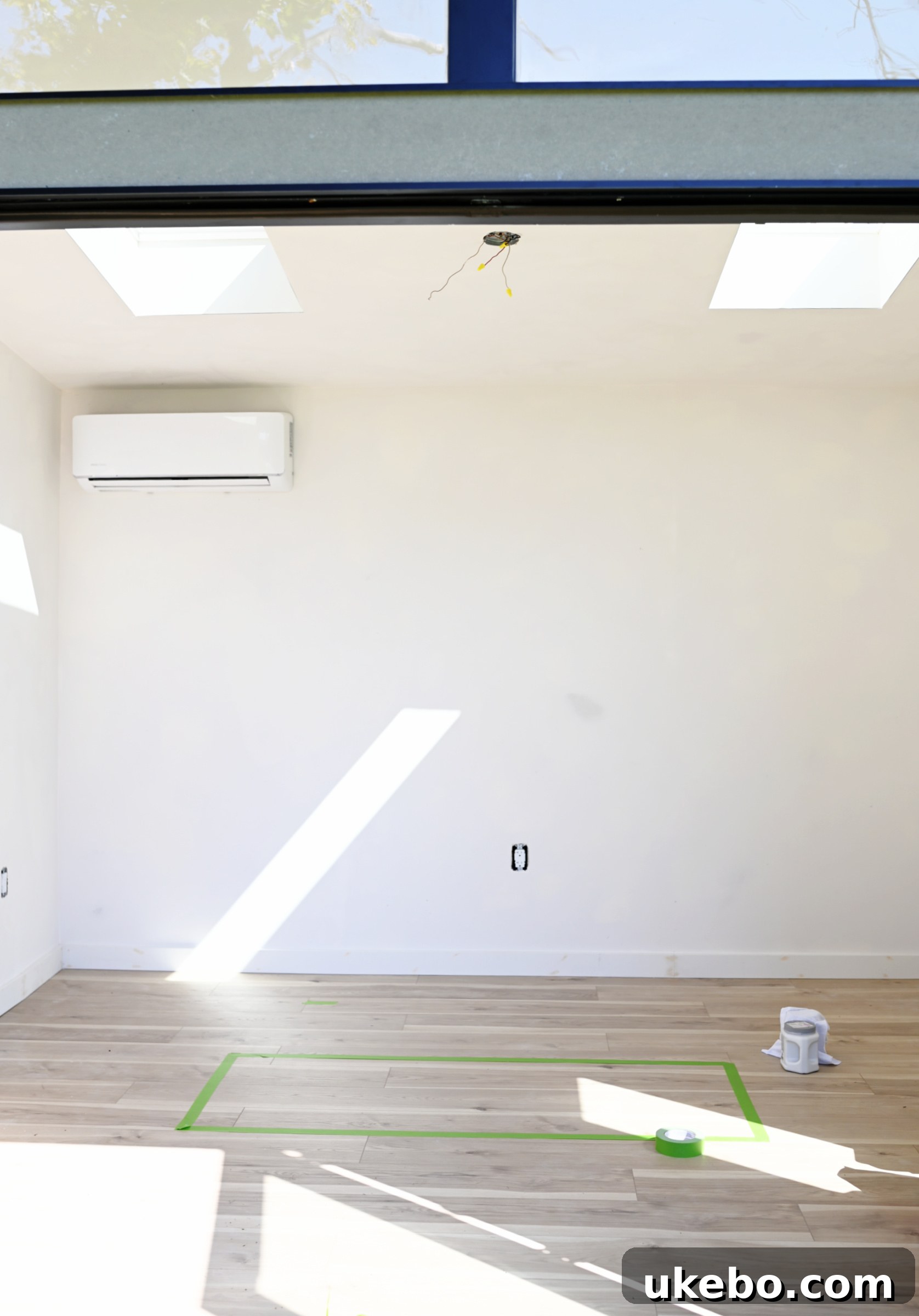
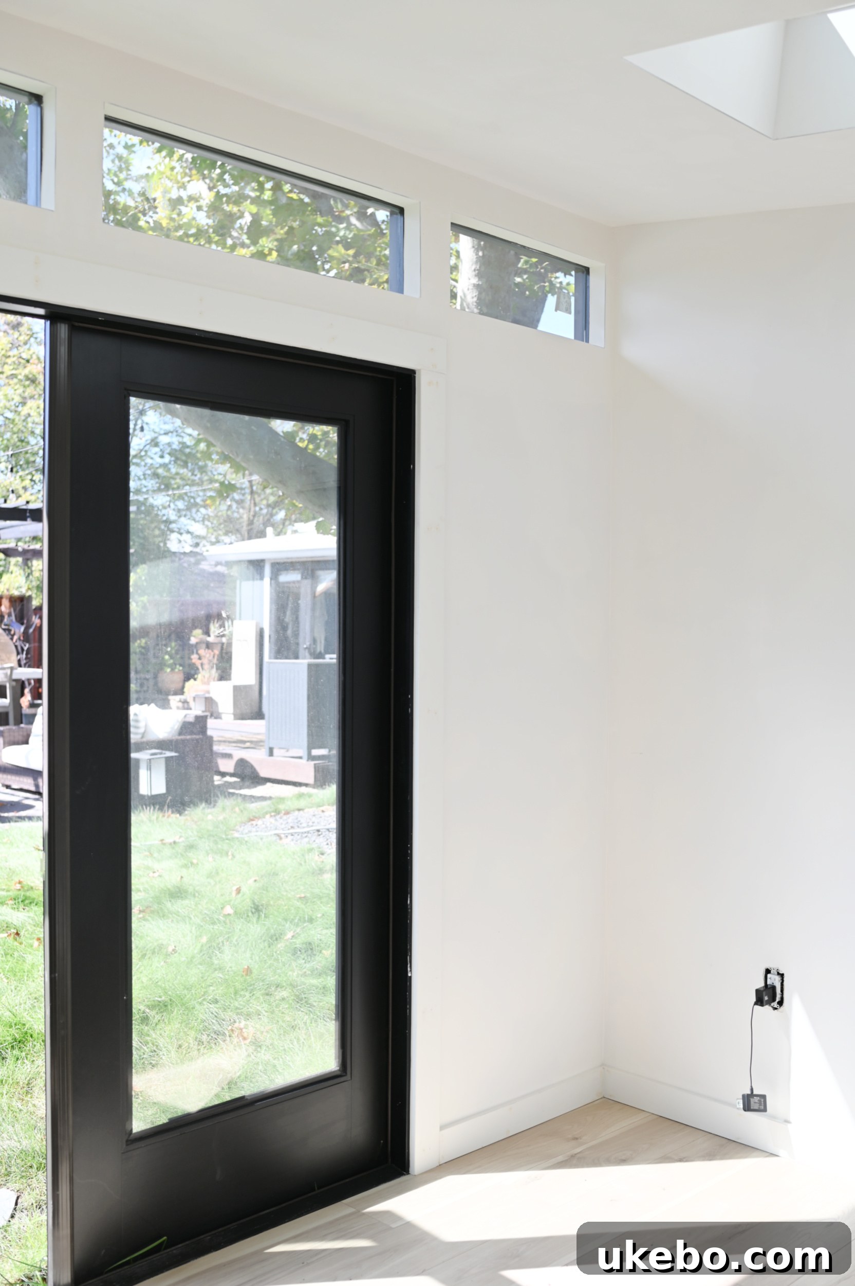

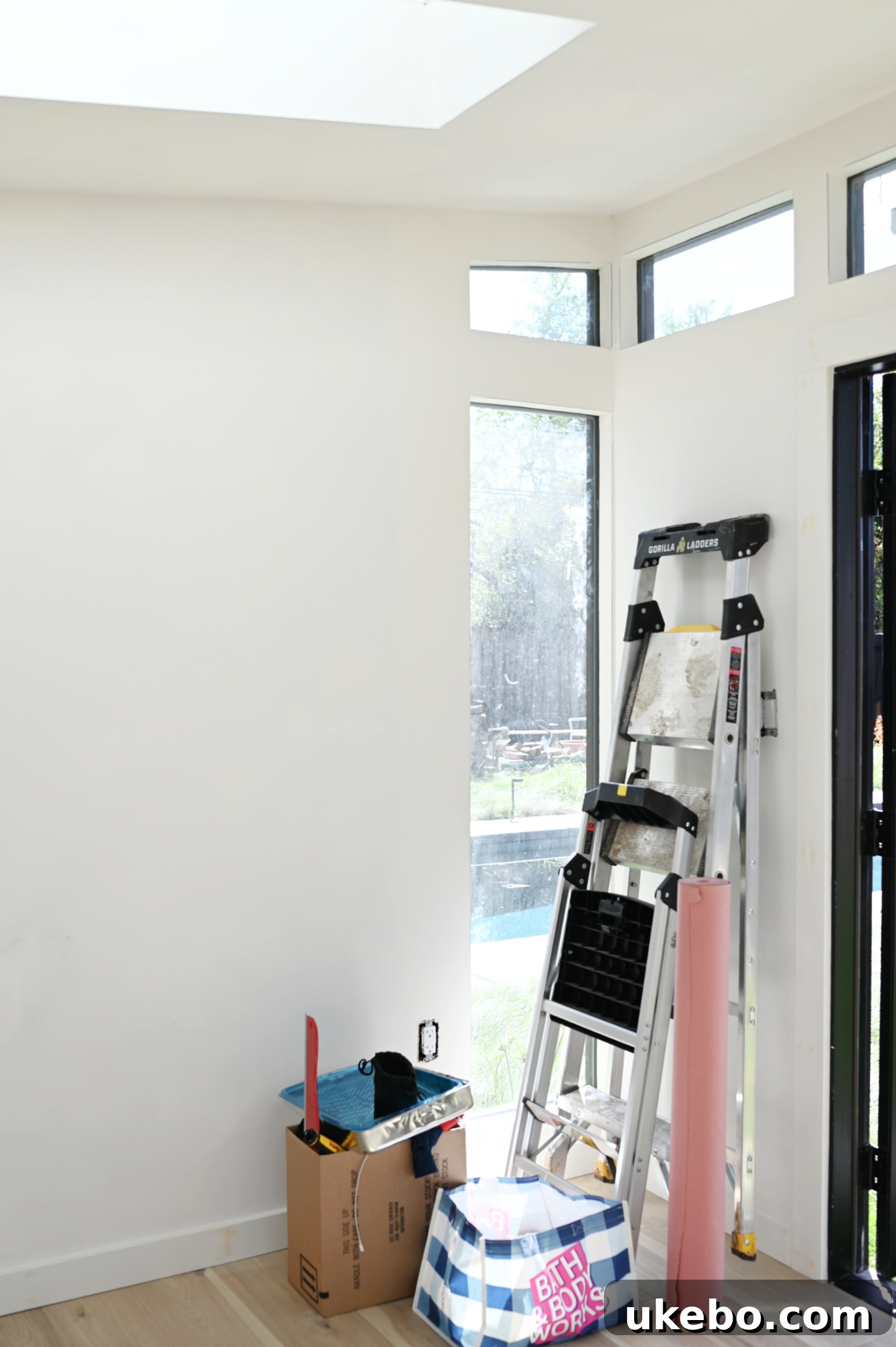
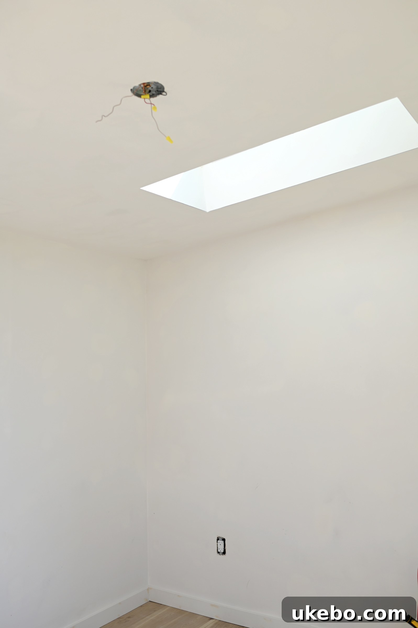

I absolutely adore this space! Measuring a cozy 10 x 12 feet, it’s perfectly proportioned for focused work and creative exploration. What truly sets it apart, however, is the abundance of natural light that streams in throughout the day, transforming the mood from morning to evening. And honestly, the short commute from the main house? Pure bliss! It feels like a genuine escape without ever having to leave home, providing that crucial separation between personal and professional life.
Unleashing Creativity: The Purple and Red Vision
Even before the first nail was hammered or a single wall framed, I had a crystal-clear vision for the studio’s interior: a bold and captivating blend of purple and red. This isn’t just a fleeting fancy; I’ve been a long-time admirer of this dynamic color combination, observing its powerful presence in both high fashion and sophisticated interior design. For years, my Pinterest boards have been filled with inspiration, making the decision to anchor my own creative space with these hues an absolute no-brainer. This year, keep your eyes peeled for more daring and unconventional color pairings in design; I predict they’ll be a major trendsetter. But I digress – let’s talk about the magic of color!
My love affair with color runs deep; I’ve never shied away from incorporating vibrant shades into my designs. However, it was my color theory class in design school that truly solidified my confidence and deepened my understanding. This foundational knowledge didn’t just teach me *how* to use color effectively, but more importantly, *why* I’m inherently drawn to certain palettes while others simply don’t resonate. Grasping the distinctions between analogous, complementary, and split-complementary colors was like unlocking a secret language of design. For those outside the design world, this understanding can be a powerful tool, helping to overcome the common fear of using bold colors in their own homes and spaces.
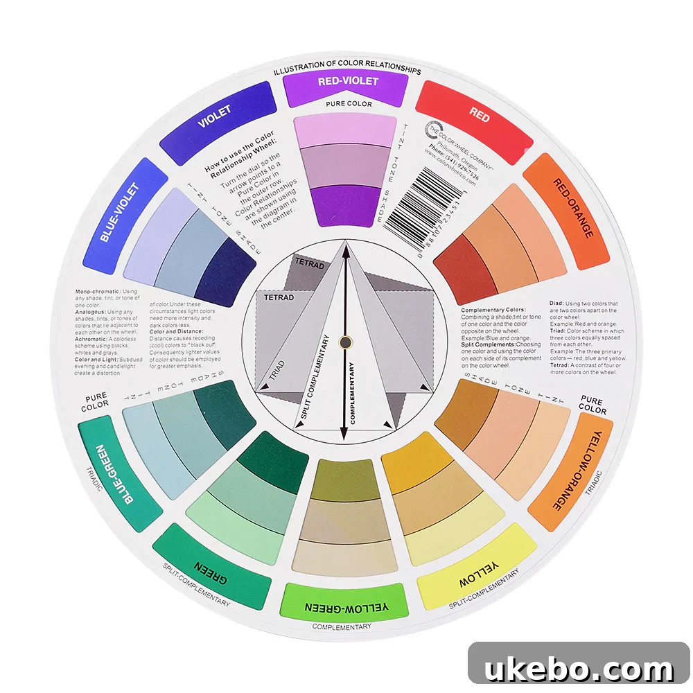
The Color Wheel: Your Ultimate Design Companion
Indeed, the color wheel is an invaluable ally in any design project! It’s an incredibly straightforward yet powerful tool for deciphering color relationships. It doesn’t just show you *which* colors harmonize beautifully, but also reveals the underlying *principles* of why they work so well together. In the case of my studio, purple and red sit right next to each other on the color wheel, making them analogous colors. Analogous color schemes are celebrated for their inherent harmony and typically create a smooth, visually pleasing transition from one shade to the next. Unlike high-contrast complementary colors (which are opposite each other on the wheel), analogous palettes offer a gentler, more soothing visual flow, making them an excellent choice for anyone looking to introduce more color into their interiors without overwhelming the space. They are perfect for dipping your toes into the vibrant waters of color without a dramatic splash.
A Bold Departure: From Moody to Vibrant
Now, many of you know me as the “queen of the moody interior.” Deep, sultry, and dramatic hues are often my first instinct when approaching a new space, and I absolutely adore the rich ambiance they create. BUT, for this very personal creative sanctuary, I decided to embark on a slightly unexpected journey. *GASP!* My initial gravitation was towards a deep, moody plum purple, a color I deeply love. However, I felt a strong pull to challenge my own comfort zone and infuse the space with a more energetic and vibrant spirit. Instead of a brooding, saturated purple for the walls, I opted for something in the delicate yet lively lavender/lilac family. And rather than a muted, deep brick red as an accent, I chose a true, unadulterated vibrant red. This conscious shift was all about creating a space that felt invigorating and inspiring for daily creative work.
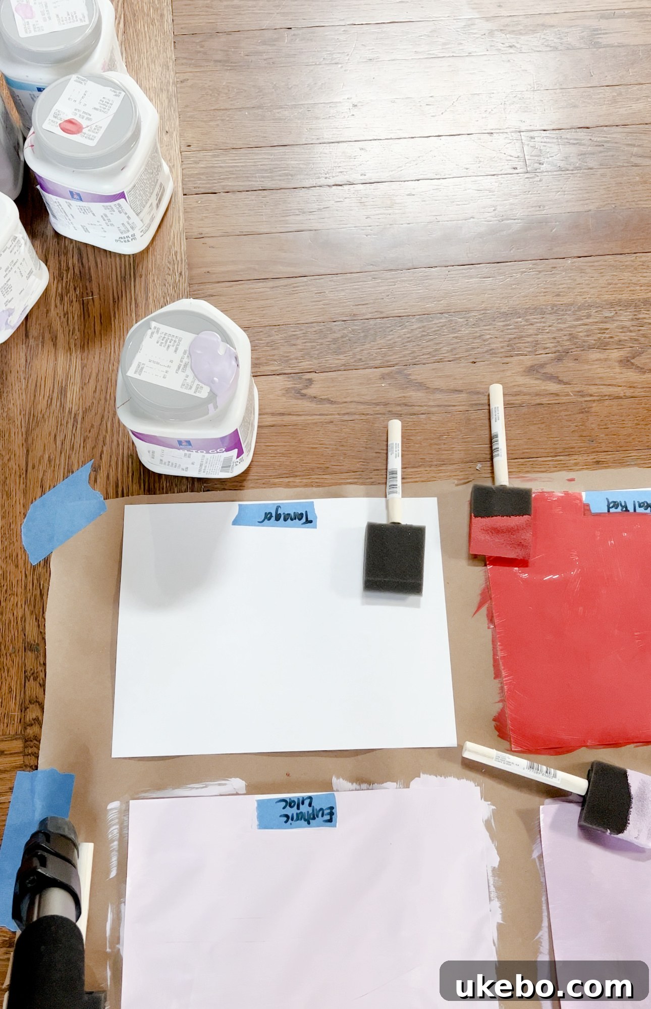
The Sherwin-Williams Color to Go® Experience
Once the general color direction was firmly set, it was time for the crucial step of testing samples. Sherwin-Williams offers an impressive array of options within both the lilac and red color families, providing a fantastic selection to explore. I picked up several of their convenient Color to Go® samples, eager to see how these potential shades would translate in my actual space. These paint samples are an absolute game-changer, offering a true sense of how a color will appear under your specific lighting conditions and within your chosen environment. Each sample comes in a clever Twist-n-Pour container, holding ample paint for creating generous test swatches. This generous quantity allows for comprehensive testing, empowering you to make your final color decision with complete confidence. I meticulously painted numerous sample swatches on large pieces of paper, moving them around the studio at different times of the day to observe how the light influenced each hue. This diligent process was indispensable in solidifying my ultimate color choice.
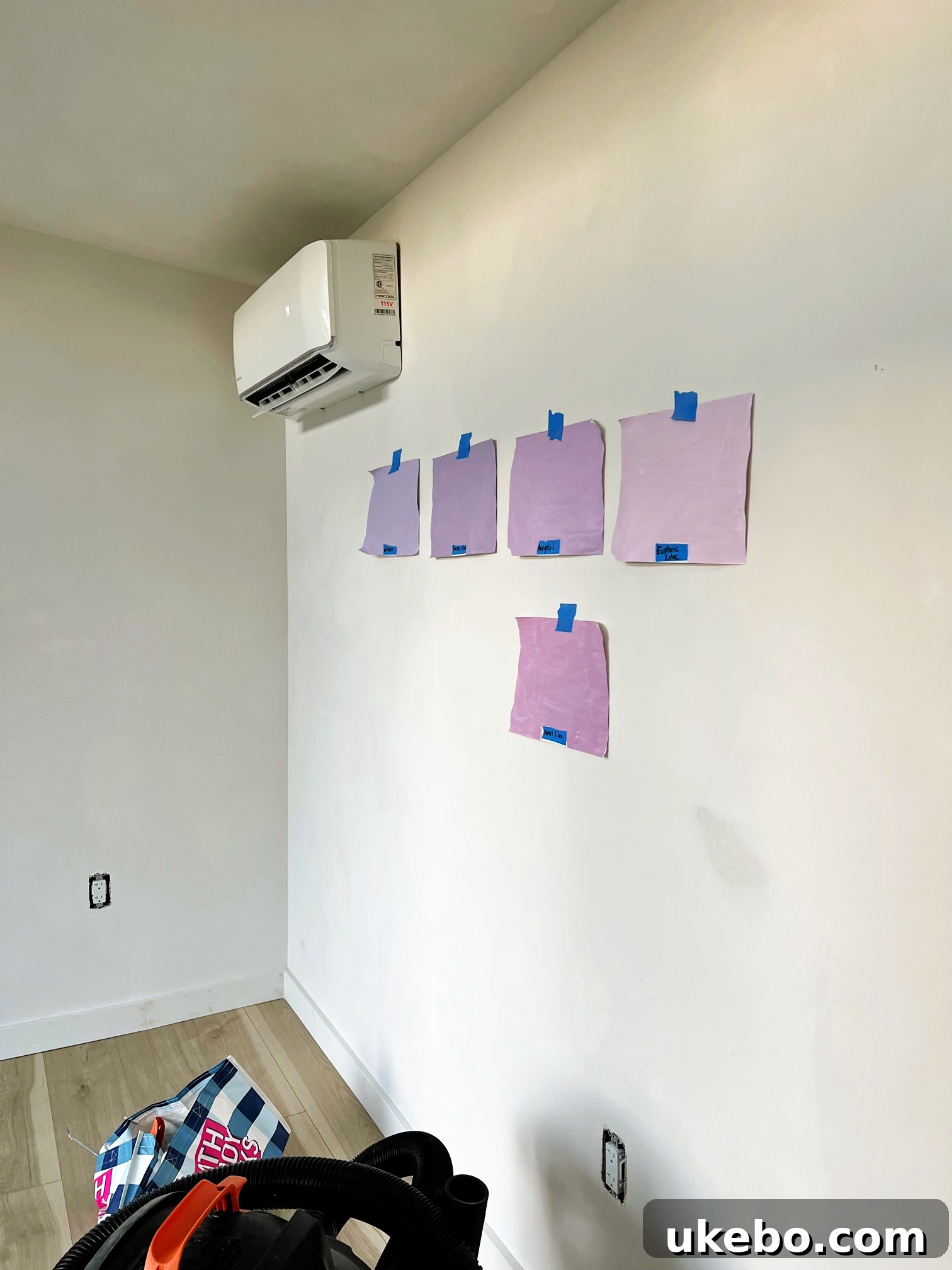
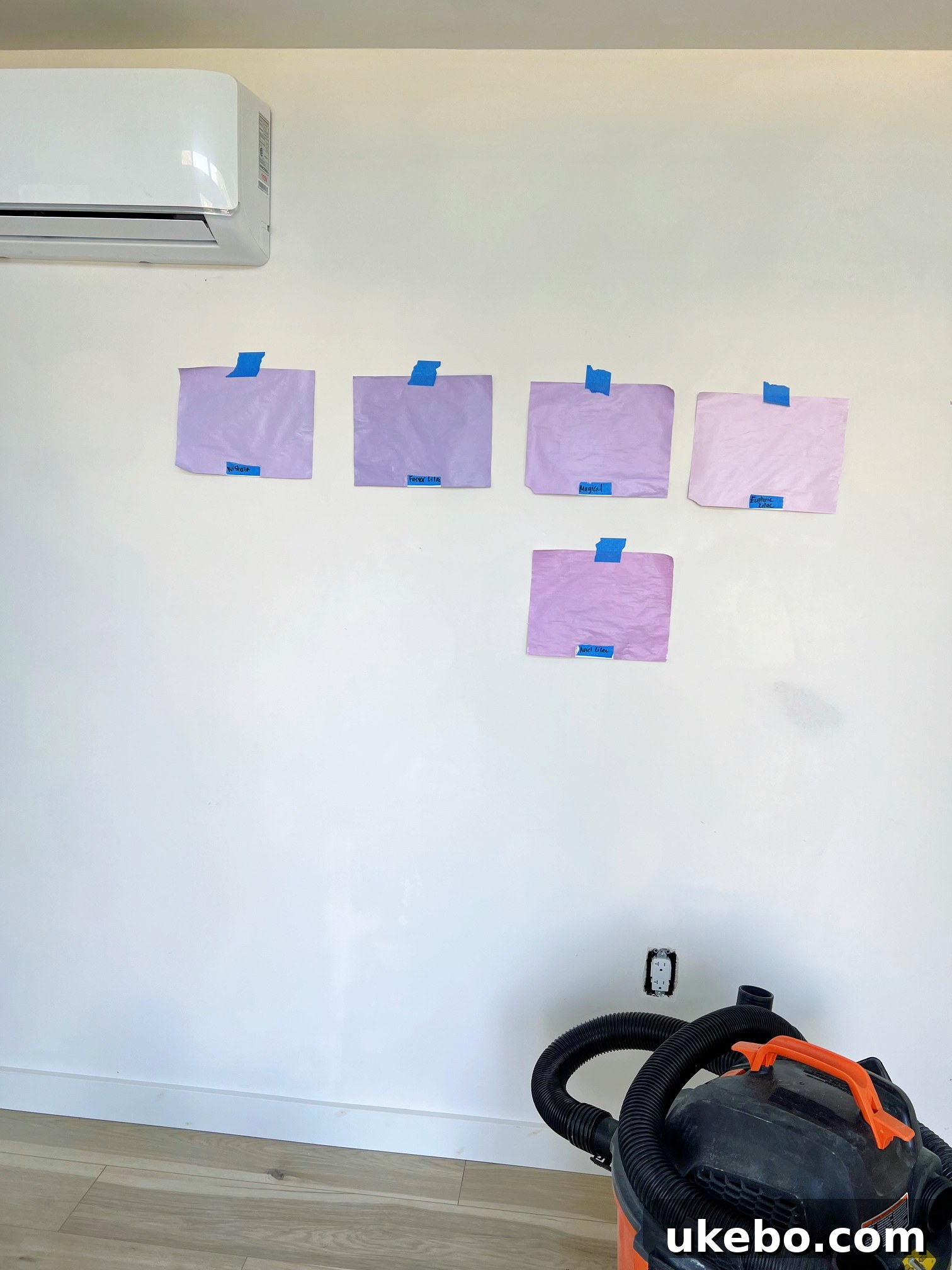
Admittedly, these initial cell phone snaps aren’t the most professional, but they capture a pivotal moment in the decision-making process. After carefully reviewing all the samples, I narrowed down my favorites to a top two: Novel Lilac SW 6836 and Magical SW 6829. The debate was fierce, as both colors had their unique charm.
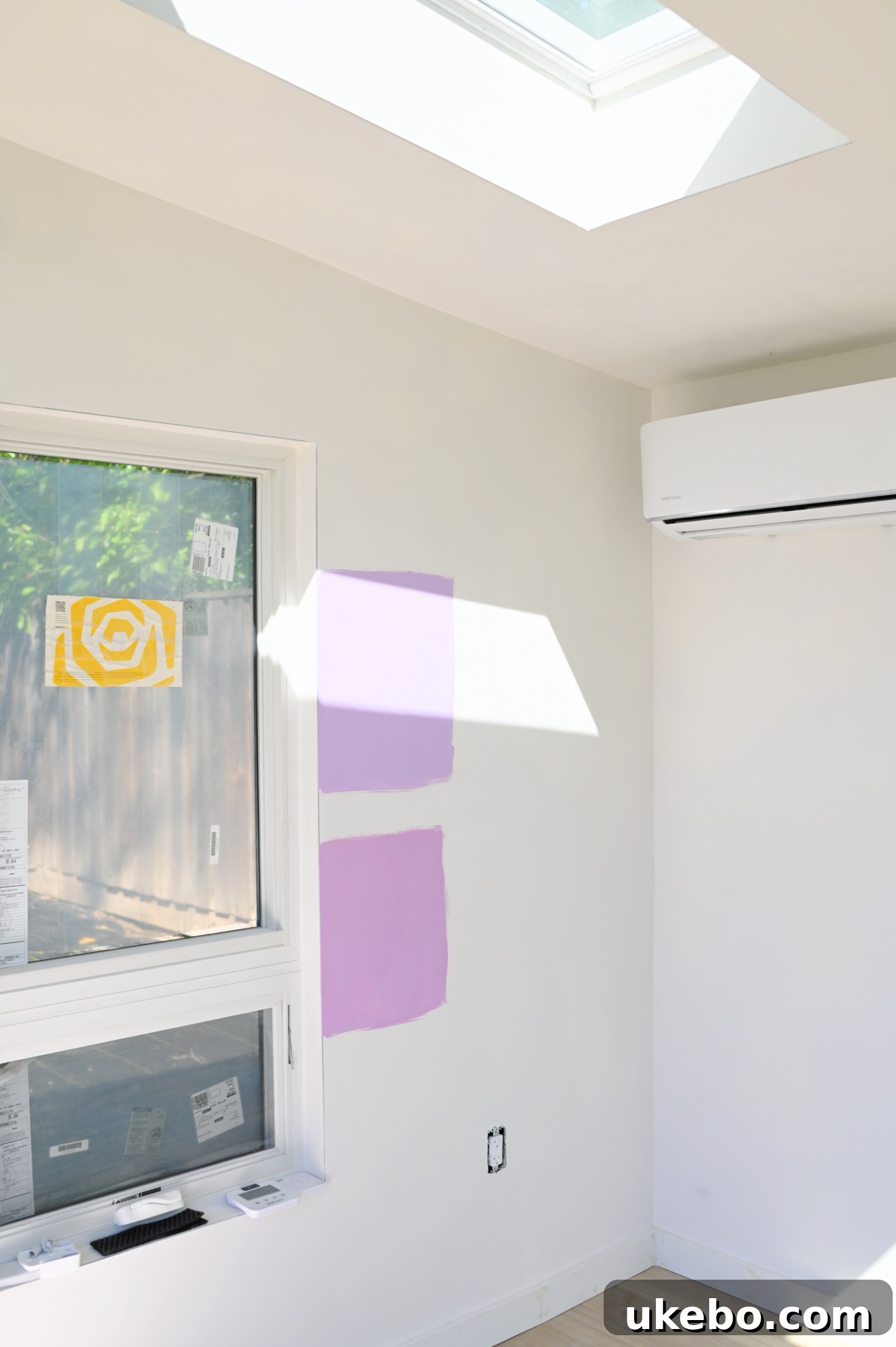
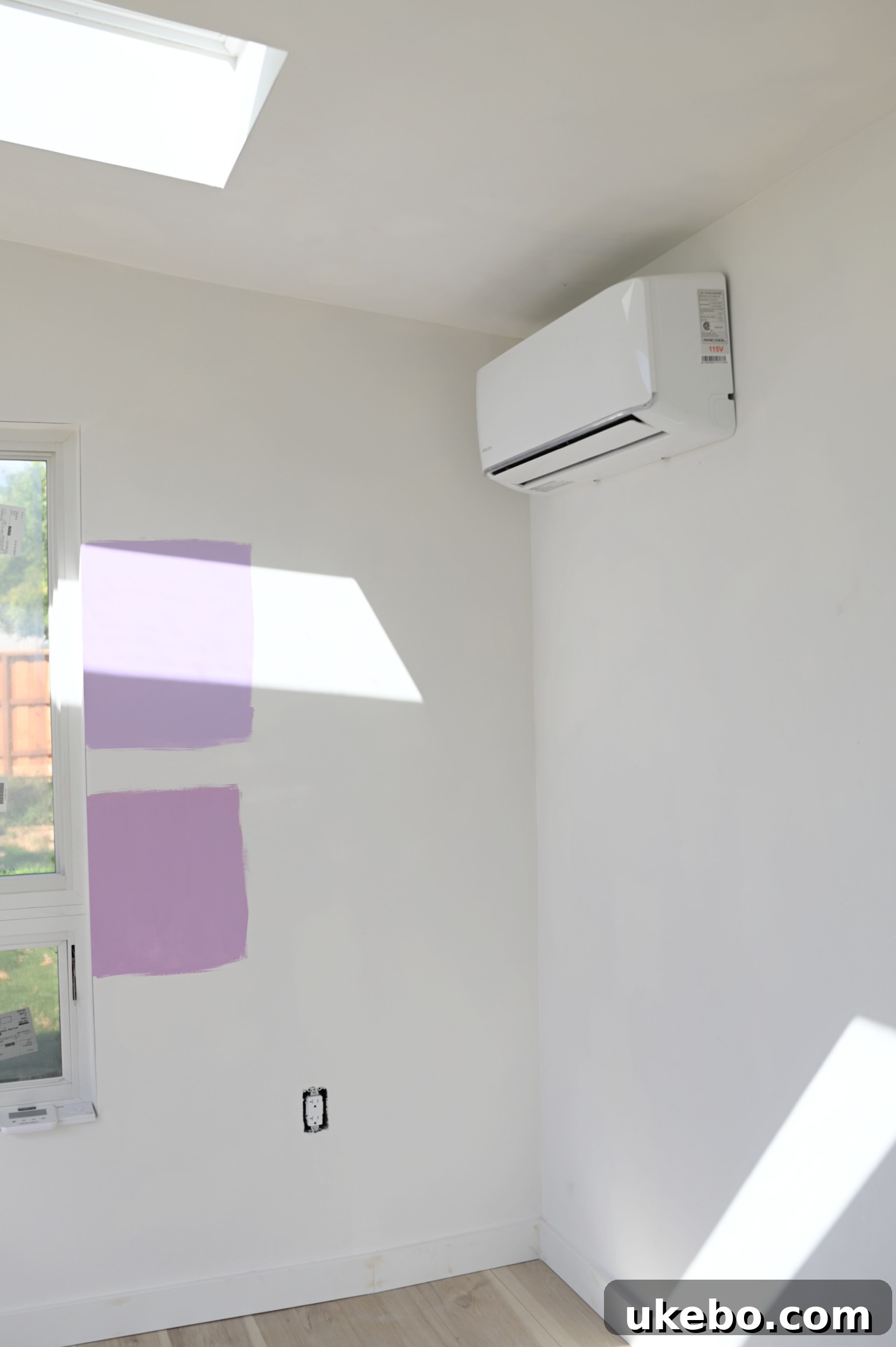
Here, you can see the colors in a much truer light, showcasing their subtle differences. The top swatch is Magical, and the bottom is Novel Lilac. I genuinely loved both, and making a final choice was surprisingly difficult. Ultimately, I chose Magical because, well, the name itself holds a certain allure, doesn’t it!? More practically, I felt that Novel Lilac carried a touch more pink undertone than I was aiming for. Magical offered that perfect balance of vibrancy and sophistication I envisioned for my creative hub.
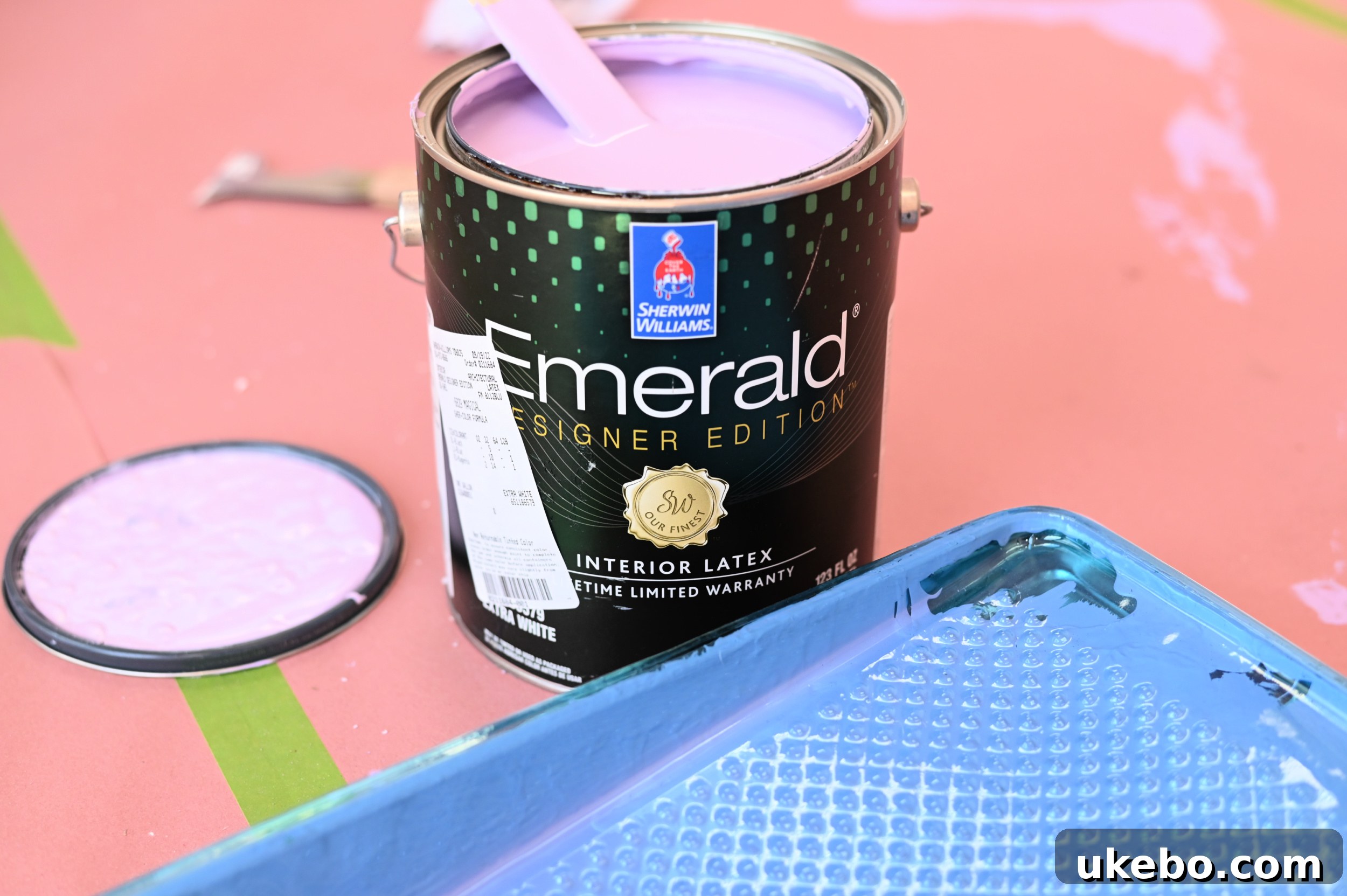
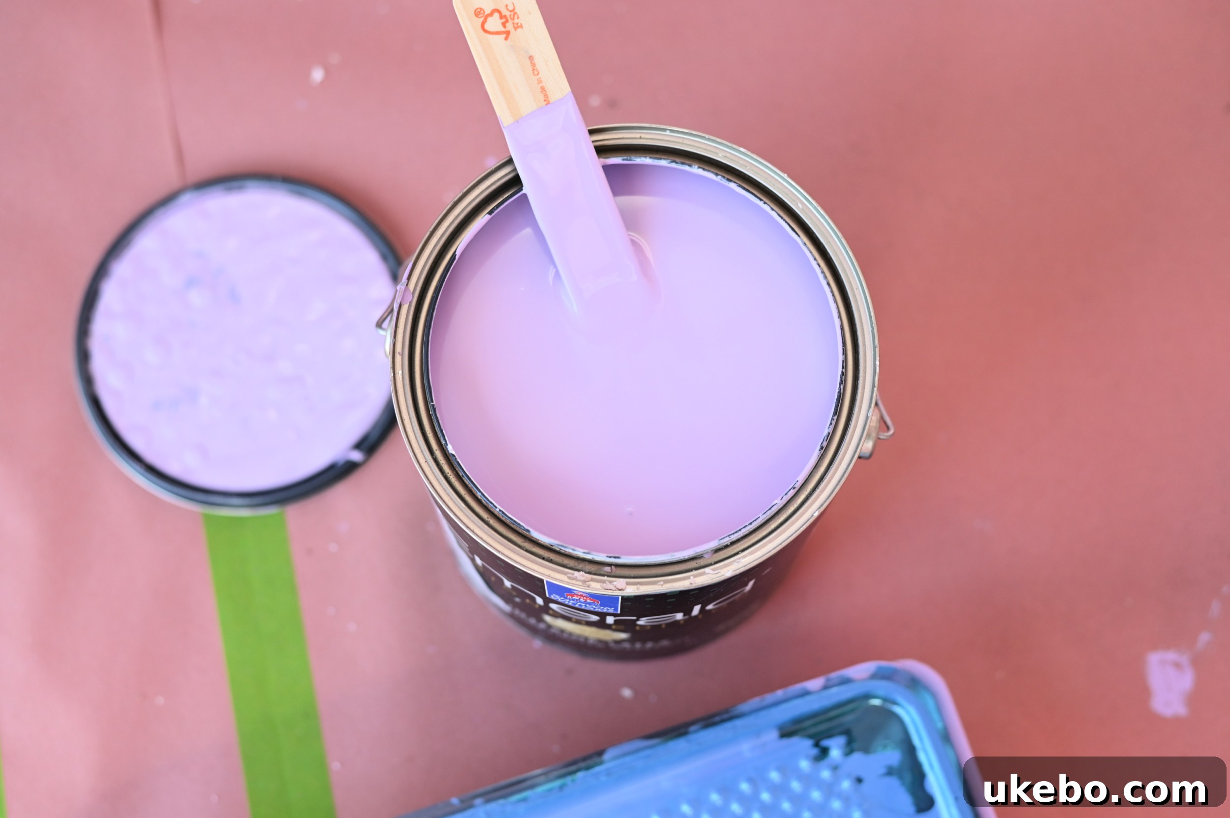
With my decision made, it was finally time to transform the bare walls with paint. Watching this beautiful shade of purple come to life on the walls was an incredibly exhilarating experience!
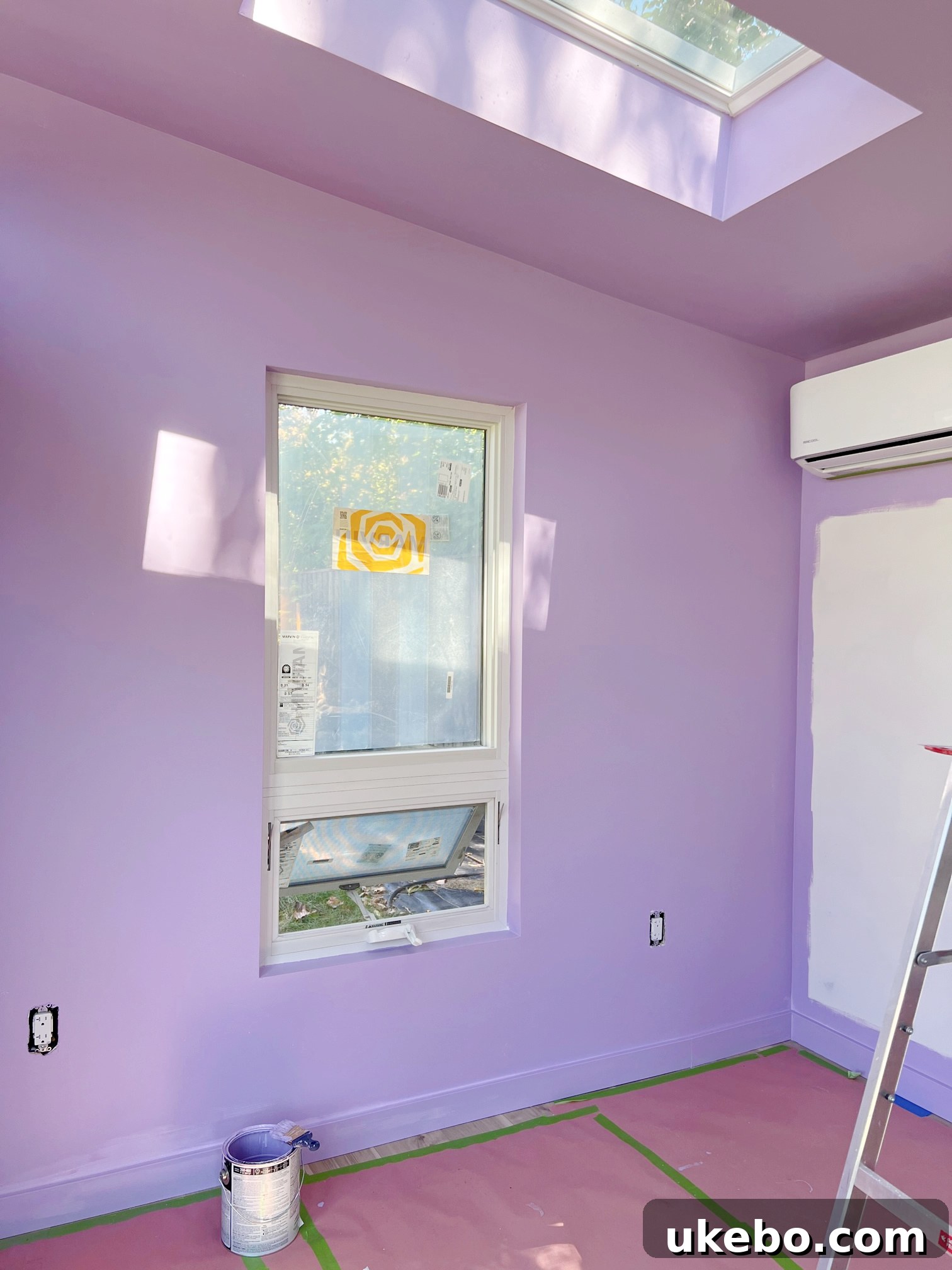
Barely fifteen minutes into painting, I knew without a doubt that I had made the absolute right choice. The color exuded exactly the energy and mood I was hoping for, and I could already vividly picture it as the perfect backdrop for the vibrant red console I had planned to install. Speaking of which…
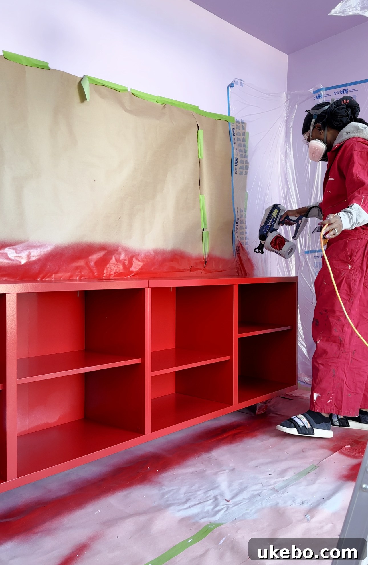
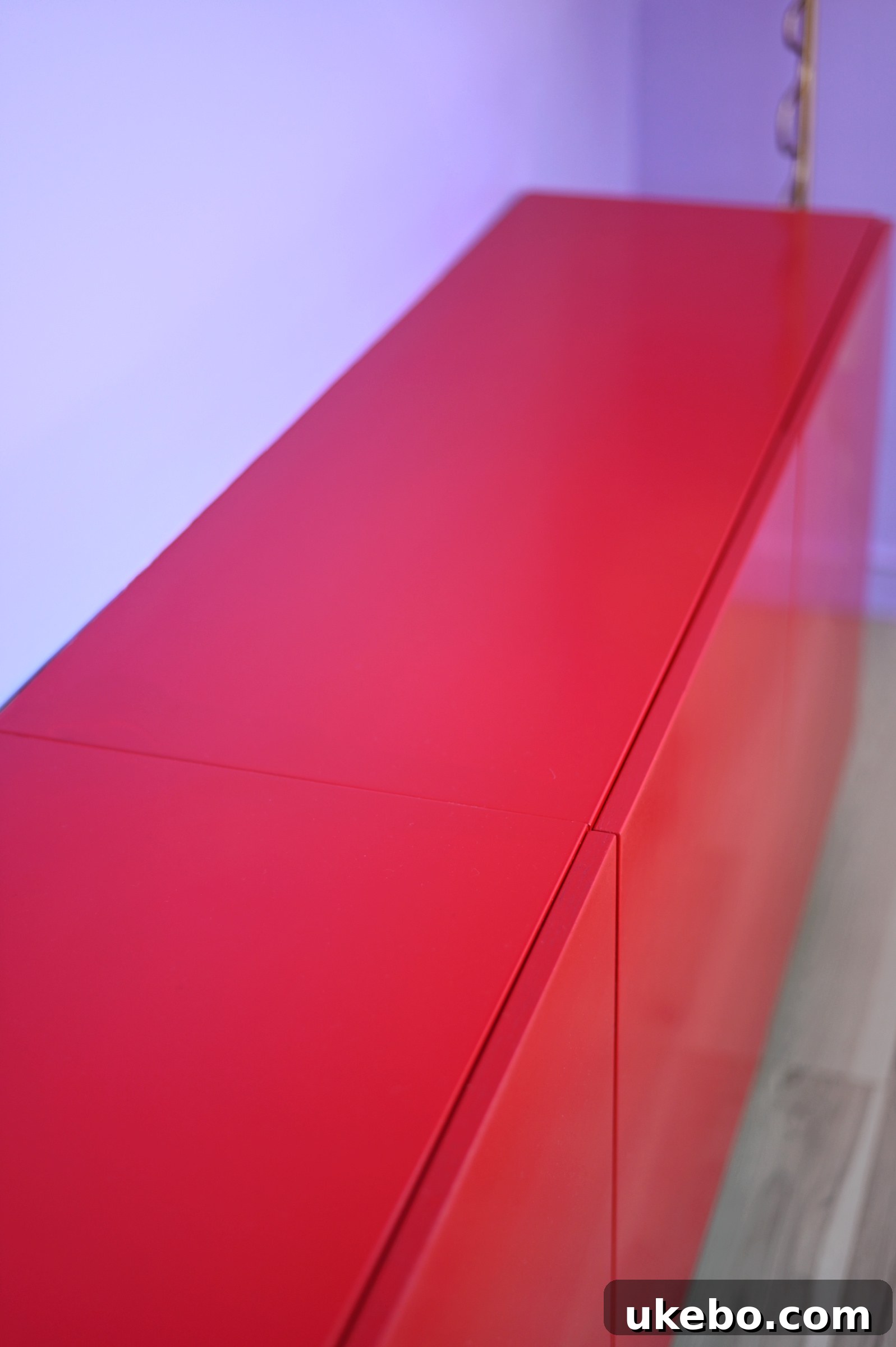
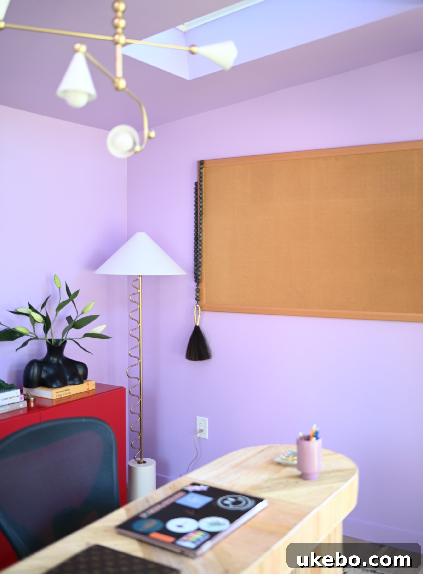
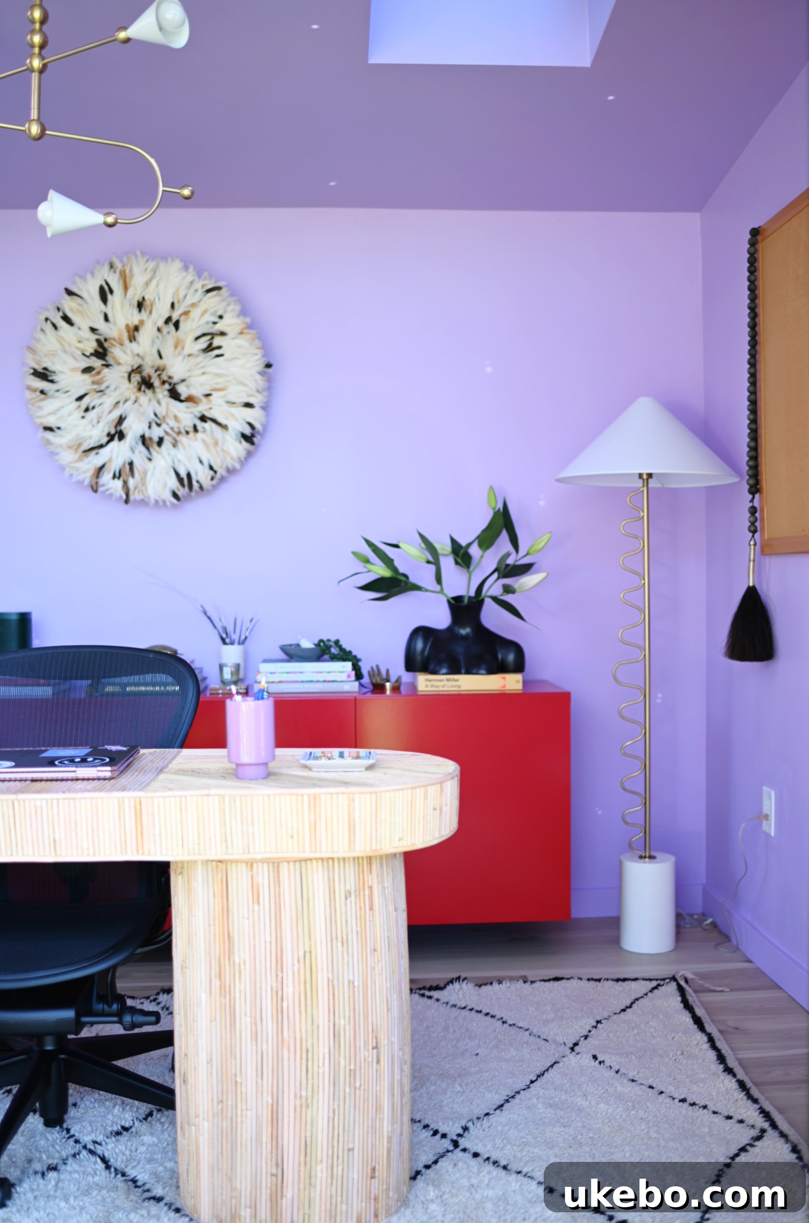
Seriously, can we just take a moment to appreciate this color?! It’s utterly magnificent! This is Positive Red SW 6871, and it truly is *positively* perfect against the serene yet vibrant purple. The juxtaposition creates a dynamic tension and a playful energy that perfectly embodies the spirit of a creative workspace. It’s a bold statement that doesn’t overwhelm but rather invigorates, proving that analogous colors, when chosen with care, can truly sing together.
Bringing the Vision to Life: Curating the Workspace
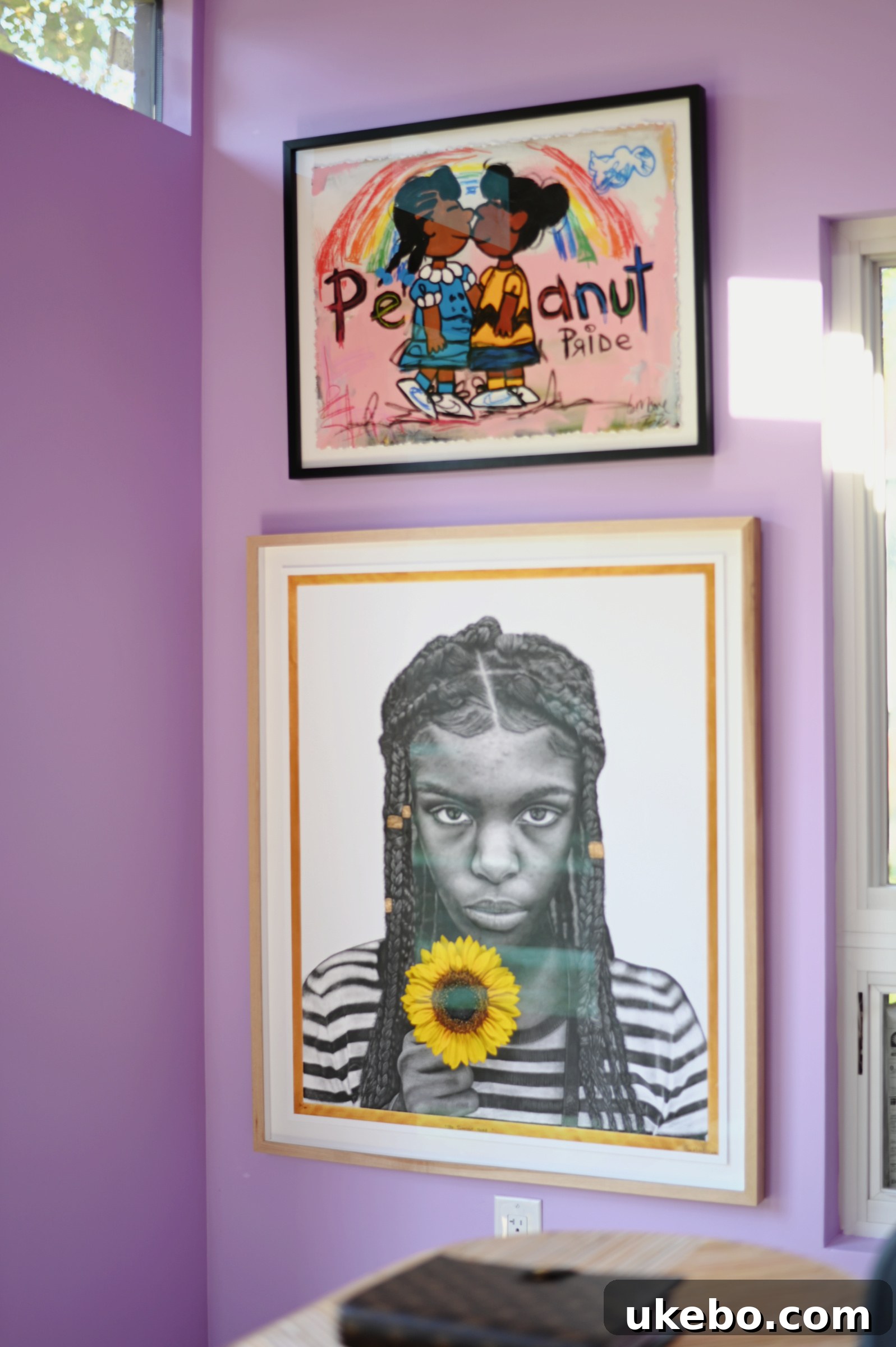
With the walls freshly painted and the console settled into its vibrant new home, it was time for the exciting task of pulling the entire space together. This moment was particularly special because I had been meticulously collecting and stockpiling various pieces for my office studio in the garage for over a year! The anticipation had been building, and I (and my furry helper, Naomi!) were absolutely thrilled to finally unearth all those treasures and begin assembling this creative haven. Each item, from art pieces to functional furniture, had been chosen with careful consideration, envisioning its place within this colorful new world.
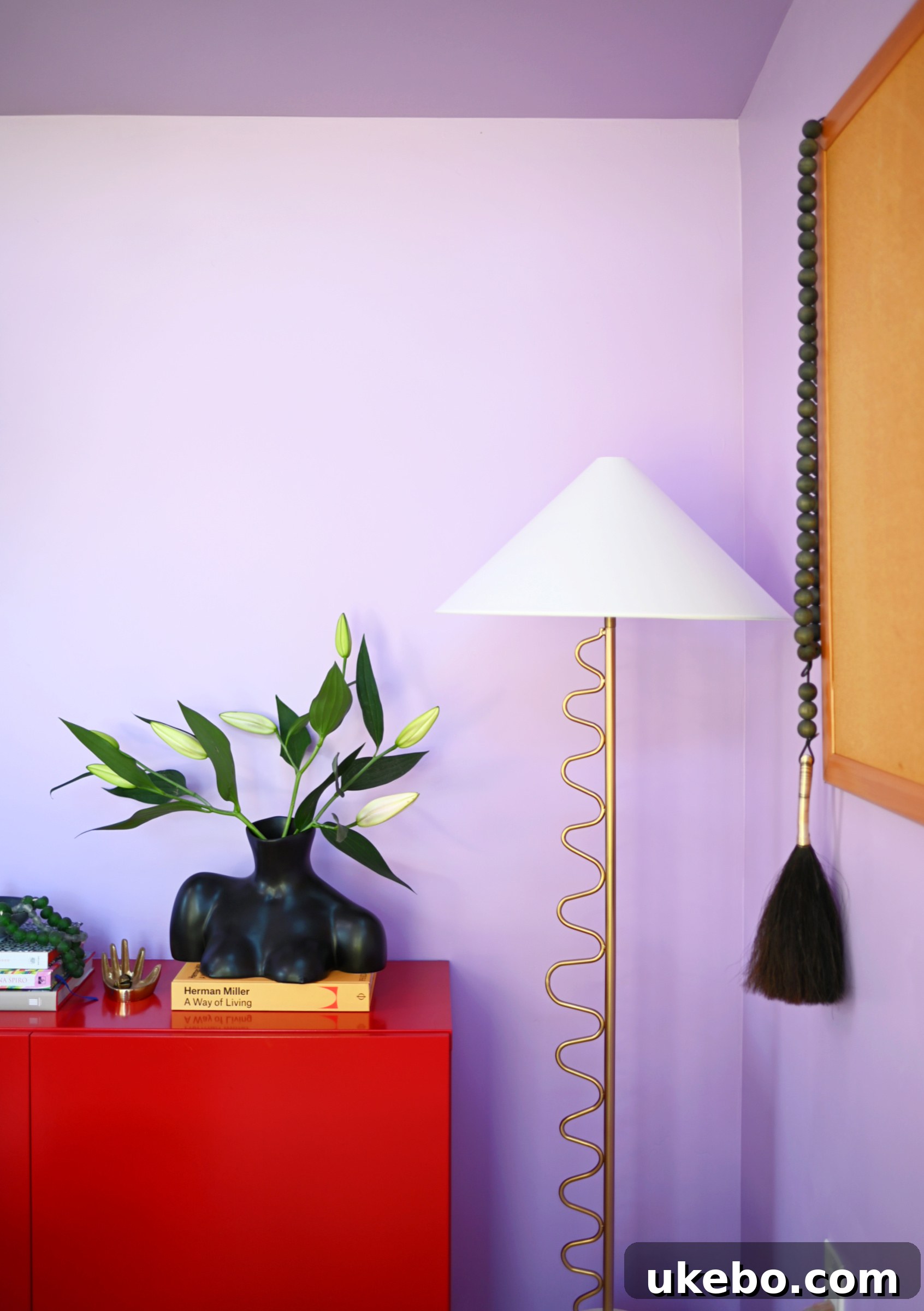
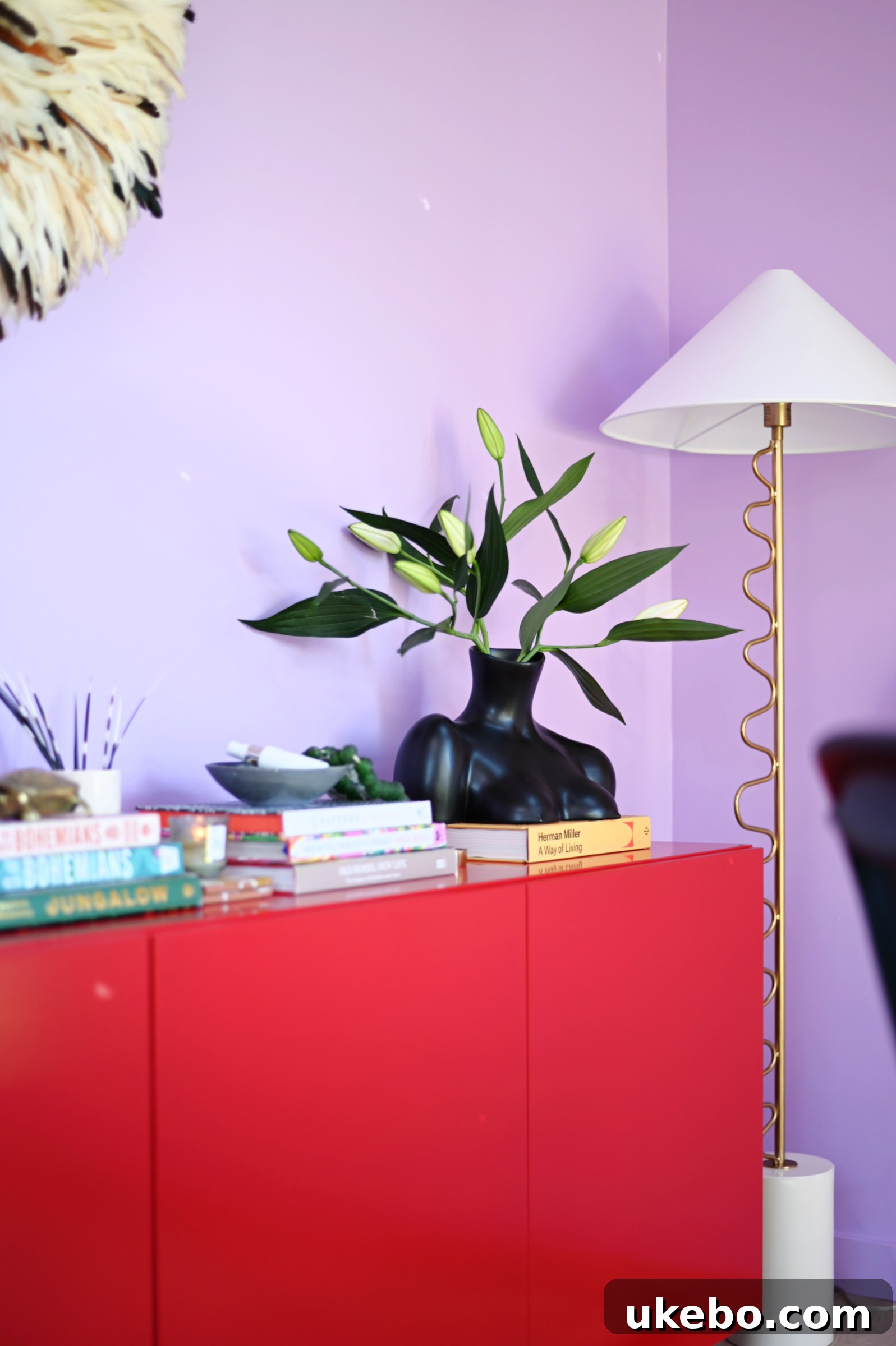
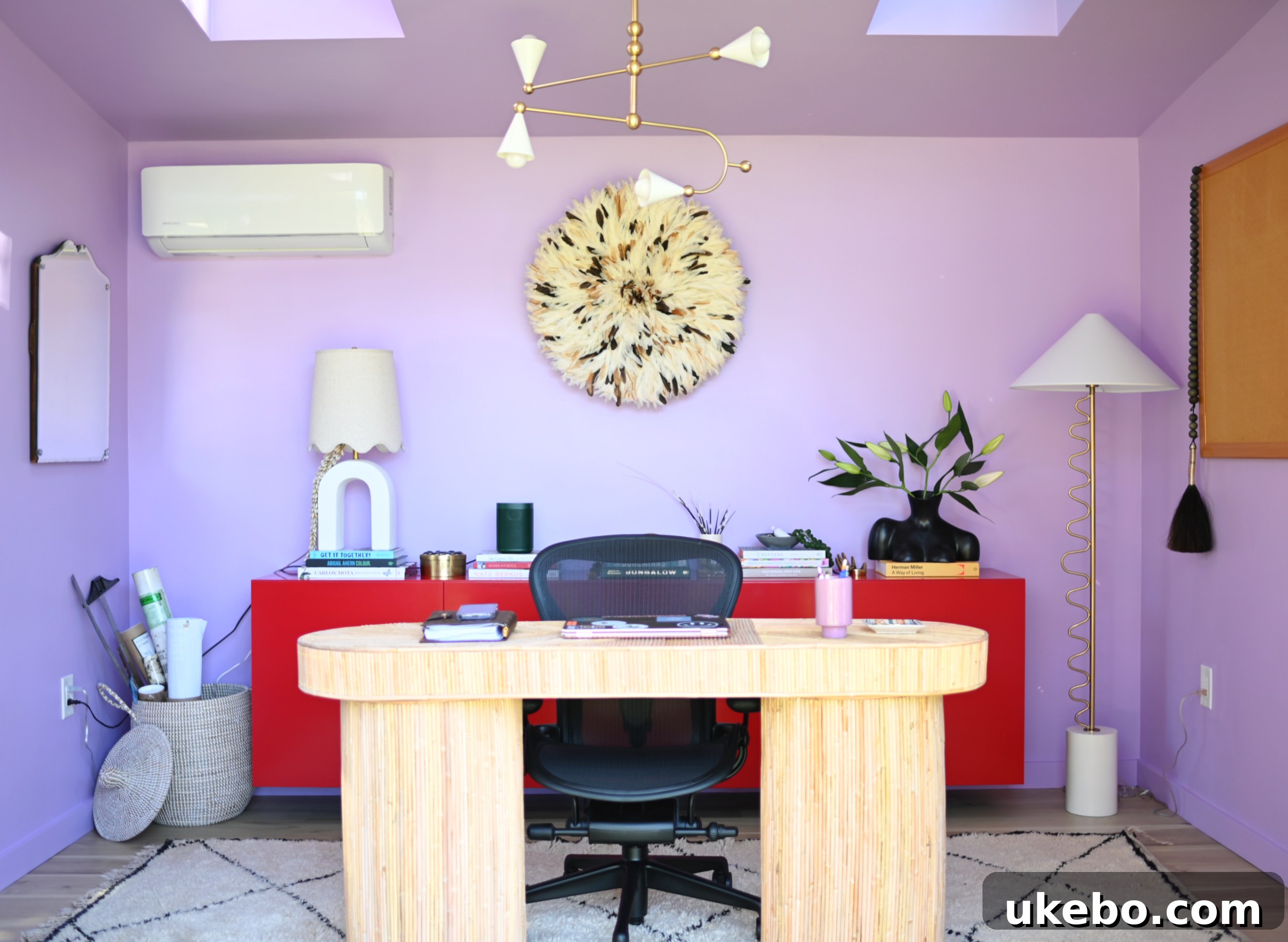
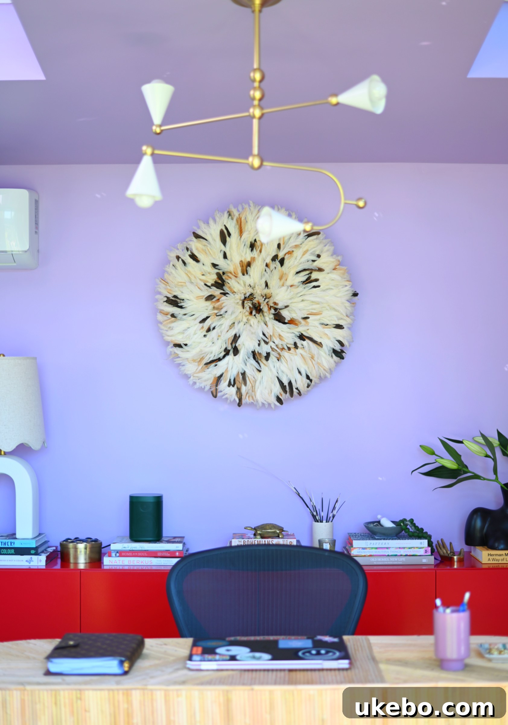
The Living Color: An Ever-Changing Palette
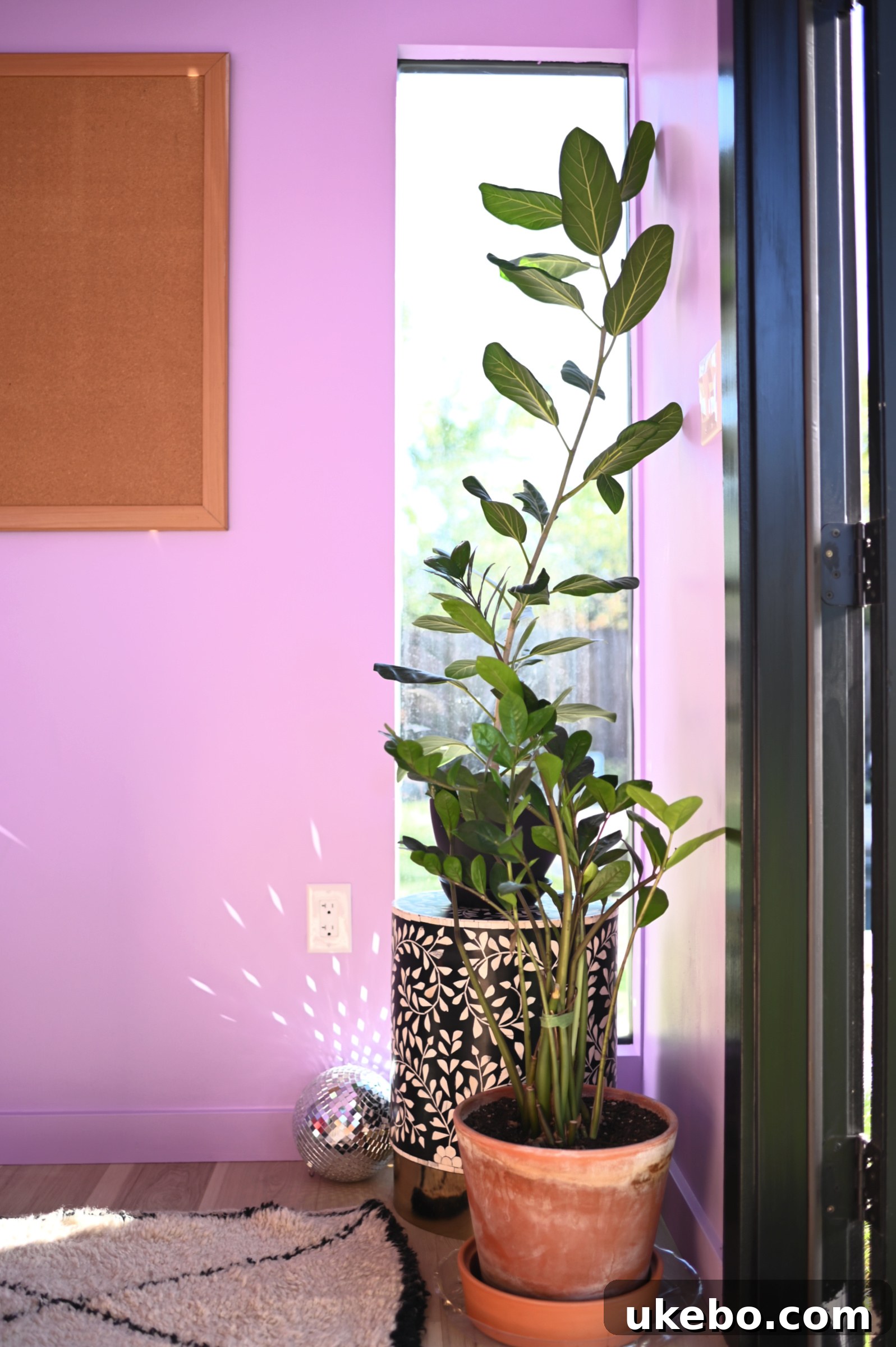
One of the most captivating aspects of Sherwin-Williams Magical is its fascinating chameleon-like quality; the color truly transforms throughout the day as the natural light shifts and changes. On a bright, sun-drenched afternoon, it takes on a lighter, almost ethereal lavender quality. Yet, on an overcast day, it deepens into a richer, more contemplative purple. It’s a living color that never ceases to surprise and delight. I even snapped a picture on a particularly sunny day to capture this striking difference, and you can truly see how the intensity and perception of the hue dramatically change.
An Evolving Sanctuary: Inspiration and Growth
Of course, like all my cherished spaces, this office studio is a living entity that will undoubtedly continue to evolve and change over time. In fact, even since these photos were taken, new pieces have arrived, and arrangements have shifted, reflecting the organic process of design. But having my very own dedicated space to work, create, and dream in feels utterly incredible. I thrive in environments infused with thoughtful layers of color and texture, so walking into this vibrant studio every single day is an absolute joy. It feels fresh, invigorating, and profoundly inspiring. There’s a palpable energy here that fuels my creativity, making every task feel less like work and more like a passion project. It truly feels *magical* in every sense of the word, a testament to the power of thoughtful design and courageous color choices.
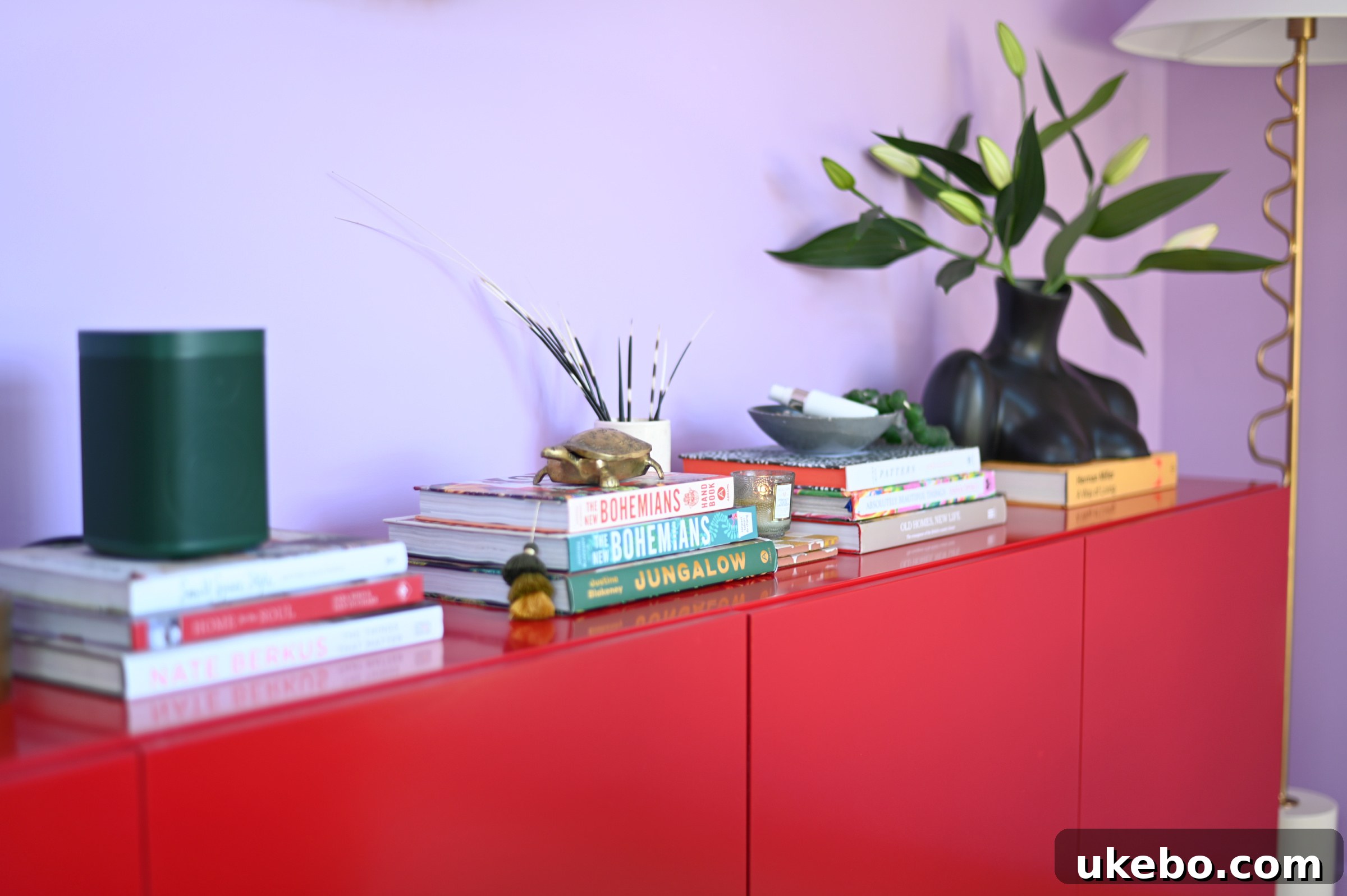
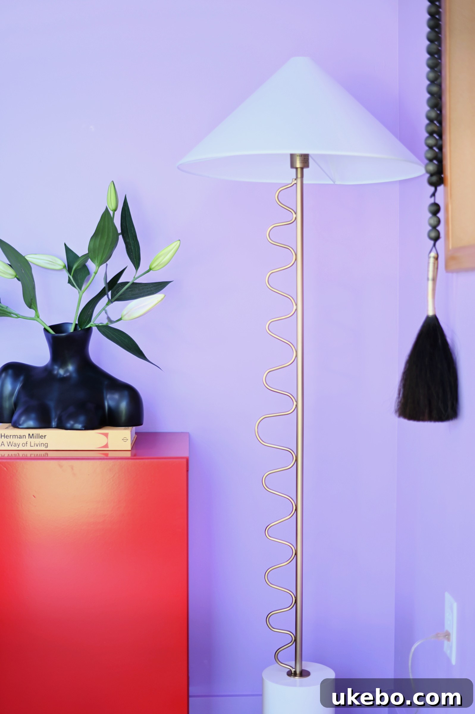
I’m eager to share even more details about the office studio soon, including the exterior paint choices and some of the specific decor elements. For now, if you’re wondering where I am, you know exactly where to find me – immersed in my colorful new haven!
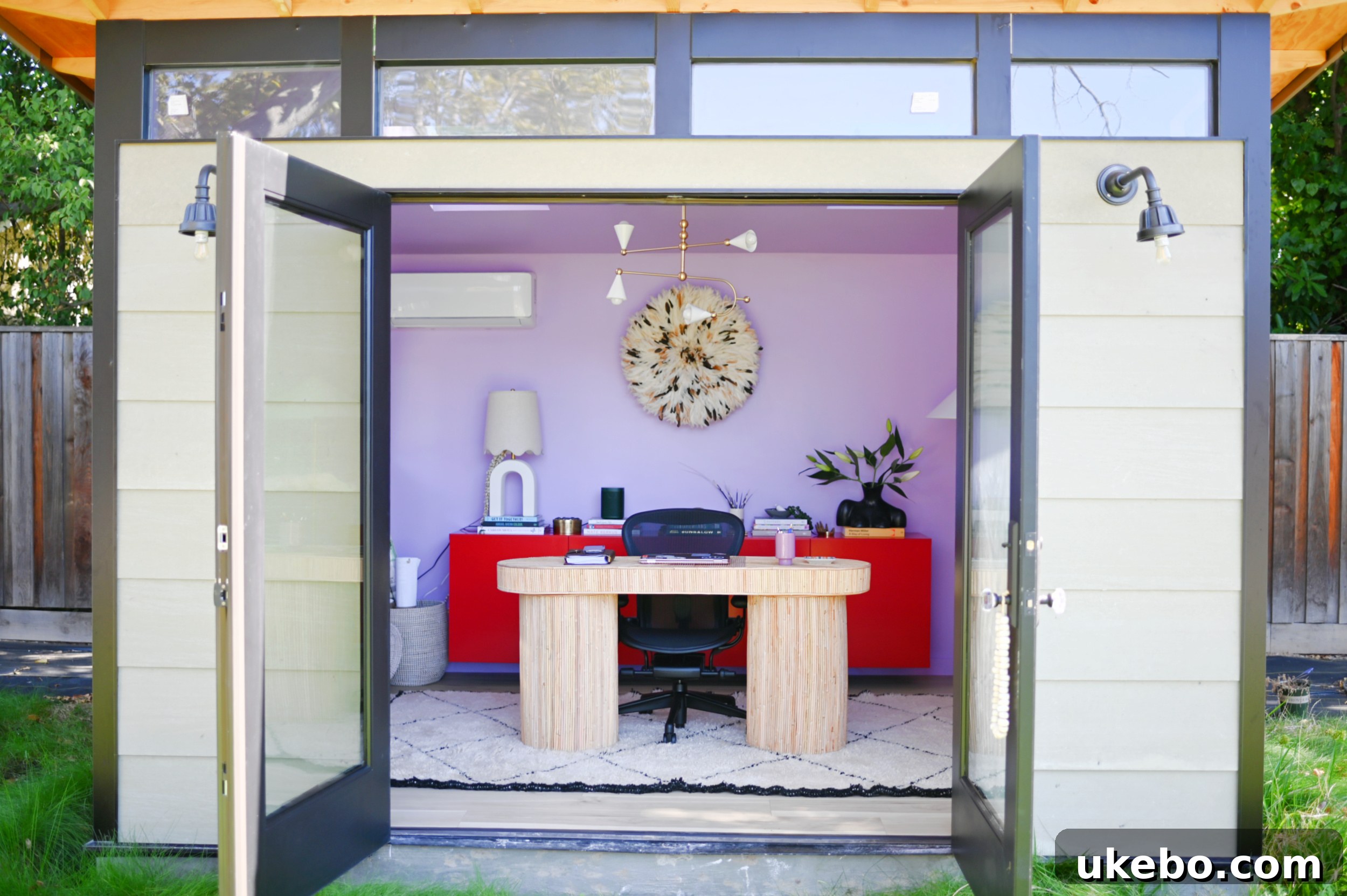
Until our next design adventure…