
*This post is in partnership with Sherwin-Williams. I am a Sherwin-Williams brand ambassador and received payment for this project. All thoughts, opinions, and work are courtesy of yours truly.*
Embracing the Unexpected: Sherwin-Williams Color of the Year & the Power of Urbane Bronze
Hello design enthusiasts and fellow creatives! It’s that thrilling time of year again, and no, I’m not talking about the holidays. I’m talking about the highly anticipated Color of the Year season! For a designer like me, this period is akin to a personal Super Bowl, filled with excitement as we anticipate and predict which hues will dominate the design landscape in the coming year. After the truly unprecedented challenges of 2020, the announcement of the next Sherwin-Williams Color of the Year felt more significant than ever. This marks the 11th consecutive year Sherwin-Williams has bestowed this honor, and I can hardly contain my excitement about their exceptional choice.
Unveiling Urbane Bronze: A Sophisticated Neutral for Modern Homes
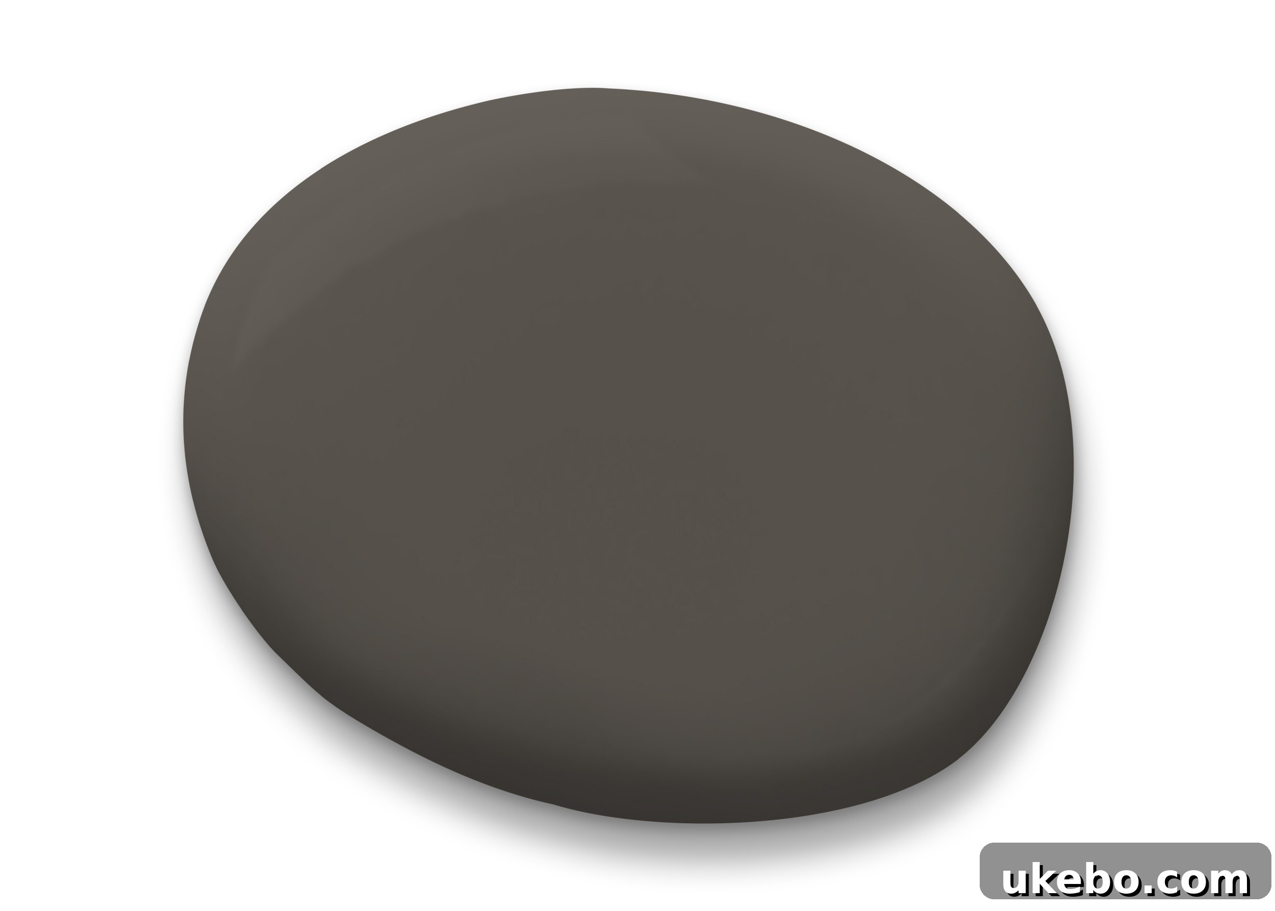
When I first learned the chosen color, I was genuinely surprised! My predictions certainly weren’t leaning towards a deep brown or sophisticated gray. However, the moment I truly immersed myself in Urbane Bronze SW 7048, its incredible versatility and timeless appeal became immediately apparent. It truly is my kind of neutral – rich, grounding, and effortlessly chic. For those who, like me, are drawn to the depth and drama of moody interiors, Urbane Bronze serves as the perfect entry point. It encourages homeowners to venture slightly outside their traditional comfort zones, offering a warm, earthy alternative to more commonly used dark shades like black, charcoal, or navy. Its subtle gray undertones prevent it from feeling too heavy, instead lending it an air of understated elegance that complements almost any design style.
The Sherwin-Williams global color forecasting team meticulously researches cultural trends to understand how color influences our world. The overarching theme for this year’s selection revolves around the imperative to create genuine “sanctuary spaces” within our homes. The year 2020 brought a profound realization for homeowners: the vital importance of a living environment that offers stability, warmth, and security. Urbane Bronze, a rich, deep brown imbued with subtle gray undertones, perfectly embodies this sentiment. It acts as an anchor, a steadfast hue that evokes feelings of being grounded, safe, and profoundly secure. This ultra-sophisticated shade is incredibly versatile, seamlessly transitioning between a foundational neutral and a bold accent in a myriad of spaces. Its beautiful, muted, and moody character has truly captivated me; I am completely obsessed with it!
A Personal Project: Transforming My Sister’s Sanctuary
When considering where to bring the magic of Urbane Bronze to life, one space immediately sprang to mind: my little sister’s new house. After two decades living on opposite coasts, separated first by my military service and then hers, my sister and I are finally living close to each other again! This past summer, she relocated from Texas and purchased a home just two blocks away in my neighborhood. I am absolutely overjoyed to have her, and my niece and nephews, so close for the first time in their lives. She bought a 1950s ranch-style house that had been recently flipped, which meant it was incredibly neutral, lacking the unique personality and distinct style direction that truly makes a house a home. When she purchased it, she asked if I would help her design it, and I was deeply honored to accept the challenge of transforming this blank canvas into a special sanctuary for her and her children.
My vision began with her bedroom. I wanted to give her a makeover fit for the truly amazing “unicorn” of a person she is. Andrea is not just a Captain in the Air Force; she’s also a dedicated ICU nurse who selflessly puts others first every single day. She has been on the front lines, bravely caring for COVID-positive patients, and I couldn’t be more proud of her. My goal was to create a space that felt calm, restorative, and uniquely special – a true haven where she could unwind and recharge after her incredibly demanding work. Urbane Bronze, with its inherent sense of grounding and comfort, emerged as the perfect foundational color to make this dream a reality.
Before the Transformation: A Blank Canvas Awaiting Personality
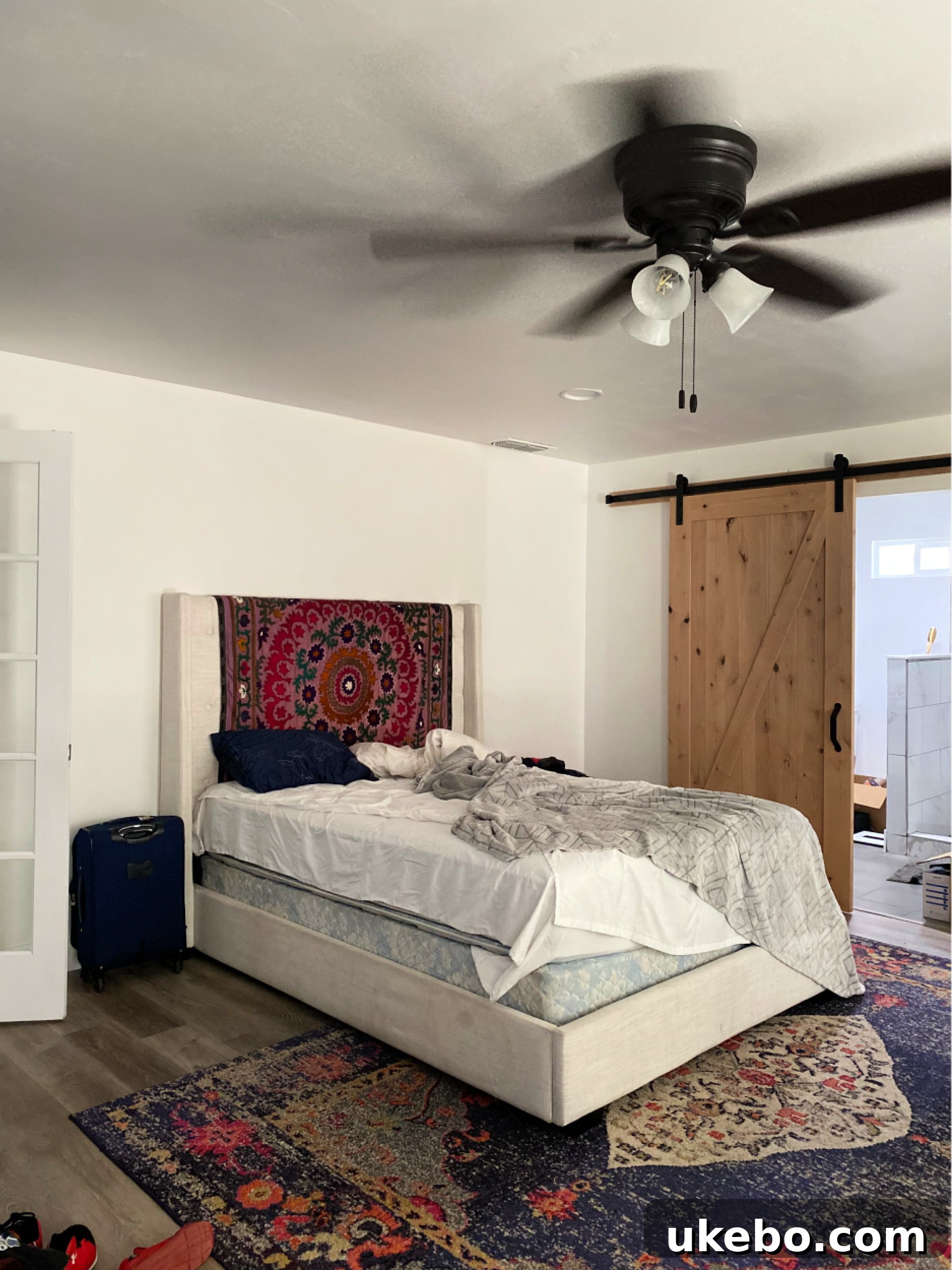
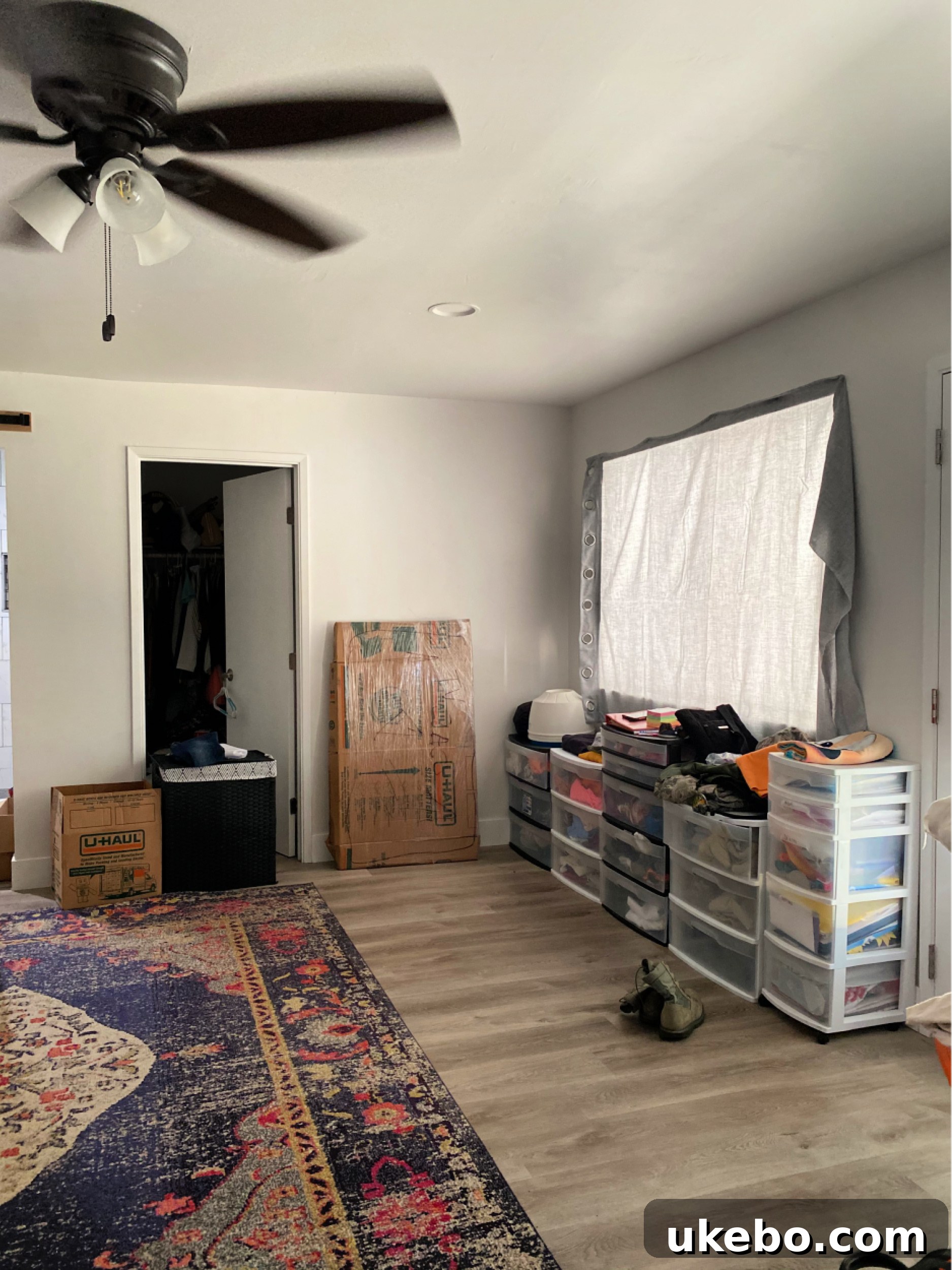
Her bedroom is quite spacious, boasting large windows that invite ample natural light, direct access to a back patio, a charming and fully functional brick wood-burning fireplace, and even enough room for a dedicated seating or lounge area, complete with elegant French doors at the entrance. Because she had just moved, the room initially housed a mix-and-match collection of furniture she brought with her, along with some pieces I lent her while we meticulously crafted a cohesive design plan. Despite the temporary clutter, the potential of this space was undeniable. It yearned for character, warmth, and a distinct identity. The first and most crucial step in unlocking this potential was to bid farewell to the sterile white walls that offered no personality or sense of escape.
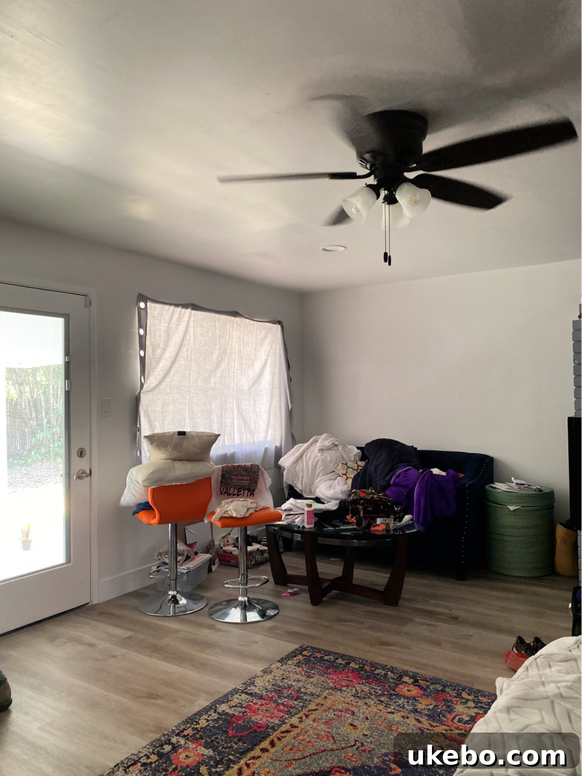
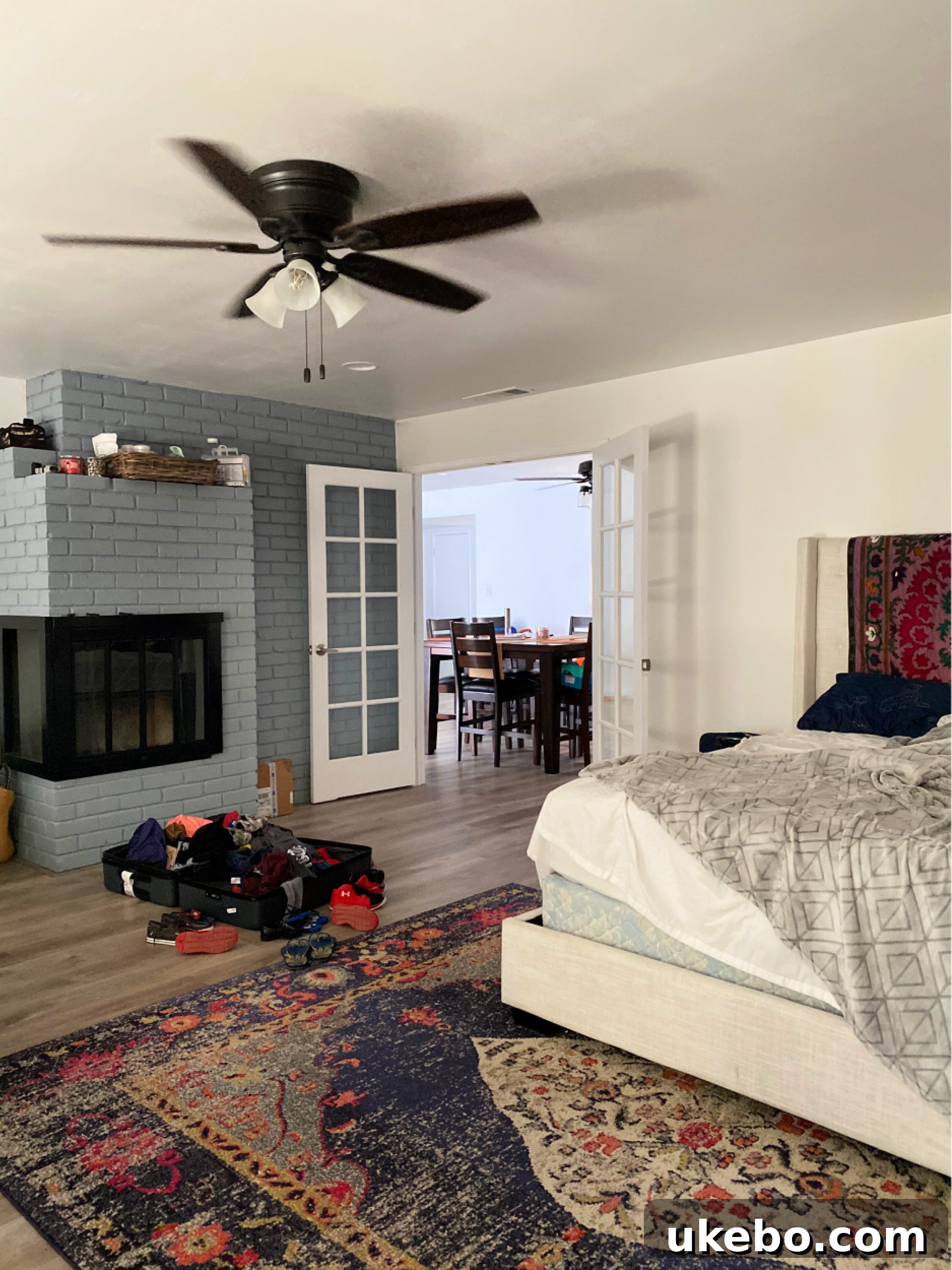
The Bold Stroke: Immersing the Space in Urbane Bronze
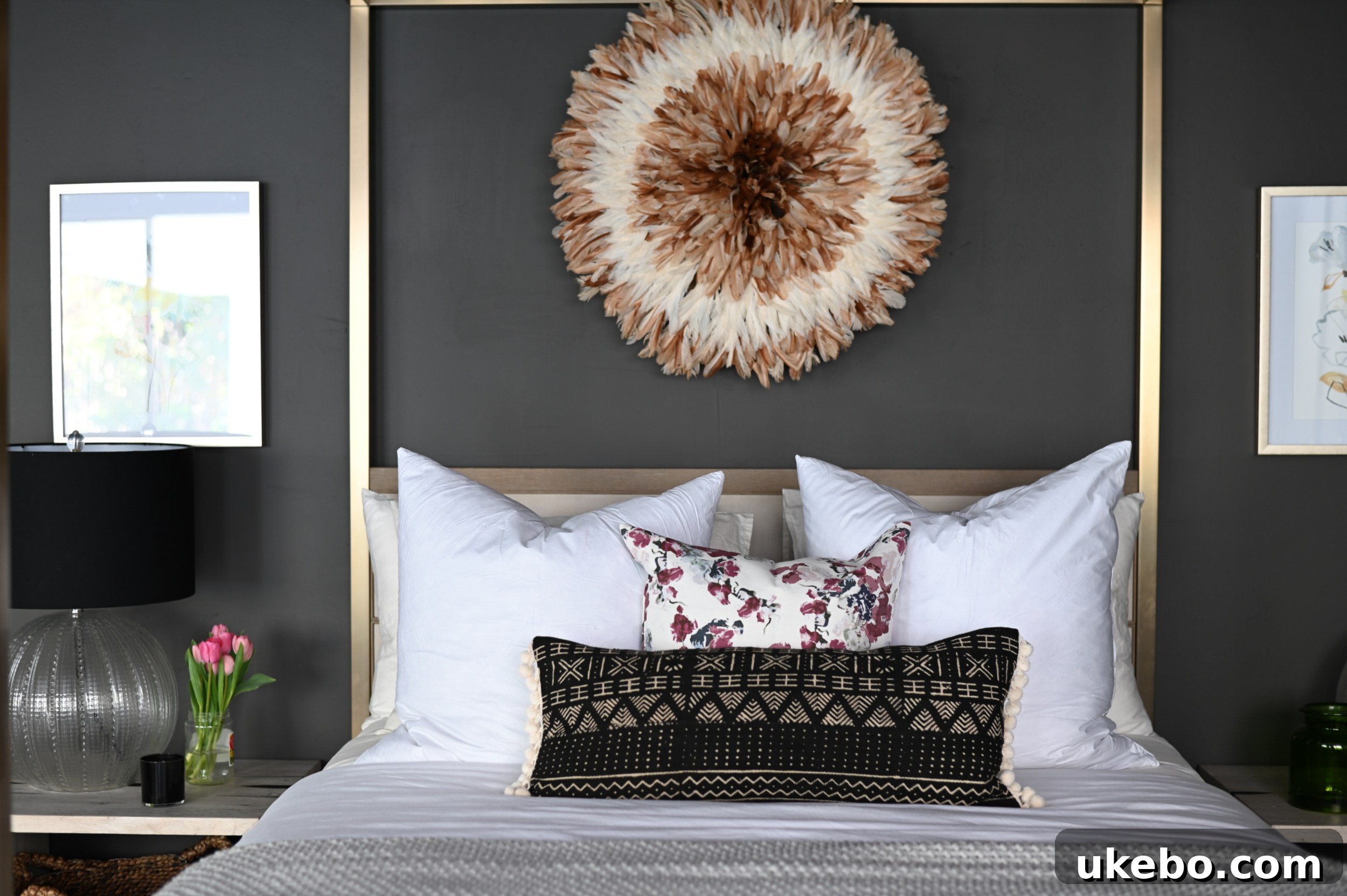
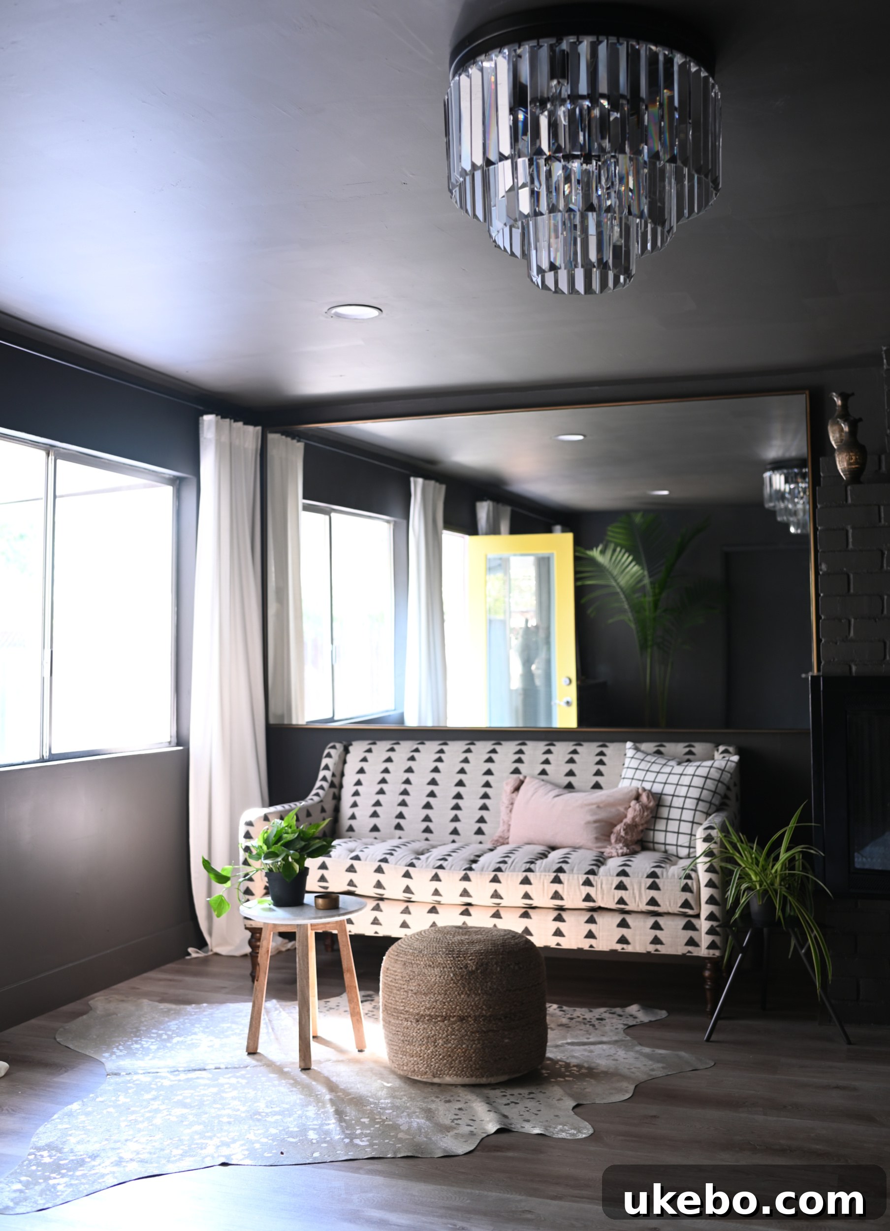
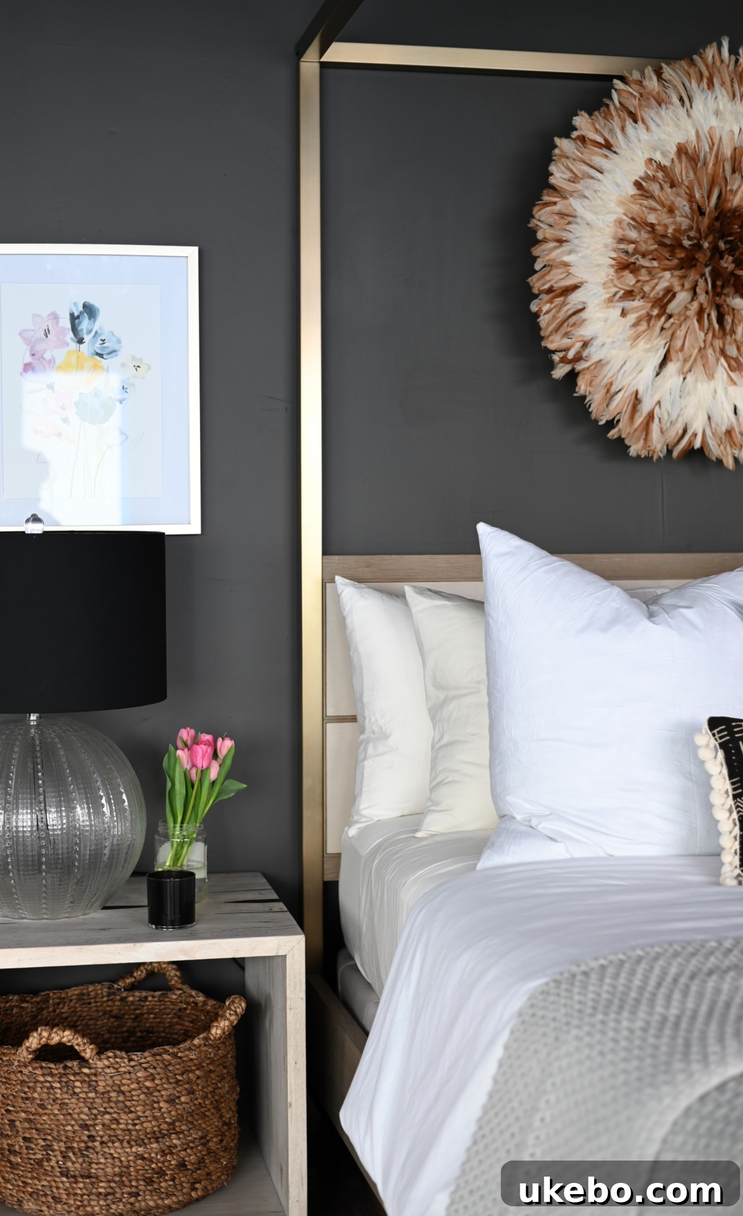
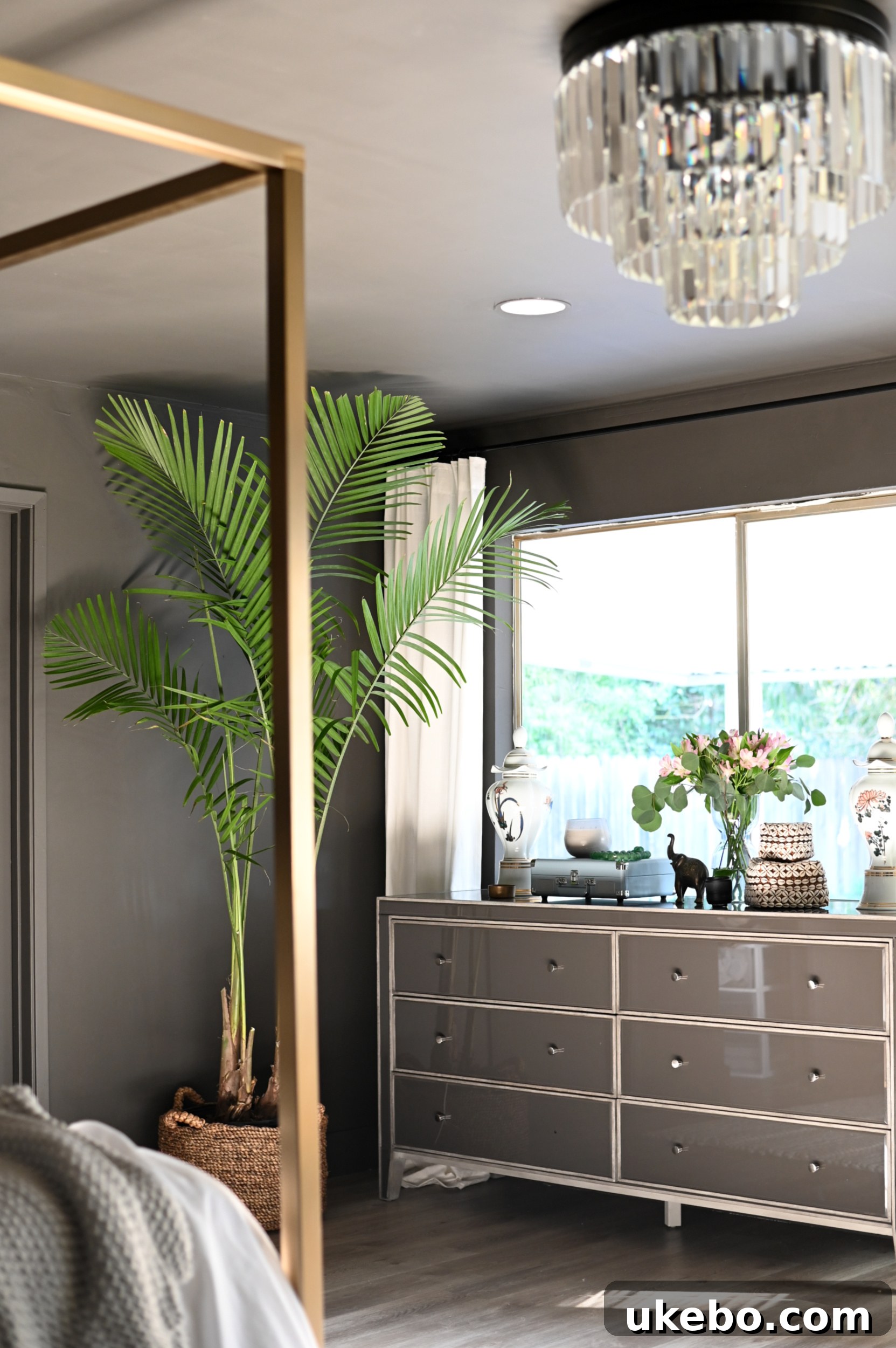
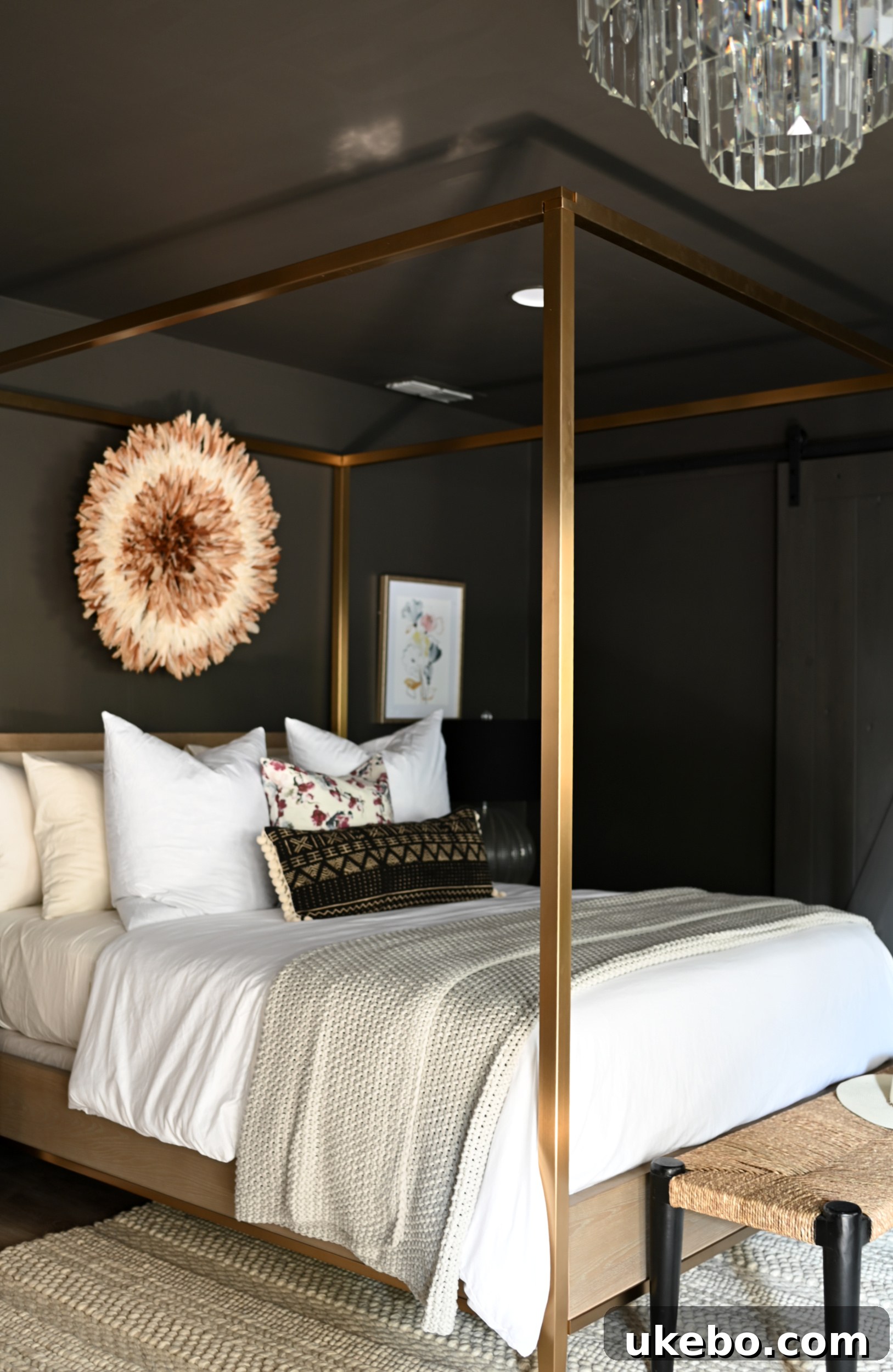
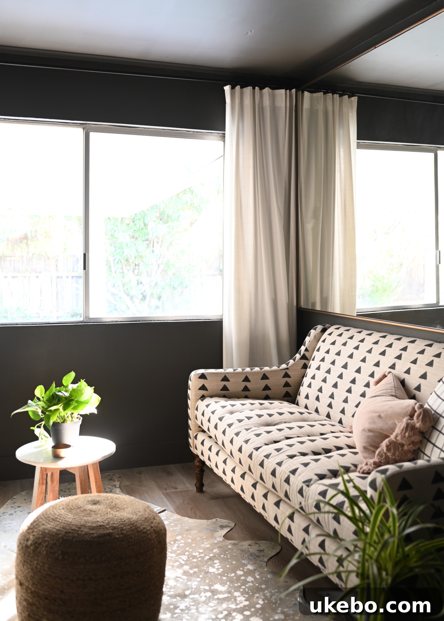
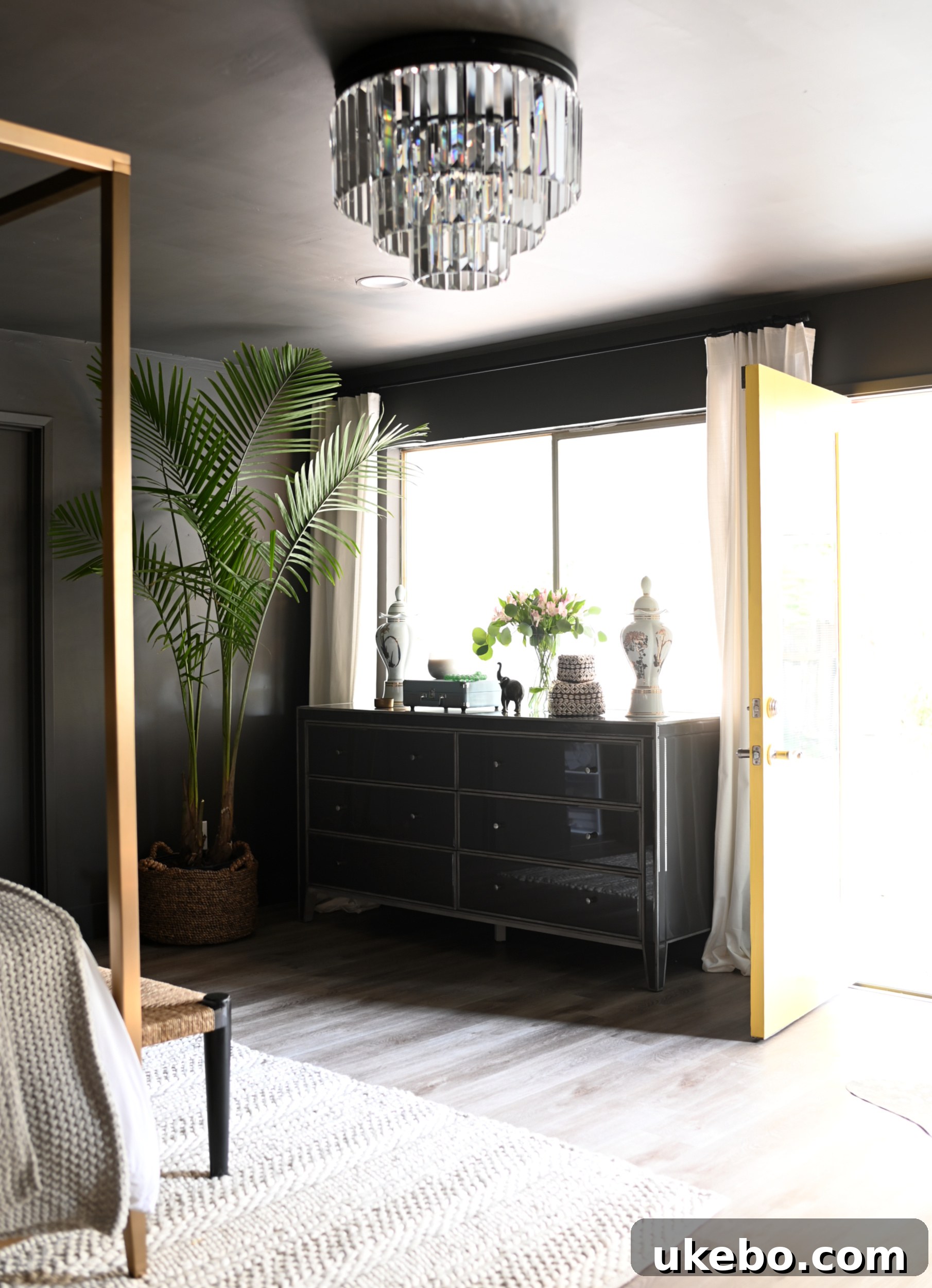
To truly make a dramatic and impactful color statement, I chose to use Sherwin-Williams Emerald Interior Acrylic Latex Paint in Urbane Bronze and apply it to every single surface of the room. This wasn’t merely about painting the walls; I enveloped the entire space, including the ceiling, all trim, baseboards, doors, and even the brick fireplace, in this luxurious hue. My design philosophy is often “go big or go home,” and in this instance, simply painting an accent wall or just the trim wouldn’t achieve the immersive, womb-like sanctuary I envisioned. I needed to create an all-encompassing experience. The transformation is absolutely breathtaking – I am utterly captivated by how incredible it looks. The decision to commit fully to this rich, earthy tone has paid off spectacularly, delivering a cohesive and deeply comforting aesthetic.
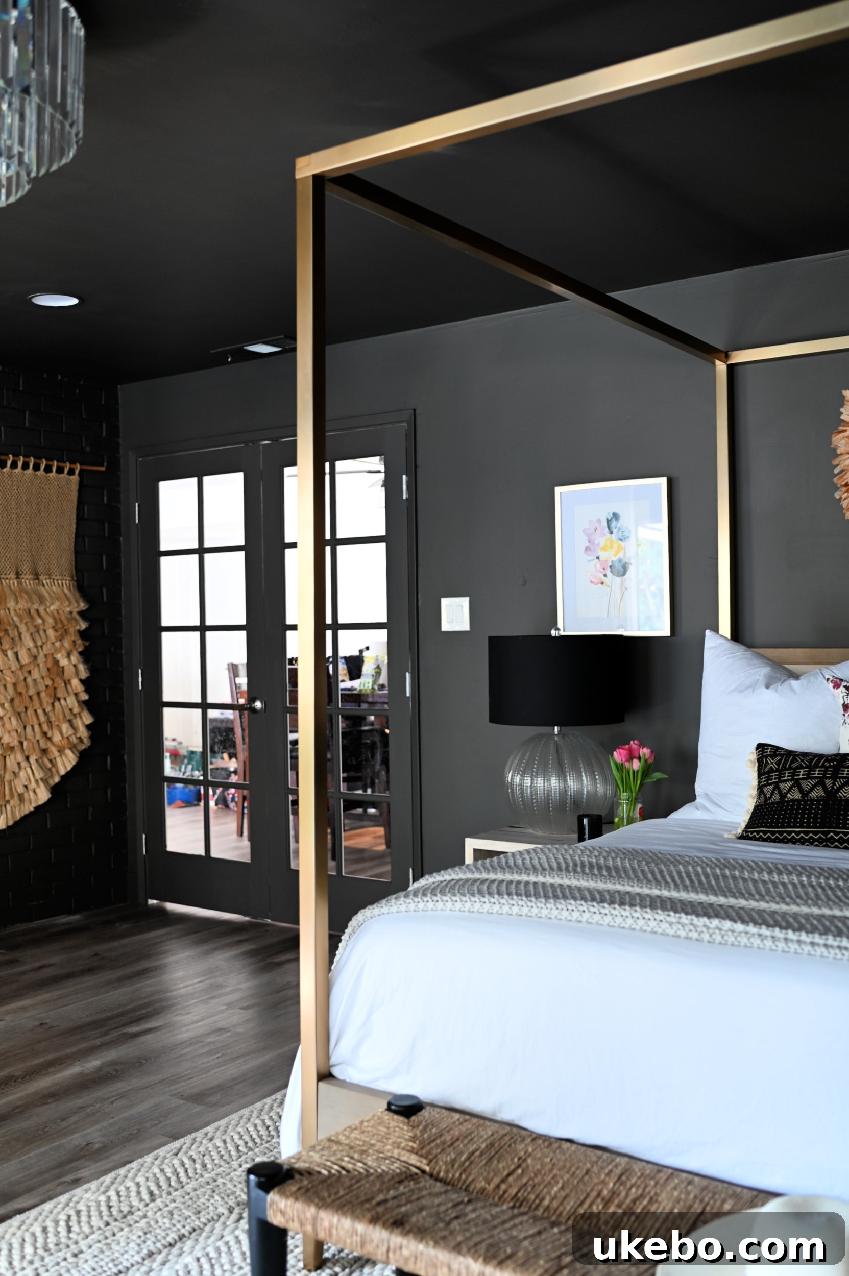
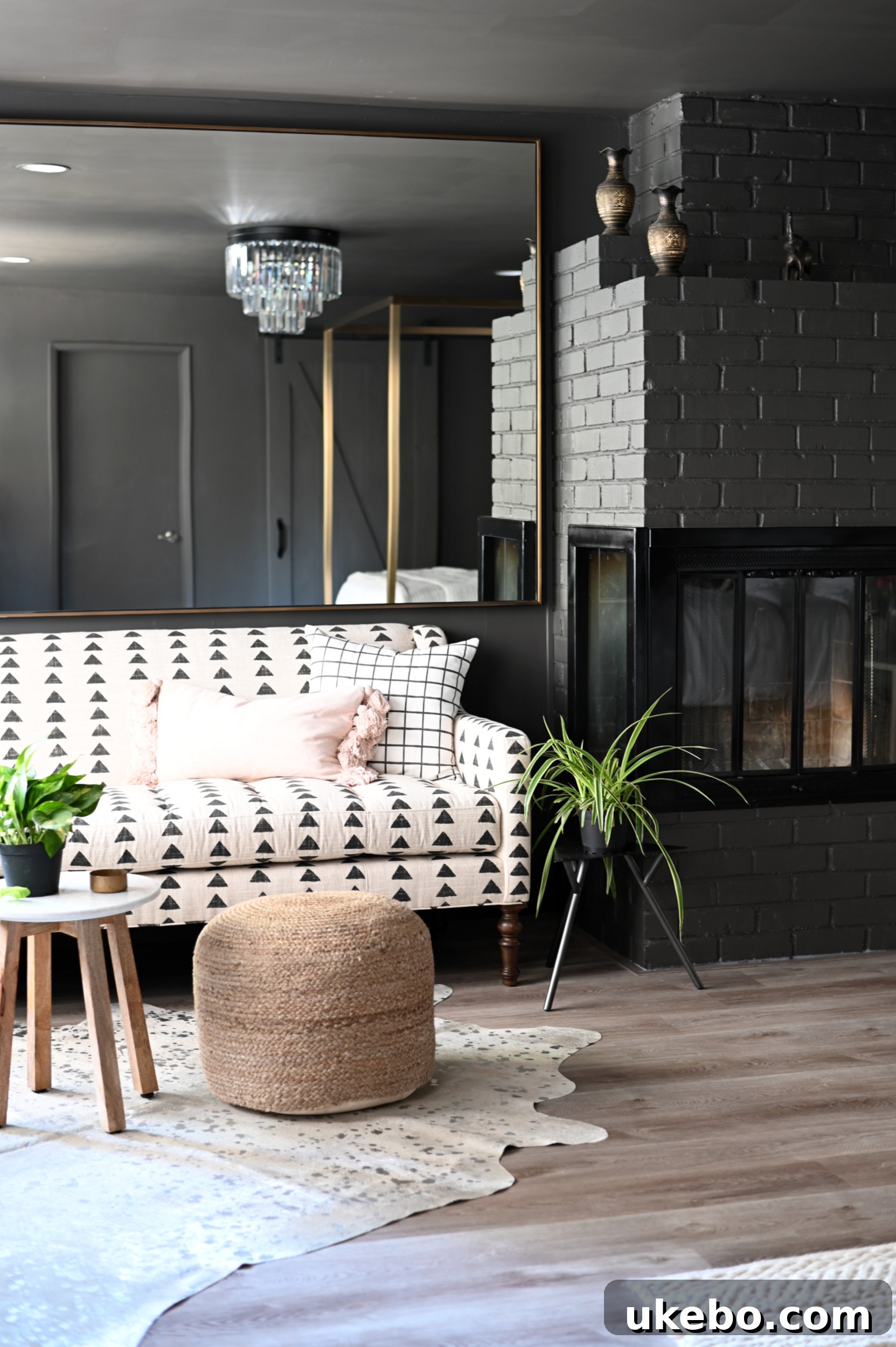
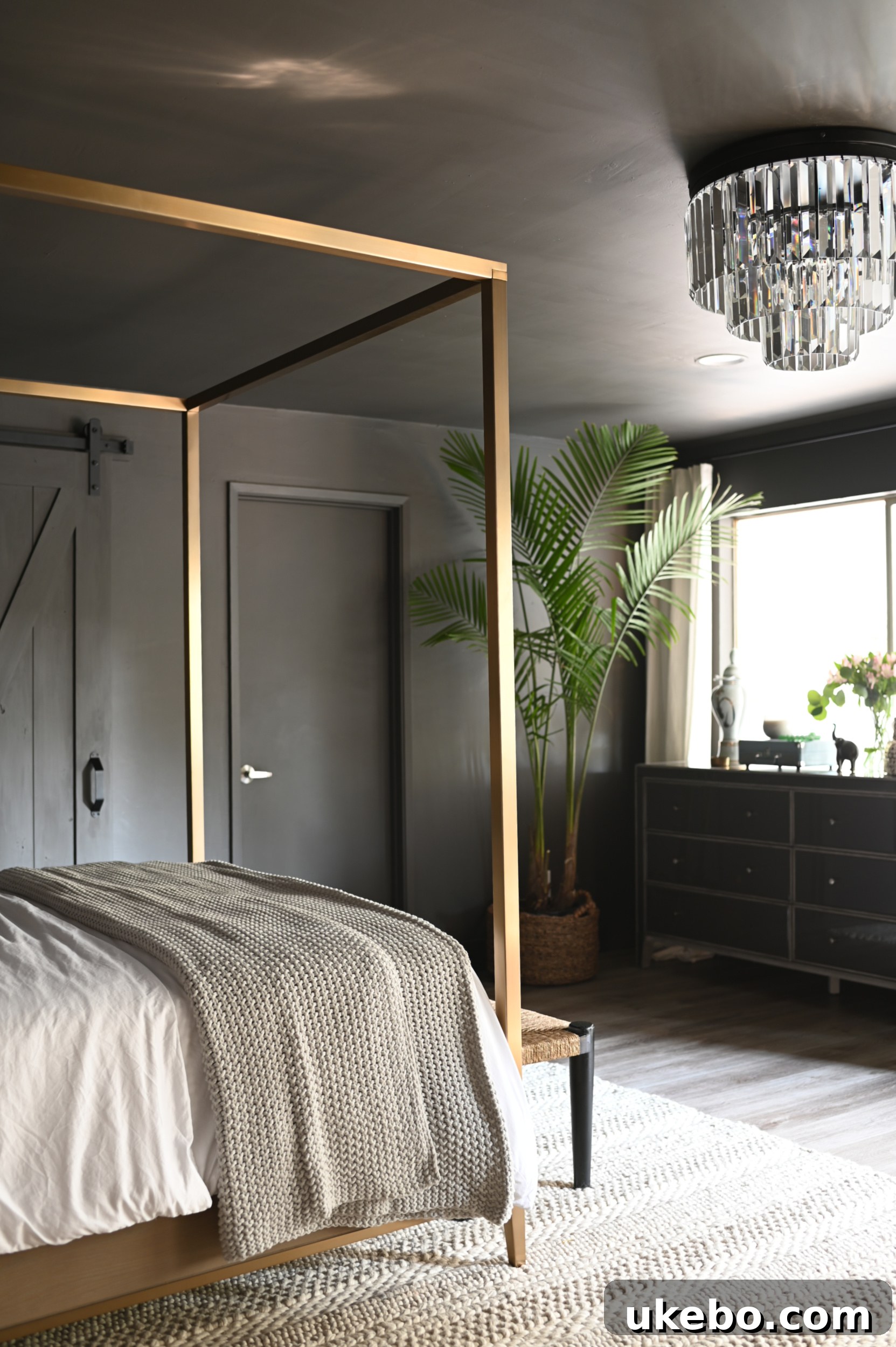
By immersing the room in Urbane Bronze, I aimed to perfectly activate those feelings of grounding and stability that the Sherwin-Williams color and design team wanted to evoke. The result is a space that feels incredibly warm, deeply grounded, and profoundly relaxing – a true escape from the outside world. I admit, I was quite nervous about revealing the finished room to my sister, as she had no idea what color I chose or what the final look would be. She specifically requested a complete surprise, and boy, was she surprised! I am ecstatic to report that she absolutely adores it. Her face lit up, and she literally jumped up and down with joy when she saw her new bedroom, a reaction that made me love the transformation even more.
A Sanctuary Unfolding: The Complete Bedroom Makeover
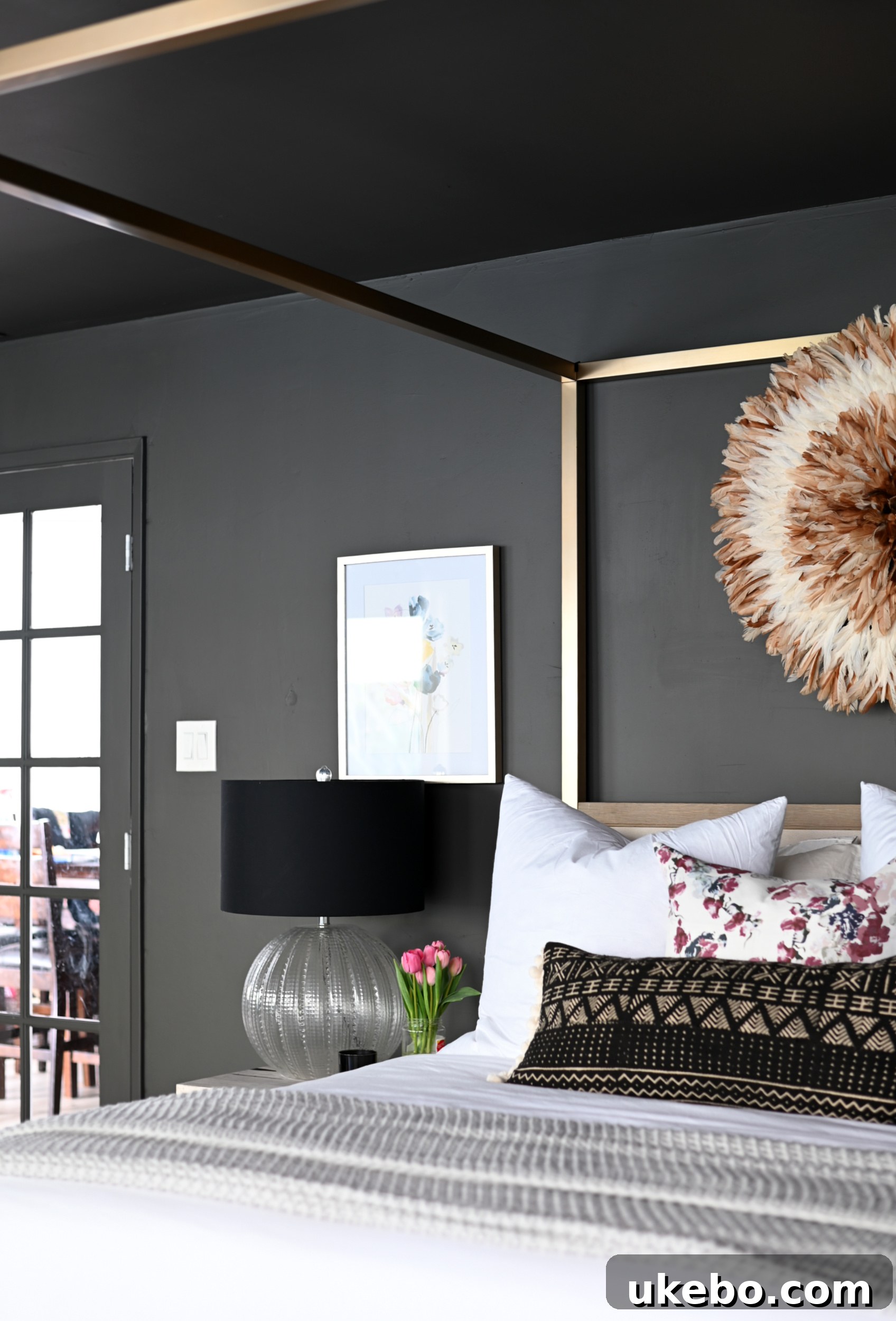
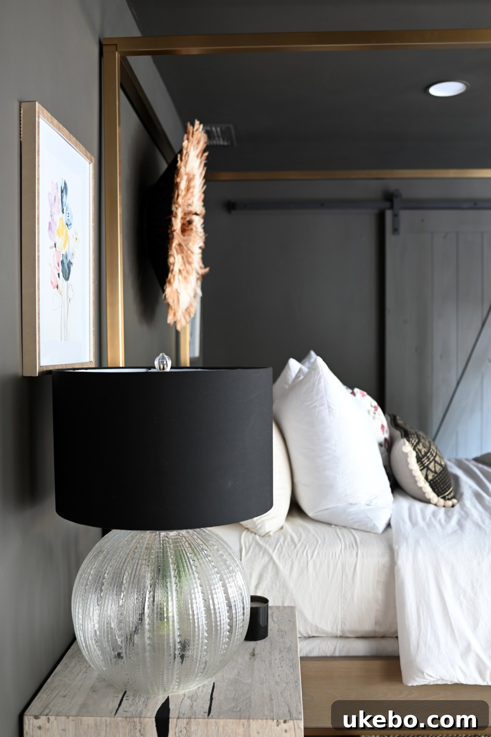
Beyond the paint, this room received a comprehensive makeover, complete with carefully selected new furniture, sophisticated lighting, and thoughtful decor. Every element was chosen to complement the rich backdrop of Urbane Bronze, which truly created the most perfect visual foundation for this complete transformation. The space now exudes a serene calm and unparalleled comfort – it is, without a doubt, a total sanctuary. While the main color transformation is complete, I still have a few finishing touches to add to perfect this haven. Stay tuned for all the intricate details and a comprehensive post about the full reveal, coming up in just a couple of weeks!
A Chameleon Hue: Urbane Bronze’s Dynamic Personality
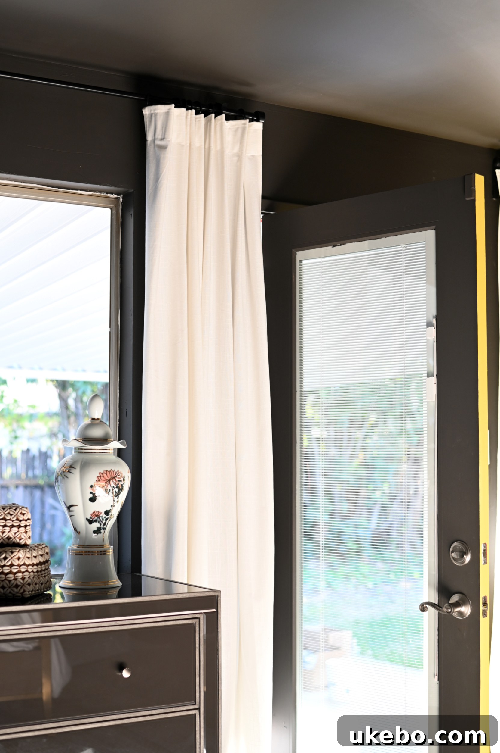
Urbane Bronze is truly a beautiful and captivating chameleon color. Its appearance subtly shifts throughout the day, depending on the natural and artificial light sources. In certain moments, it reads as a rich olive, at others, a sophisticated gray, and then a deep, warm brown. This dynamic quality adds immense depth and interest to the space, ensuring it never feels monotonous. I particularly love how harmoniously it blends with her existing floor tones, creating a seamless and grounded feel. Furthermore, the contrast it creates with Decisive Yellow SW 6902, which we painted on the exterior of the door leading to the backyard, is simply stunning. The pop of vibrant yellow against the deep bronze is an unexpected delight, adding a playful yet sophisticated touch.
The Perfect Choice for a New Beginning
While Urbane Bronze might initially seem like an unexpected pick for Color of the Year, I firmly believe there isn’t a more perfect hue to usher in a new era, especially after the tumultuous ups and downs (mostly downs) of 2020. As an Earth sign (proudly #teamtaurus!), the inherent nature of this color deeply resonates with my soul. Feeling safe, grounded, and secure is fundamental to my well-being, so crafting a space for my sister that so profoundly embodies these qualities has been an incredibly rewarding experience. I sincerely hope that you, my dear readers, can see the profound beauty and calming power I perceive in Urbane Bronze. I encourage you to consider embracing its versatility and depth in your own spaces, whether as a dominant shade or a carefully chosen accent.
So, tell me, friends, what are your thoughts? Do you love this sophisticated neutral, or is it a shade you’re still contemplating? Share your opinions in the comments below! Until next time…