
Hello, fellow home enthusiasts and design adventurers!
There comes a point in every homeowner’s journey when the familiar begins to feel… well, a little too familiar. For me, that moment arrived recently, sparking an undeniable “itch” for something fresh, something new, a delightful transformation right within the heart of our home: the kitchen. As many of you who’ve followed my journey know, I’m blessed with a bit of a nomadic spirit. While moving homes isn’t on the horizon anytime soon, my desire for change is constant. So, when the wanderlust hits, I channel it into refreshing our living spaces.
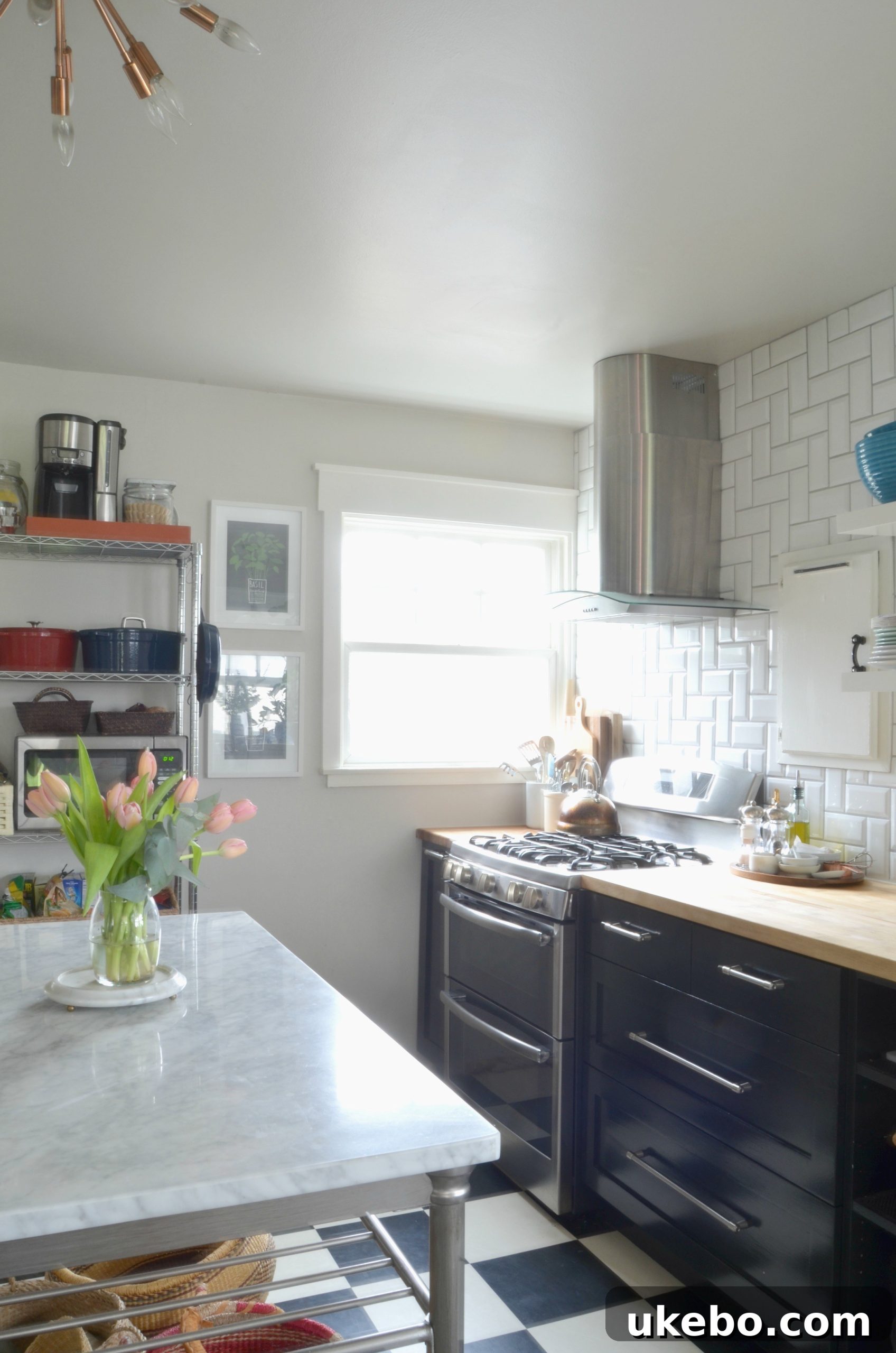
Our cozy bungalow has been our sanctuary for almost three years now – a milestone that truly snuck up on me! Time flies when you’re creating a home, doesn’t it? With this anniversary approaching, my eyes naturally drifted to areas ripe for a revitalizing update. The kitchen cabinets, in particular, had been calling out for a color change for quite some time. The timing couldn’t be more perfect, as we are finally on the cusp of installing our new floor tiles. While I’ve enjoyed the bold statement of our existing black cabinets, I knew that once the new black floors were in, a significant shift would be necessary. The subtle, yet maddening, tonal difference between the current cabinet black and the upcoming floor tile black was simply not going to work. It was a visual discord that grated on my design sensibilities, and I was determined to achieve a harmonious, intentional aesthetic.
Discovering a Palette of Green: From Emerald Dreams to Olive Aspirations
My quest for the perfect kitchen color began nearly a year ago when I stumbled upon the most gorgeous emerald green kitchen I had ever seen. It was an instant love affair, a design revelation that captured my imagination and set my heart firmly on embracing green for our kitchen. The depth, the richness, the sheer elegance of that emerald hue were simply breathtaking:
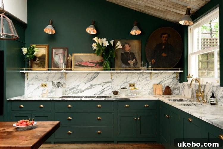
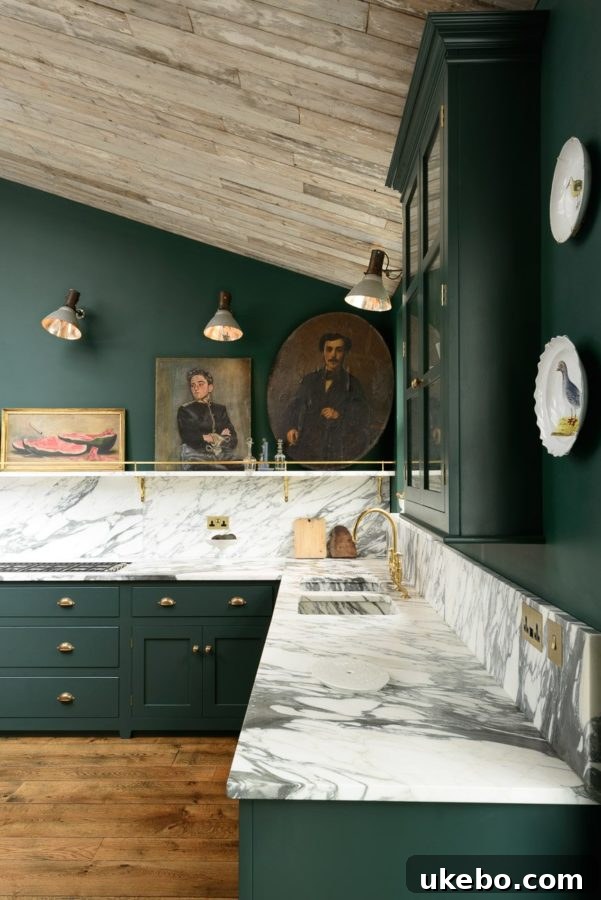
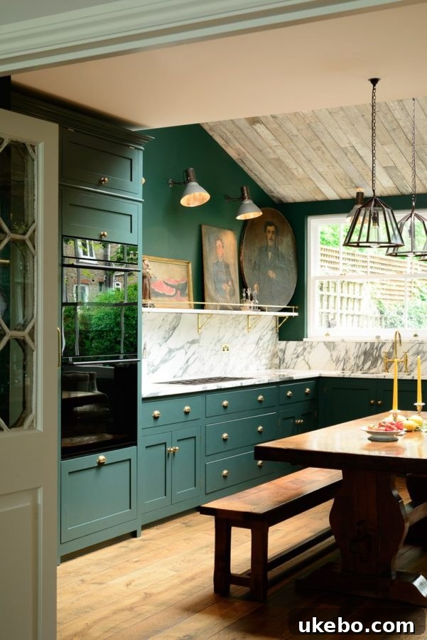
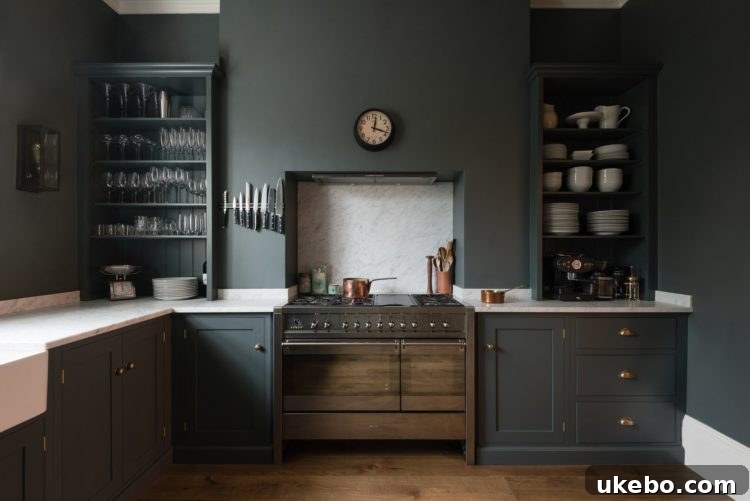
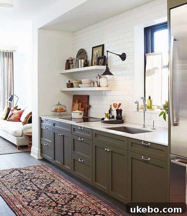
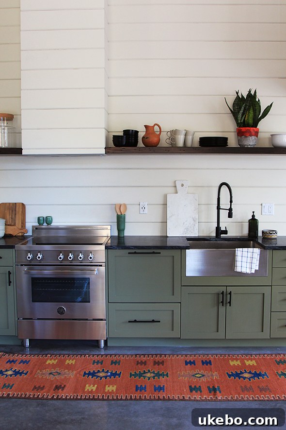
Absolutely stunning, wouldn’t you agree? That initial inspiration was powerful, but as much as I adored the vibrancy of emerald, I knew it wasn’t the right fit for our specific space and desired aesthetic. My vision leaned more towards something earthy, moody, and with a touch more bohemian charm than high glam or traditional elegance. This led me down the path of olive green. Olive felt like a natural extension of my style – grounding, sophisticated, yet incredibly versatile. It promised the deep, captivating green I yearned for, without overwhelming our bungalow’s intimate scale. The idea began to truly take root as I delved into further inspiration, finding beautiful kitchens that perfectly embodied the olive green dream:
 via
via
 via
via
 via
via
The First Attempt: A Lesson in Lighting and Undertones
After what felt like an endless parade of olive samples gracing our cabinet doors – a crucial step in any color selection process, truly test colors in your actual space under varying light conditions! – I finally settled on Benjamin Moore’s Dark Olive. The initial excitement was palpable. Once the first coat went on, I was undeniably smitten with the color. However, as the days progressed and the light shifted, a subtle but significant issue emerged: the color, while beautiful, began to read quite grey, and the distinct olive tones I loved seemed to recede, particularly during certain times of the day. This is a common challenge with paint colors; what looks perfect on a swatch can behave entirely differently when applied to a large surface and influenced by natural and artificial light sources.
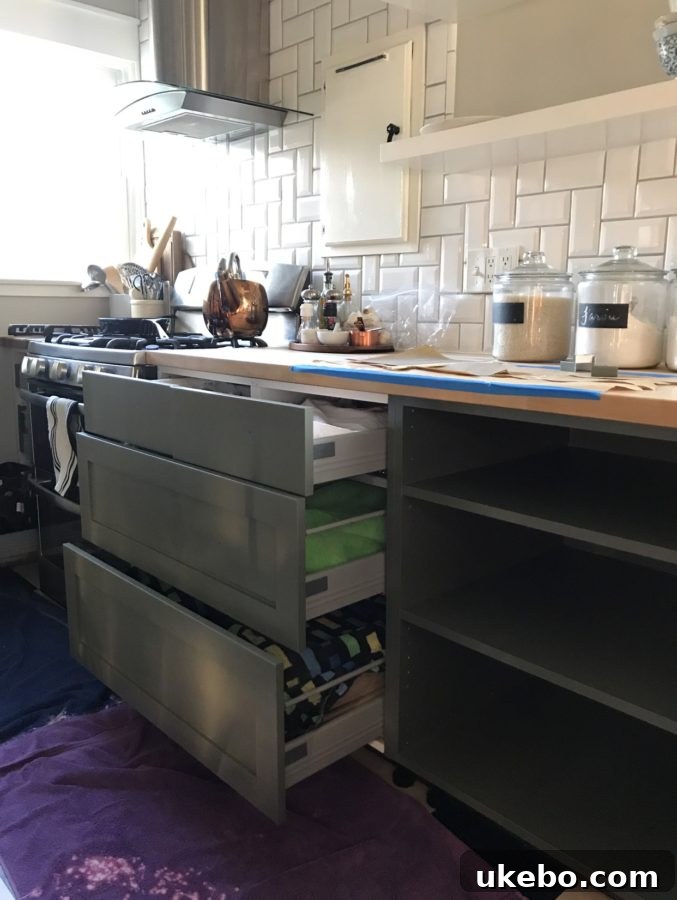
Understanding that a minor adjustment could make all the difference, I took the paint back to Benjamin Moore. Their experts, with their keen eye for color chemistry, were able to tweak the formula. I requested an amplification of the green pigment, a deepening of the overall hue, and a reduction of those elusive grey undertones. The result? A truly gorgeous, rich, and intensely moody olive green that I absolutely adored. It was everything I had envisioned for that earthy, bohemian vibe, and I captured a few shots to showcase its beauty throughout the day:
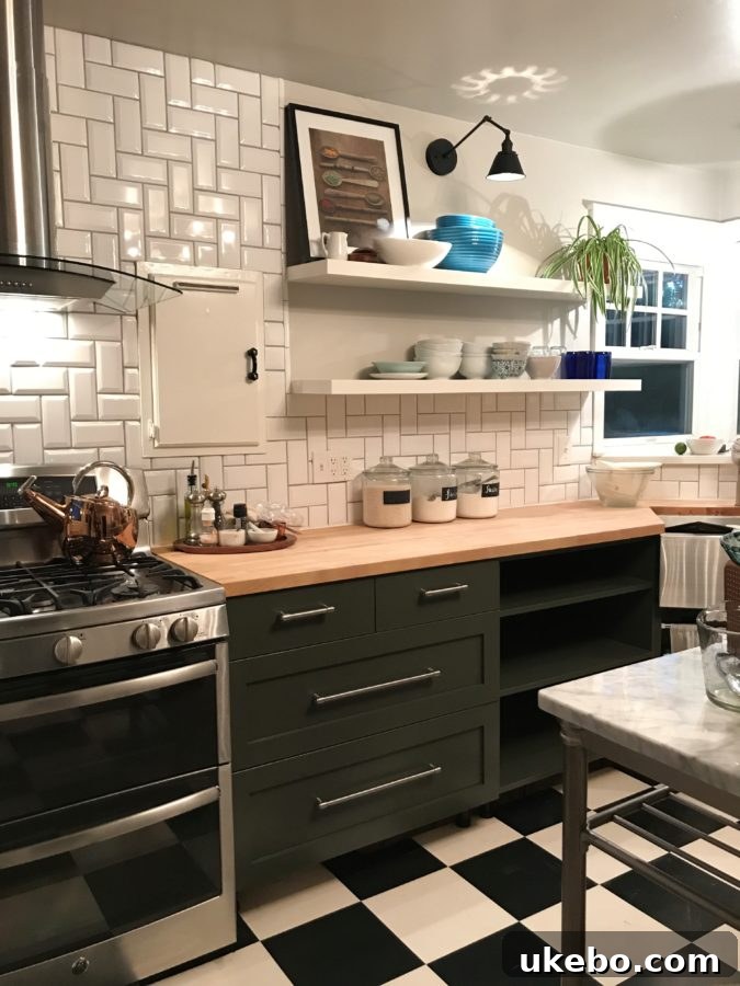
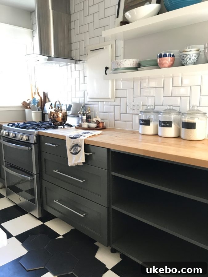
Friends, this color was magnificent. I genuinely loved it. But here’s where the design journey took an unexpected turn: despite my affection for the paint itself, it felt profoundly confusing *in this particular space*. The true test came when I laid down a few of the new black floor tiles, bringing the two key elements of the kitchen together for the first time.
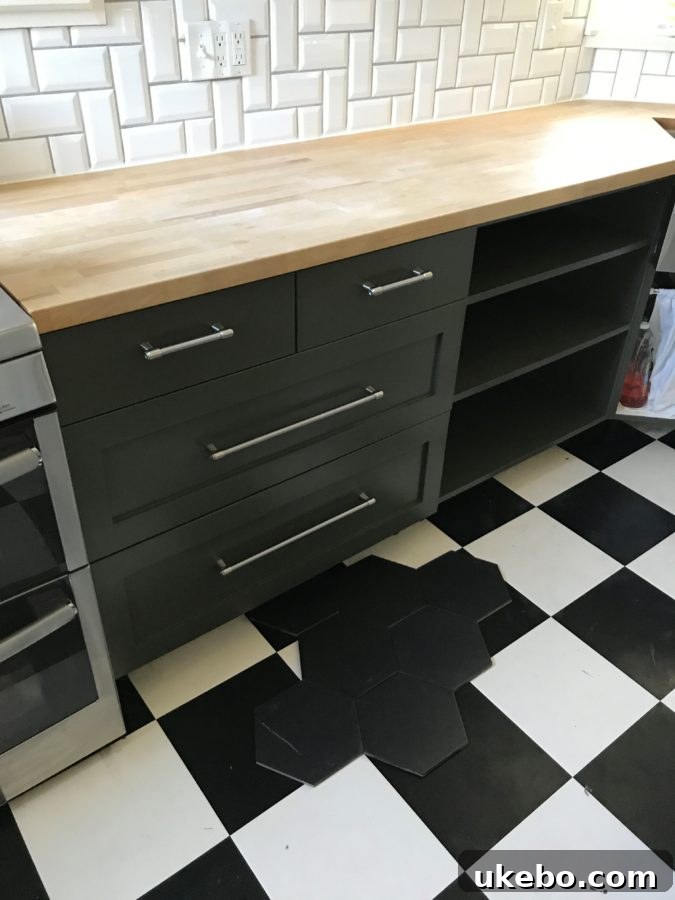
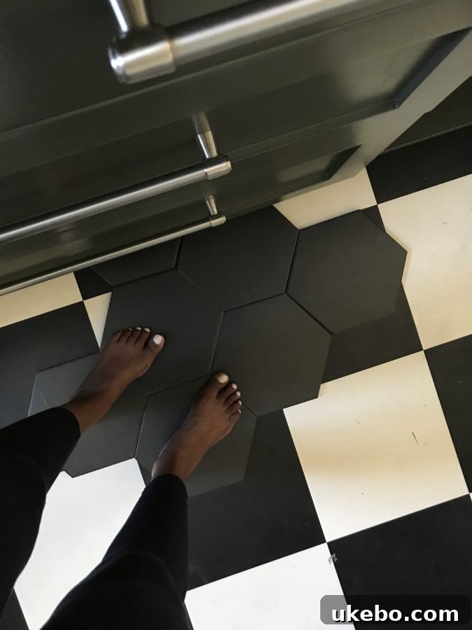
The visual outcome was disheartening. The cabinets and the tiles, instead of complementing each other, seemed to get completely lost, blending into a murky, undefined mass. This was especially evident when experienced in person, creating a visual disconnect that felt undeniably “off.” While I don’t mind a subtle blend between floor and cabinets in some designs, here, the undertones or perhaps the lack of sufficient contrast created an unsettling visual dissonance. A persistent, nagging feeling told me that this was simply not the right direction. And oh, how that feeling stung, for multiple reasons.
First and foremost, as a designer and creative, it’s never easy to witness a carefully crafted vision fail to materialize as hoped. There’s an inherent disappointment when the reality doesn’t align with the dream. Secondly, and perhaps more practically, it was frustrating because I had just invested significant time and effort into painting the cabinets, only to realize I would most likely have to start all over again! Ugh. However, I reminded myself of a small silver lining: our kitchen is quite compact, with only five cabinets. This meant the expense and time required for a redo, while unwelcome, wouldn’t be an insurmountable obstacle.
It’s Just Paint: Embracing Flexibility in Design
Those who know me well understand that I consider myself a very color-confident person. I harbor zero fear when it comes to experimenting with bold hues or making a grand statement with color. Rarely do I second-guess my initial design instincts. Yet, after living with the adjusted olive green cabinets for a couple of days, the truth became undeniable: I simply *had* to change them. I had, for all my confidence, missed the mark. The harmonious balance I sought wasn’t there, and the space wasn’t singing. This realization prompted me to step back, take a deep breath, and approach the challenge from an entirely fresh perspective.
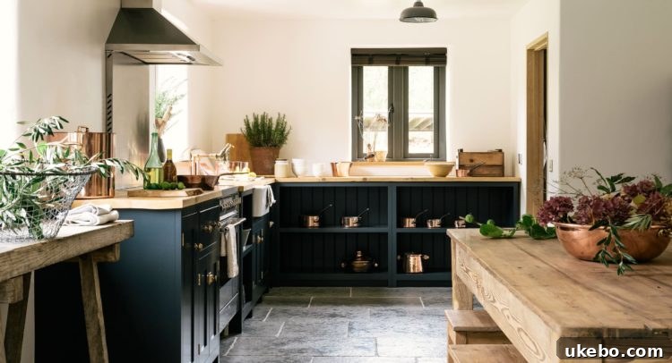
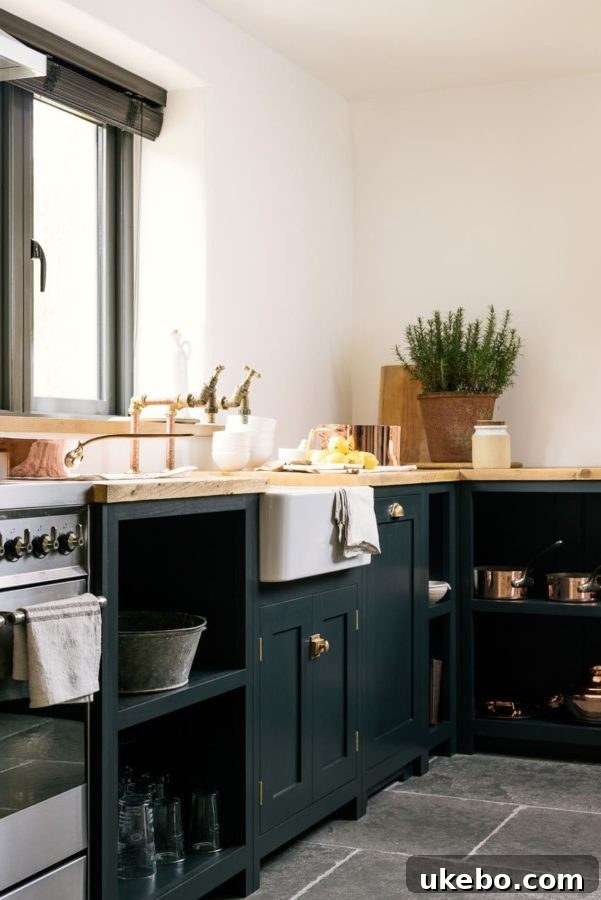
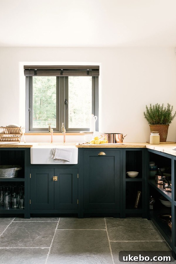
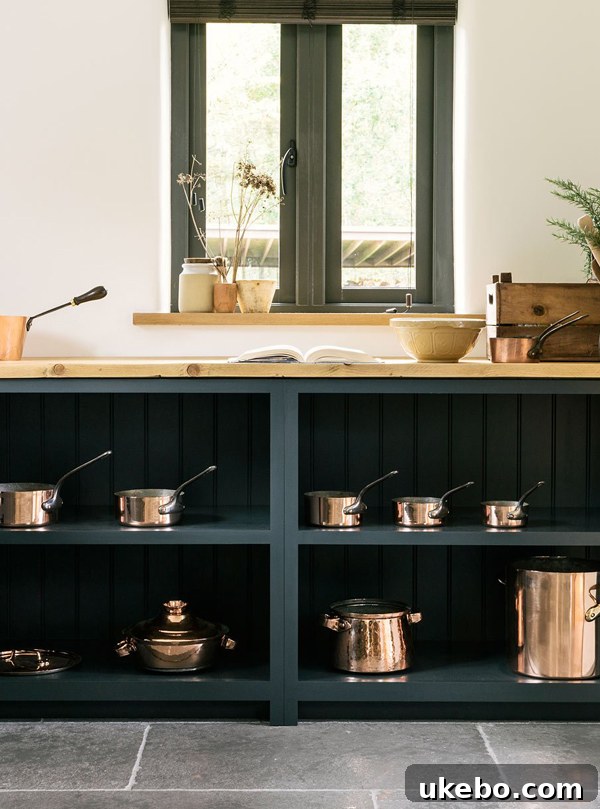
I returned to the drawing board, figuratively speaking, and re-evaluated the core design goals for the space. The overall aspiration remained clear: a kitchen that felt moody, earthy, and distinctly bohemian. I also knew, without a doubt, that I still wanted green cabinets. However, the crucial shift in perspective was acknowledging that they didn’t *have* to be olive green. And, as a fixed point in our design universe, the new black floor tiles were non-negotiable. Once I regrouped and focused on these fundamental facts, a new pathway emerged. I began to consider a green with a more intense, richer tone – something perhaps in the hunter green or jewel-tone family. This deeper, more saturated green, I reasoned, would provide the necessary contrast against the black floors while still honoring the earthy, moody aesthetic. As fate would have it, on the very same day, I stumbled upon another kitchen inspiration that immediately resonated with this refined direction, and I was instantly sold…
 via
via
I mean, come on! Right?! Every single element of this space embodies my forever home kitchen goals. I’m tucking these images away, absolutely certain I’ll be referring to them for years to come when we embark on future dream projects. What captivated me most was the incredible depth of this green, harmoniously contrasted against the lighter wood countertops. And the integration of copper accents – a design choice already happening in our kitchen – was an absolute delight, confirming that this richer green could beautifully accommodate our existing elements. While this particular green leaned a tad bluer than my ultimate preference, it perfectly encapsulated the overall “feel” and ambiance I was striving for: sophisticated, deeply pigmented, and unequivocally inviting.
Feeling significantly more focused, refreshed, and reignited with inspiration, I quickly gathered a few more paint samples. From this curated selection, I chose a color that I am, quite frankly, absolutely crazy about. This past weekend was dedicated to meticulously repainting the cabinets, and they are now in the crucial curing stage. The anticipation is immense! I can hardly wait to pull the entire kitchen back together and share the stunning finished results with you all. In the meantime, for those who follow me on Instagram, you might just catch some sneak peeks in my stories!
The Right Foundation: A Primer Story for Durable Cabinet Painting
On a related note, and speaking from experience, if you’re undertaking a cabinet painting project – especially if you’re dealing with challenging surfaces like Ikea laminate cabinet boxes and doors – you absolutely NEEEEED to get your hands on Stix by Inslx. This product was a complete game-changer for me. For years, Zinsser’s Cover Stain and BIN 123 have been my reliable go-to primers, and they are excellent products. However, Stix takes adhesion and versatility to an entirely new level. From the moment I tried it, I knew I had found my forever primer. It’s a Benjamin Moore brand, which immediately boosted my trust radar, but experiencing its superior performance firsthand truly cemented its place in my toolkit. The combination of this incredible bonding primer with my favorite topcoat, Benjamin Moore Advance paint, means that this new finish will not only look professional but will also be exceptionally durable, resisting chipping and peeling even on the trickiest laminate surfaces. This is critical for high-traffic areas like kitchen cabinets, ensuring your hard work stands the test of time.
Thank you for sticking with me through this rather lengthy, but hopefully insightful, journey. I felt it was incredibly important to share the full process, including the moments of doubt and course correction. It’s a powerful reminder that in home design, just like in life, we don’t always get it right on the very first try. You are certainly not alone in facing these design dilemmas; it happens to the best of us, even seasoned designers! The key is to remain adaptable, to refocus on your ultimate goal, and to keep pushing forward. With perseverance and an open mind, you will undoubtedly achieve the beautiful results you envision. And always remember this liberating truth: it’s just paint! It can always be changed, offering endless possibilities for transformation and personalization in your cherished home.
Until next time, friends, may your design endeavors be joyful and inspiring!
Xo-Shavonda
Hello, fellow home enthusiasts and design adventurers!
There comes a point in every homeowner’s journey when the familiar begins to feel… well, a little too familiar. For me, that moment arrived recently, sparking an undeniable “itch” for something fresh, something new, a delightful transformation right within the heart of our home: the kitchen. As many of you who’ve followed my journey know, I’m blessed with a bit of a nomadic spirit. While moving homes isn’t on the horizon anytime soon, my desire for change is constant. So, when the wanderlust hits, I channel it into refreshing our living spaces.
Our cozy bungalow has been our sanctuary for almost three years now – a milestone that truly snuck up on me! Time flies when you’re creating a home, doesn’t it? With this anniversary approaching, my eyes naturally drifted to areas ripe for a revitalizing update. The kitchen cabinets, in particular, had been calling out for a color change for quite some time. The timing couldn’t be more perfect, as we are finally on the cusp of installing our new floor tiles. While I’ve enjoyed the bold statement of our existing black cabinets, I knew that once the new black floors were in, a significant shift would be necessary. The subtle, yet maddening, tonal difference between the current cabinet black and the upcoming floor tile black was simply not going to work. It was a visual discord that grated on my design sensibilities, and I was determined to achieve a harmonious, intentional aesthetic.
Discovering a Palette of Green: From Emerald Dreams to Olive Aspirations
My quest for the perfect kitchen color began nearly a year ago when I stumbled upon the most gorgeous emerald green kitchen I had ever seen. It was an instant love affair, a design revelation that captured my imagination and set my heart firmly on embracing green for our kitchen. The depth, the richness, the sheer elegance of that emerald hue were simply breathtaking:
Absolutely stunning, wouldn’t you agree? That initial inspiration was powerful, but as much as I adored the vibrancy of emerald, I knew it wasn’t the right fit for our specific space and desired aesthetic. My vision leaned more towards something earthy, moody, and with a touch more bohemian charm than high glam or traditional elegance. This led me down the path of olive green. Olive felt like a natural extension of my style – grounding, sophisticated, yet incredibly versatile. It promised the deep, captivating green I yearned for, without overwhelming our bungalow’s intimate scale. The idea began to truly take root as I delved into further inspiration, finding beautiful kitchens that perfectly embodied the olive green dream:
via
via
via
The First Attempt: A Lesson in Lighting and Undertones
After what felt like an endless parade of olive samples gracing our cabinet doors – a crucial step in any color selection process, truly test colors in your actual space under varying light conditions! – I finally settled on Benjamin Moore’s Dark Olive. The initial excitement was palpable. Once the first coat went on, I was undeniably smitten with the color. However, as the days progressed and the light shifted, a subtle but significant issue emerged: the color, while beautiful, began to read quite grey, and the distinct olive tones I loved seemed to recede, particularly during certain times of the day. This is a common challenge with paint colors; what looks perfect on a swatch can behave entirely differently when applied to a large surface and influenced by natural and artificial light sources.
Understanding that a minor adjustment could make all the difference, I took the paint back to Benjamin Moore. Their experts, with their keen eye for color chemistry, were able to tweak the formula. I requested an amplification of the green pigment, a deepening of the overall hue, and a reduction of those elusive grey undertones. The result? A truly gorgeous, rich, and intensely moody olive green that I absolutely adored. It was everything I had envisioned for that earthy, bohemian vibe, and I captured a few shots to showcase its beauty throughout the day:
Friends, this color was magnificent. I genuinely loved it. But here’s where the design journey took an unexpected turn: despite my affection for the paint itself, it felt profoundly confusing *in this particular space*. The true test came when I laid down a few of the new black floor tiles, bringing the two key elements of the kitchen together for the first time.
The visual outcome was disheartening. The cabinets and the tiles, instead of complementing each other, seemed to get completely lost, blending into a murky, undefined mass. This was especially evident when experienced in person, creating a visual disconnect that felt undeniably “off.” While I don’t mind a subtle blend between floor and cabinets in some designs, here, the undertones or perhaps the lack of sufficient contrast created an unsettling visual dissonance. A persistent, nagging feeling told me that this was simply not the right direction. And oh, how that feeling stung, for multiple reasons.
First and foremost, as a designer and creative, it’s never easy to witness a carefully crafted vision fail to materialize as hoped. There’s an inherent disappointment when the reality doesn’t align with the dream. Secondly, and perhaps more practically, it was frustrating because I had just invested significant time and effort into painting the cabinets, only to realize I would most likely have to start all over again! Ugh. However, I reminded myself of a small silver lining: our kitchen is quite compact, with only five cabinets. This meant the expense and time required for a redo, while unwelcome, wouldn’t be an insurmountable obstacle.
It’s Just Paint: Embracing Flexibility in Design
Those who know me well understand that I consider myself a very color-confident person. I harbor zero fear when it comes to experimenting with bold hues or making a grand statement with color. Rarely do I second-guess my initial design instincts. Yet, after living with the adjusted olive green cabinets for a couple of days, the truth became undeniable: I simply *had* to change them. I had, for all my confidence, missed the mark. The harmonious balance I sought wasn’t there, and the space wasn’t singing. This realization prompted me to step back, take a deep breath, and approach the challenge from an entirely fresh perspective.
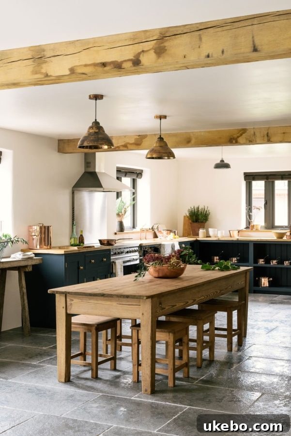
I returned to the drawing board, figuratively speaking, and re-evaluated the core design goals for the space. The overall aspiration remained clear: a kitchen that felt moody, earthy, and distinctly bohemian. I also knew, without a doubt, that I still wanted green cabinets. However, the crucial shift in perspective was acknowledging that they didn’t *have* to be olive green. And, as a fixed point in our design universe, the new black floor tiles were non-negotiable. Once I regrouped and focused on these fundamental facts, a new pathway emerged. I began to consider a green with a more intense, richer tone – something perhaps in the hunter green or jewel-tone family. This deeper, more saturated green, I reasoned, would provide the necessary contrast against the black floors while still honoring the earthy, moody aesthetic. As fate would have it, on the very same day, I stumbled upon another kitchen inspiration that immediately resonated with this refined direction, and I was instantly sold…
via
I mean, come on! Right?! Every single element of this space embodies my forever home kitchen goals. I’m tucking these images away, absolutely certain I’ll be referring to them for years to come when we embark on future dream projects. What captivated me most was the incredible depth of this green, harmoniously contrasted against the lighter wood countertops. And the integration of copper accents – a design choice already happening in our kitchen – was an absolute delight, confirming that this richer green could beautifully accommodate our existing elements. While this particular green leaned a tad bluer than my ultimate preference, it perfectly encapsulated the overall “feel” and ambiance I was striving for: sophisticated, deeply pigmented, and unequivocally inviting.
Feeling significantly more focused, refreshed, and reignited with inspiration, I quickly gathered a few more paint samples. From this curated selection, I chose a color that I am, quite frankly, absolutely crazy about. This past weekend was dedicated to meticulously repainting the cabinets, and they are now in the crucial curing stage. The anticipation is immense! I can hardly wait to pull the entire kitchen back together and share the stunning finished results with you all. In the meantime, for those who follow me on Instagram, you might just catch some sneak peeks in my stories!
The Right Foundation: A Primer Story for Durable Cabinet Painting
On a related note, and speaking from experience, if you’re undertaking a cabinet painting project – especially if you’re dealing with challenging surfaces like Ikea laminate cabinet boxes and doors – you absolutely NEEEEED to get your hands on Stix by Inslx. This product was a complete game-changer for me. For years, Zinsser’s Cover Stain and BIN 123 have been my reliable go-to primers, and they are excellent products. However, Stix takes adhesion and versatility to an entirely new level. From the moment I tried it, I knew I had found my forever primer. It’s a Benjamin Moore brand, which immediately boosted my trust radar, but experiencing its superior performance firsthand truly cemented its place in my toolkit. The combination of this incredible bonding primer with my favorite topcoat, Benjamin Moore Advance paint, means that this new finish will not only look professional but will also be exceptionally durable, resisting chipping and peeling even on the trickiest laminate surfaces. This is critical for high-traffic areas like kitchen cabinets, ensuring your hard work stands the test of time.
Thank you for sticking with me through this rather lengthy, but hopefully insightful, journey. I felt it was incredibly important to share the full process, including the moments of doubt and course correction. It’s a powerful reminder that in home design, just like in life, we don’t always get it right on the very first try. You are certainly not alone in facing these design dilemmas; it happens to the best of us, even seasoned designers! The key is to remain adaptable, to refocus on your ultimate goal, and to keep pushing forward. With perseverance and an open mind, you will undoubtedly achieve the beautiful results you envision. And always remember this liberating truth: it’s just paint! It can always be changed, offering endless possibilities for transformation and personalization in your cherished home.
Until next time, friends, may your design endeavors be joyful and inspiring!
Xo-Shavonda