
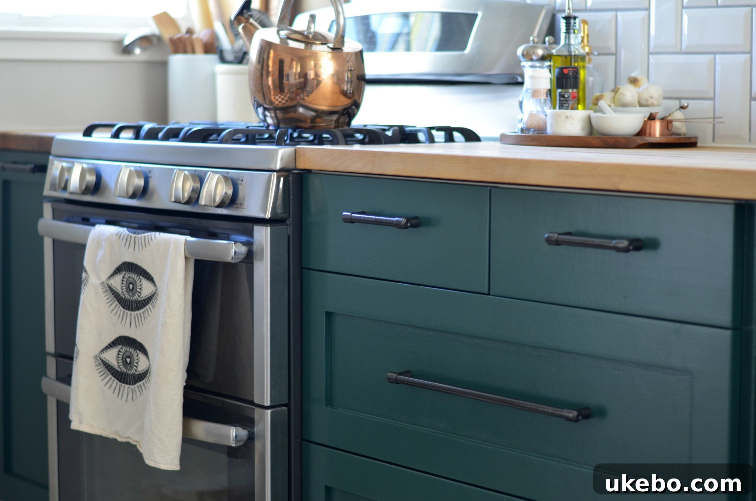
A Kitchen’s Redemption: From Olive-Grey Blunder to Hunter Green Perfection
Hello, fellow home enthusiasts! Today marks a moment I’ve been eager to share for quite some time – a comprehensive, long-overdue update on our beloved kitchen transformation. If you’ve been following along, you might recall my previous post where I candidly discussed a significant design misstep: my initial choice of an olive-grey cabinet color. It was a beautiful shade in its own right, but simply didn’t harmonize with the vision I had for this central space in our home. Today, I’m thrilled to unveil the “second half” of that story, detailing how we navigated back to a path of design triumph and achieved the kitchen of our dreams.
Home renovation, especially DIY projects, often involves a journey of trial and error. My “big miss” with the first paint color was a valuable lesson in trusting intuition and understanding that sometimes, even well-intentioned choices don’t quite hit the mark. The initial olive-grey, while trending and aesthetically pleasing in many contexts, just didn’t bring the depth or warmth I craved for our bungalow kitchen. It felt… off. Recognizing this was the first step towards rectifying it, and that realization ignited a new quest for the perfect hue.
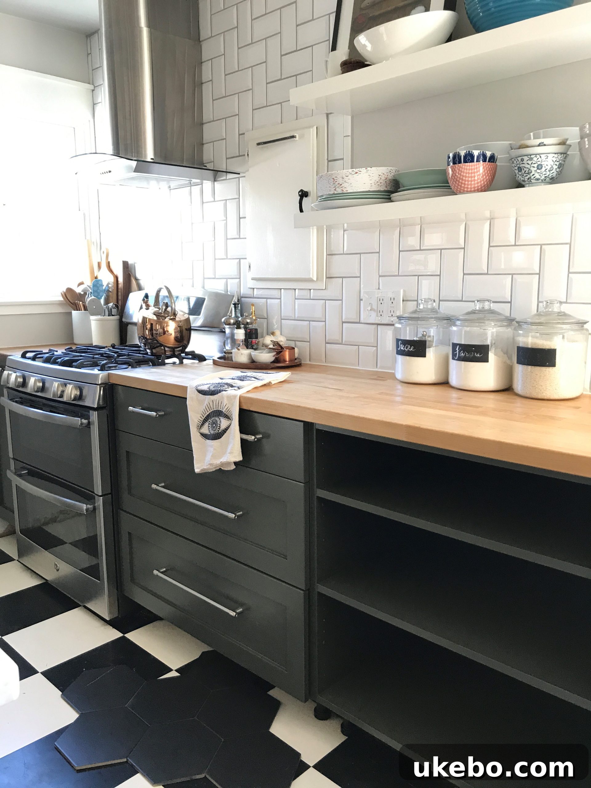
The Quest for the Perfect Hue: Embracing Depth and Mood
After acknowledging that the olivey-grey wasn’t making the impact I desired, it was time to pivot. Armed with a renewed sense of purpose and a clearer vision, I meticulously cleaned and prepped the cabinets with a quick coat of primer. This fresh canvas allowed me to start anew, free from the previous color’s influence. My next stop was the paint store, where I aimed to gather a new selection of samples that truly spoke to the aesthetic I was striving for.
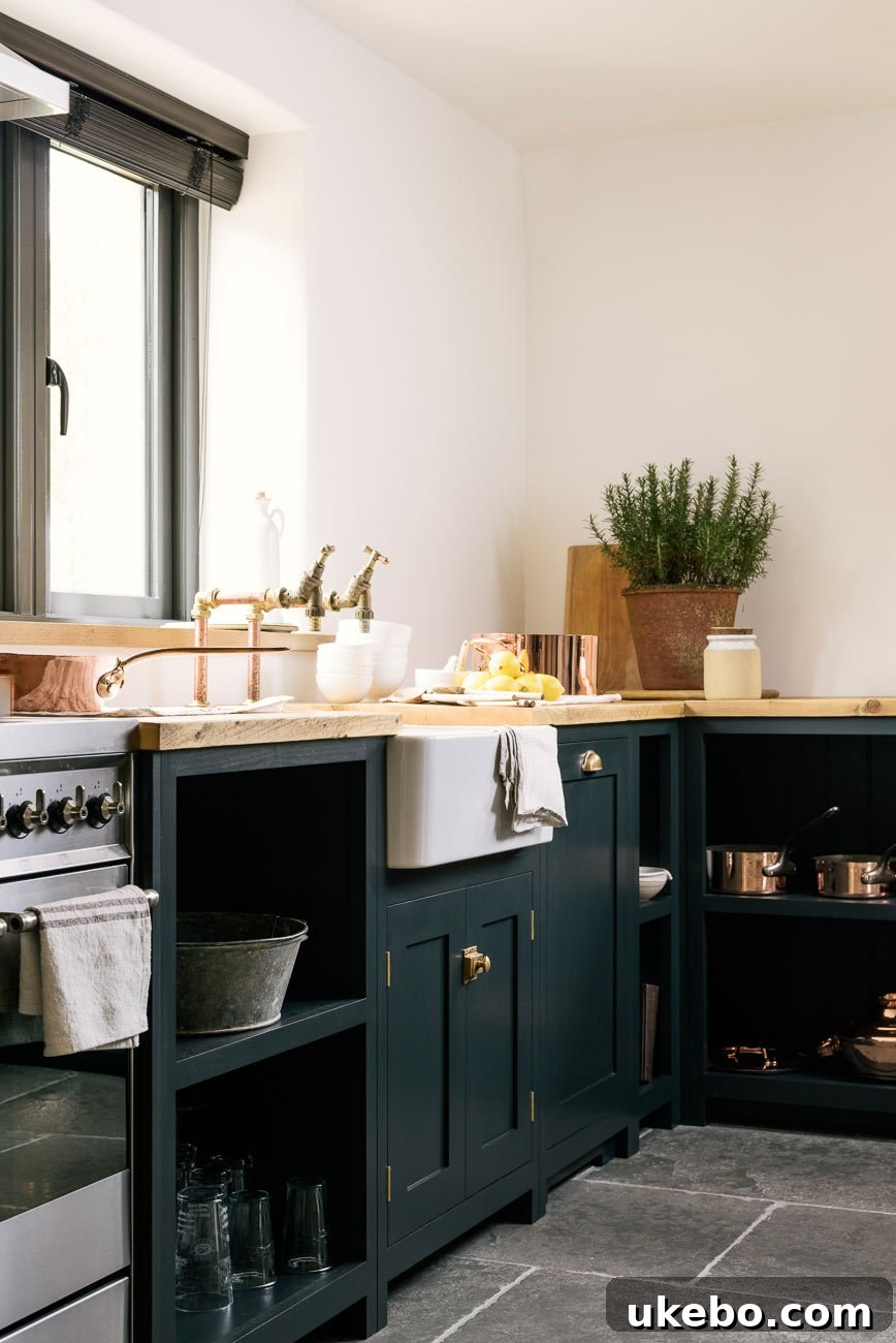
Inspiration via DeVOL Kitchens
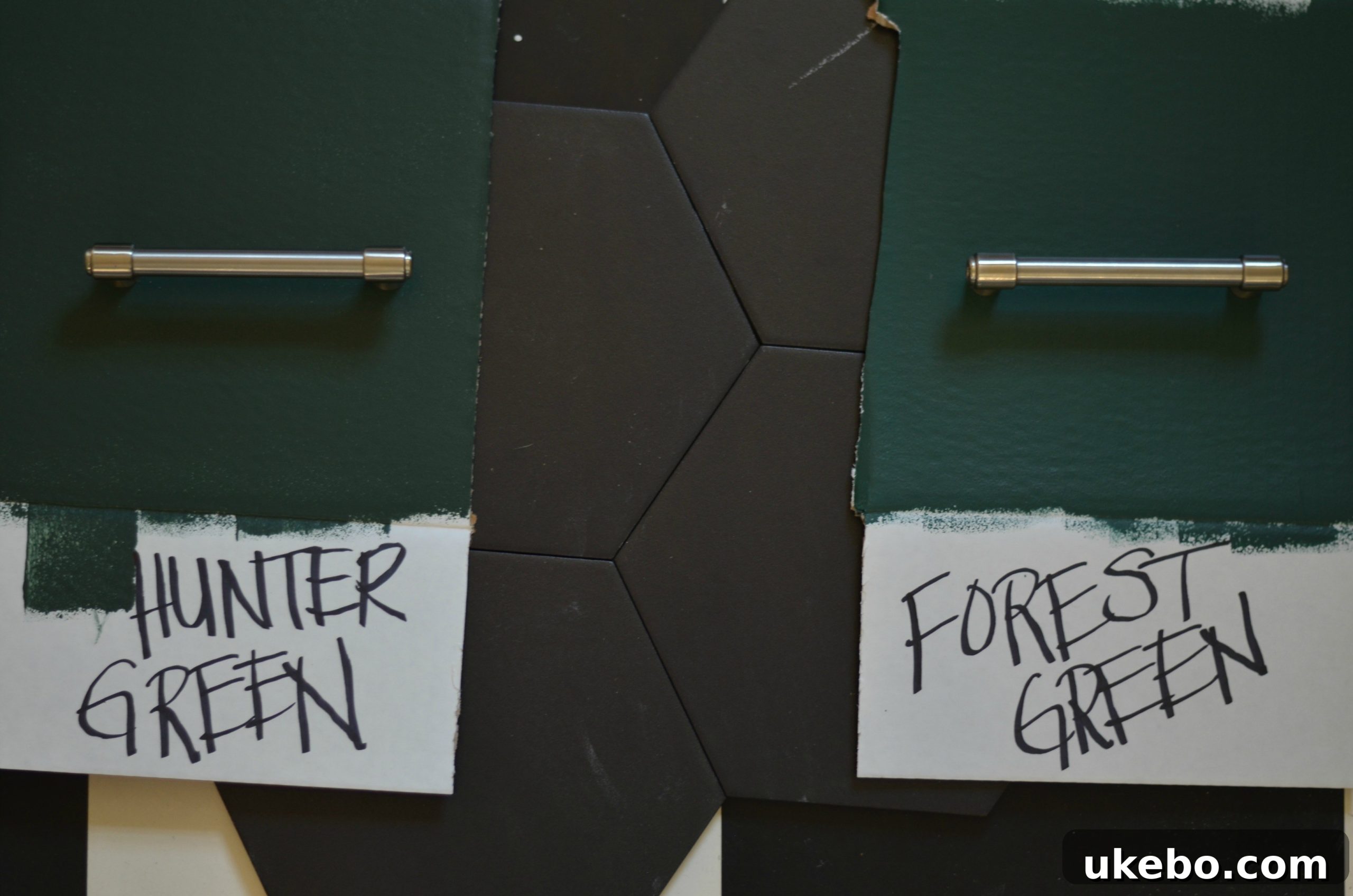
My inspiration this time around was drawn from images of kitchens that exuded a sense of luxurious depth and sophisticated moodiness. While I wasn’t fixated on replicating a specific shade, the rich, captivating tones I observed in these spaces became my guiding principle. I was looking for a color that had significant gravitas, something that would anchor the kitchen and make a statement without overpowering the room. After much deliberation and swatching, I narrowed my choices down to two exquisite contenders from Benjamin Moore: Hunter Green and Forest Green.
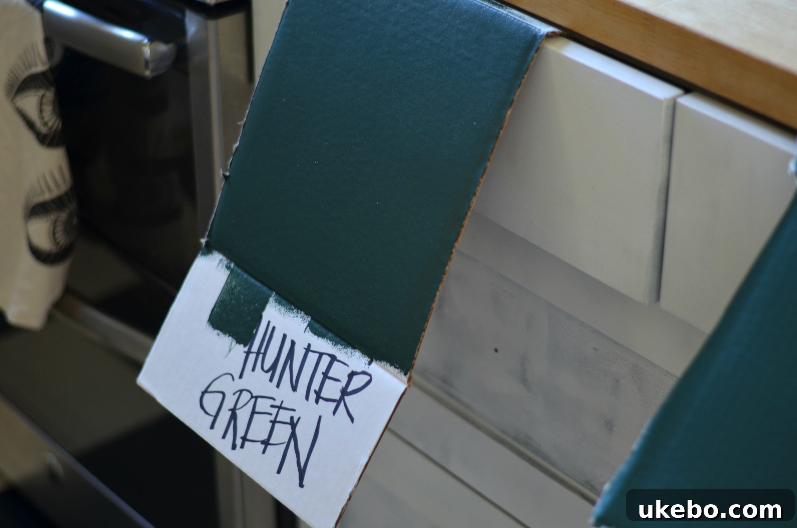
Choosing between these two was surprisingly challenging. Both shades were remarkably similar, yet each possessed a subtle, distinct character. It’s often in these minute differences that the true personality of a space is defined. The process involved painting large swatches on different cabinet doors and observing them throughout the day under varying light conditions – natural daylight, overcast skies, and evening artificial light. This crucial step revealed how each color interacted with our home’s unique ambiance, a vital consideration for any successful paint project.
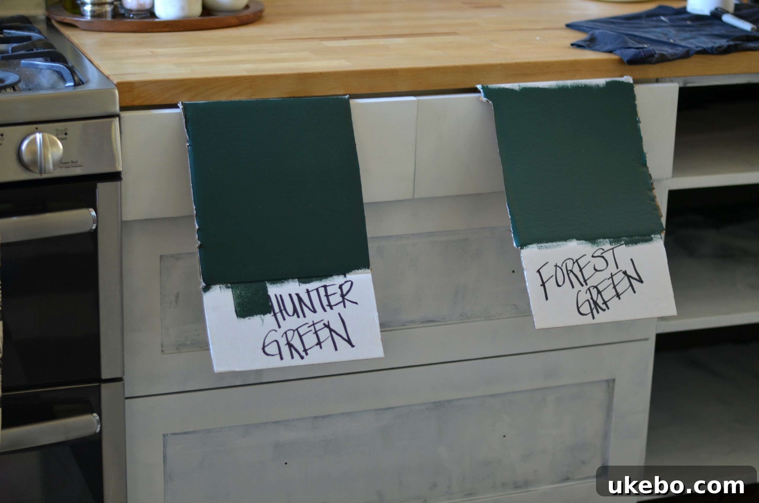
The colors were indeed very similar, but the slight difference in their undertones and depth was perceptible enough to make a decision.
The Final Decision: Embracing Benjamin Moore Hunter Green
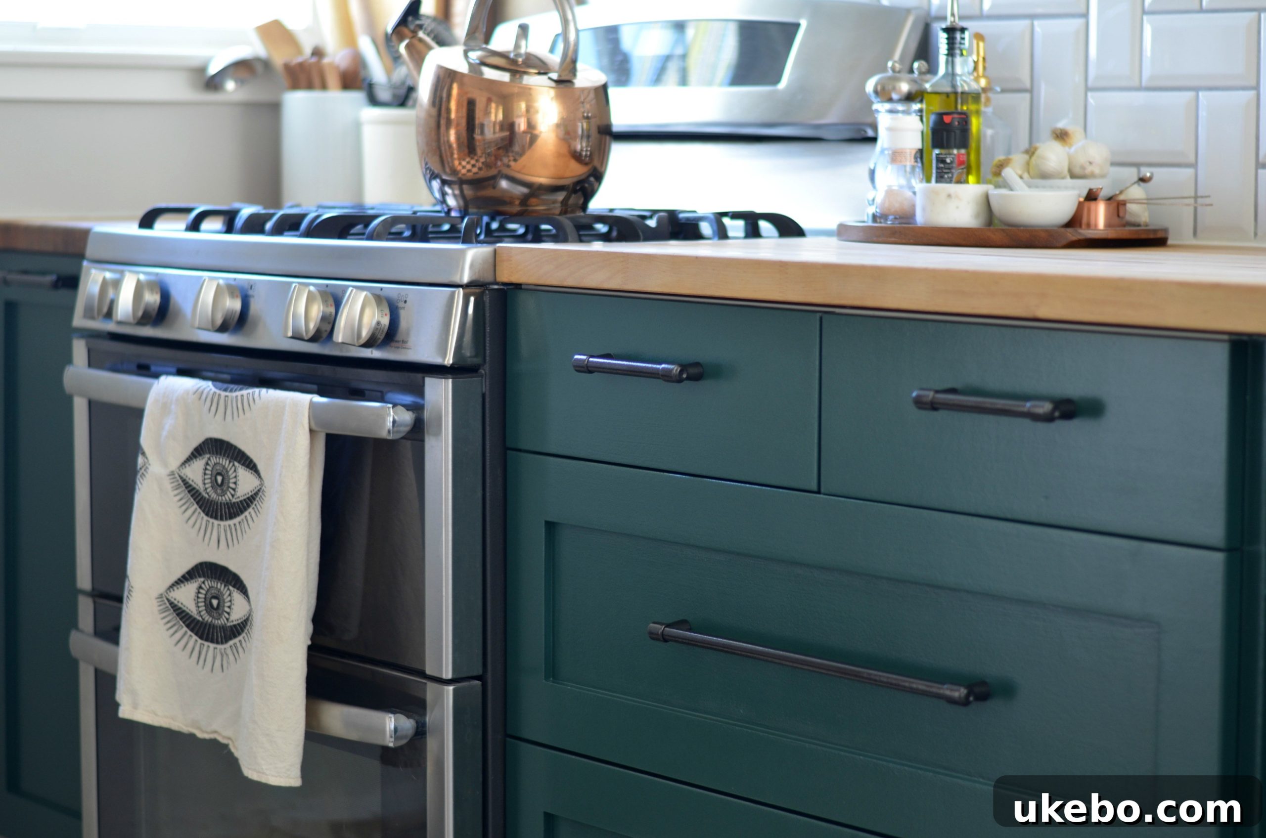
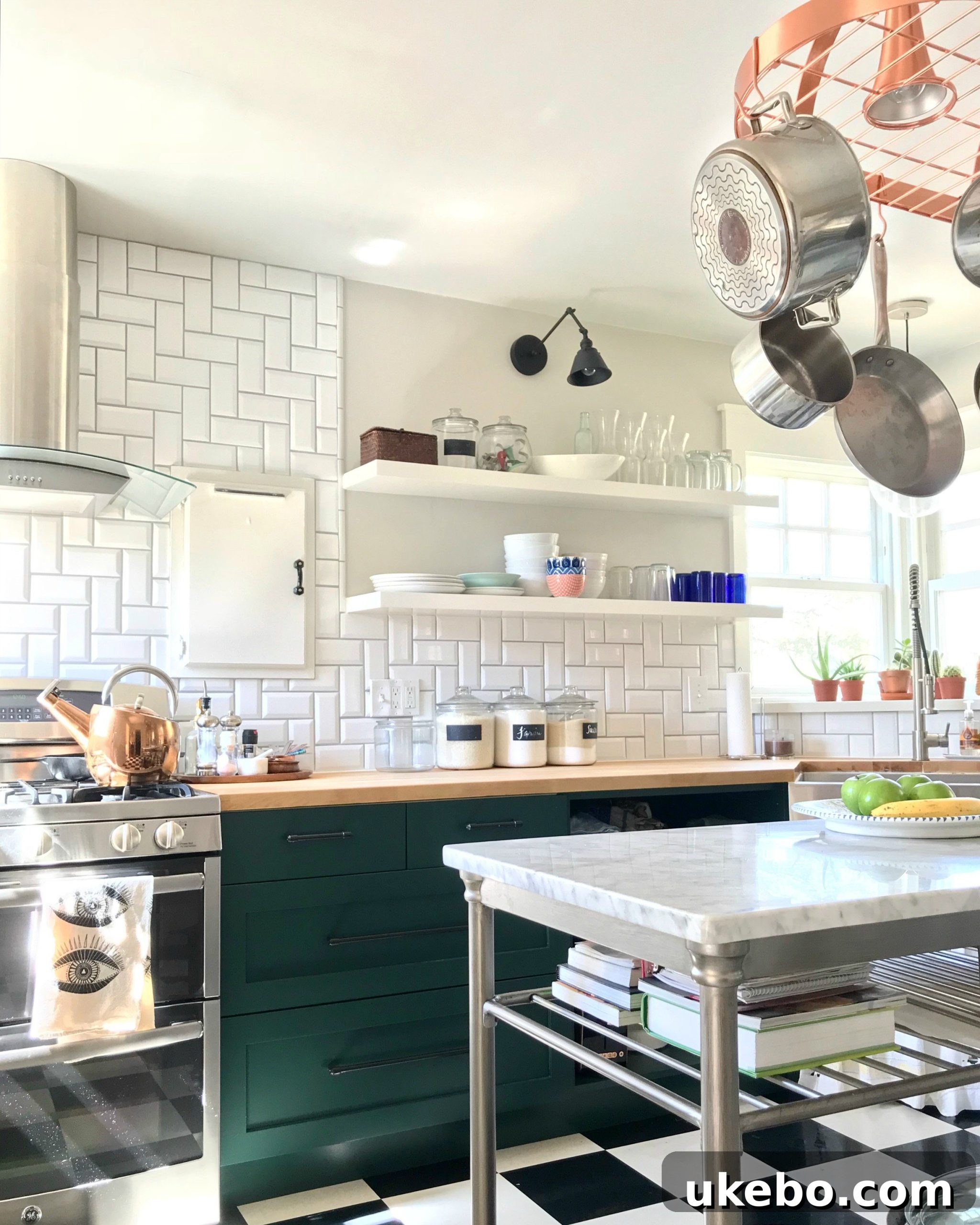
Ultimately, the scales tipped in favor of Benjamin Moore’s Hunter Green. What drew me to it was its undeniable richness and a slightly deeper undertone compared to Forest Green. It had an almost inky quality that promised to deliver the sophisticated, moody aesthetic I yearned for. Crucially, I adored how it beautifully contrasted with our black hex tiles, creating a cohesive and visually striking foundation for the entire kitchen. The interplay between the deep green and the dark tiles immediately felt right, signaling that this was the color meant for our space.
The Painting Process: A Durable and Beautiful Finish
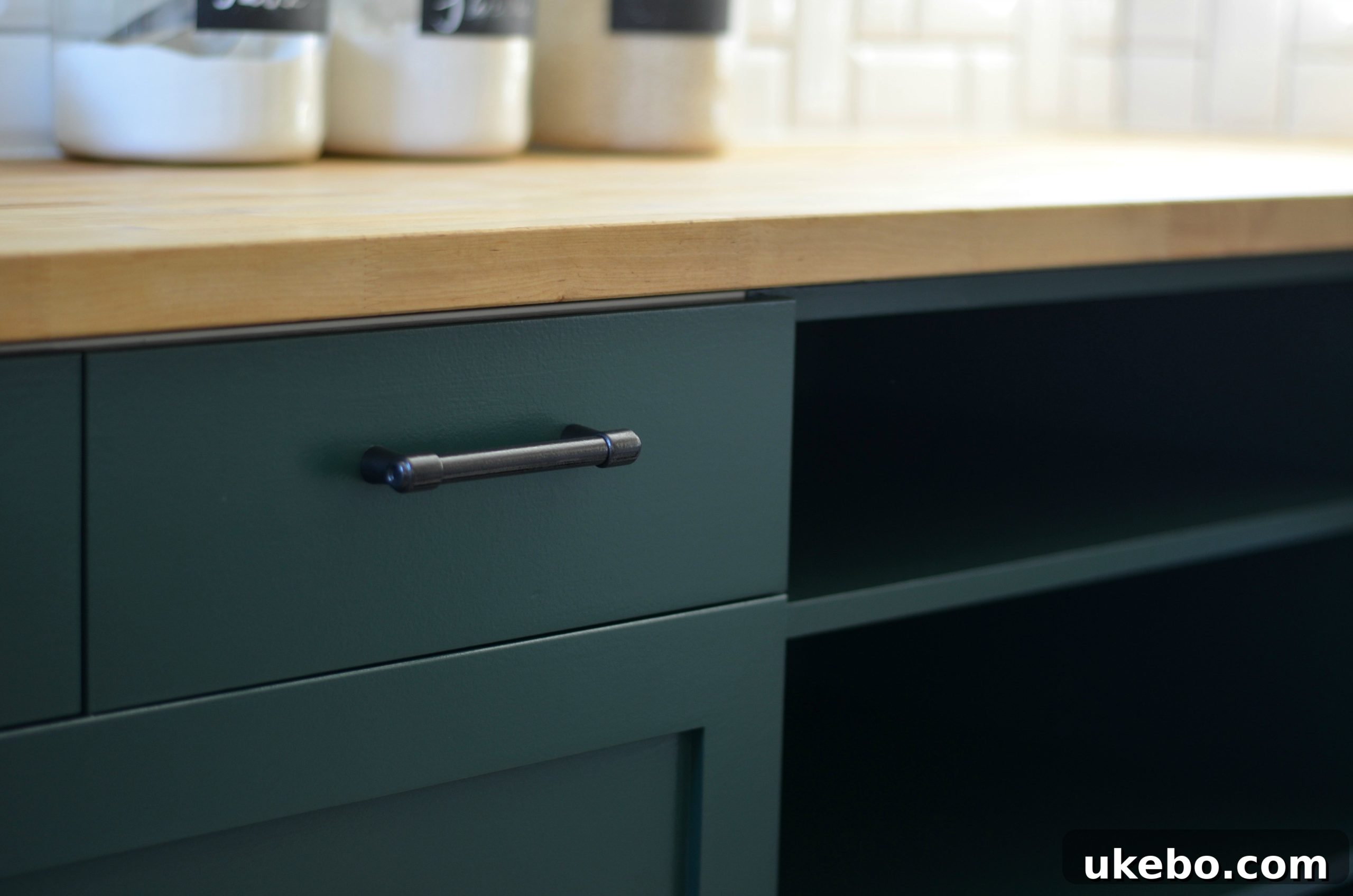
For the actual application, I turned to my absolute favorite paint for cabinets and furniture: Benjamin Moore Advance. This oil-enriched alkyd paint is renowned for its exceptional durability, smooth finish, and superior flow and leveling properties, making it an ideal choice for high-traffic areas like kitchen cabinets. I opted for a Satin finish, which strikes a perfect balance between a subtle sheen that’s easy to clean and a refined, elegant look that isn’t overly glossy. Applying two meticulous coats ensured a rich, even color and a resilient surface that would stand up to daily use for years to come.
The secret to a professional-looking paint job on cabinets lies in meticulous preparation and patience. Beyond priming, it involves thorough cleaning, light sanding between coats for adhesion, and allowing ample drying time. Using high-quality brushes and rollers designed for smooth finishes also makes a significant difference. The transformation was astounding; the Hunter Green breathed new life into the kitchen, providing the exact blend of warmth, character, and sophistication I had envisioned.
Revitalizing Existing Hardware for a Cohesive Look
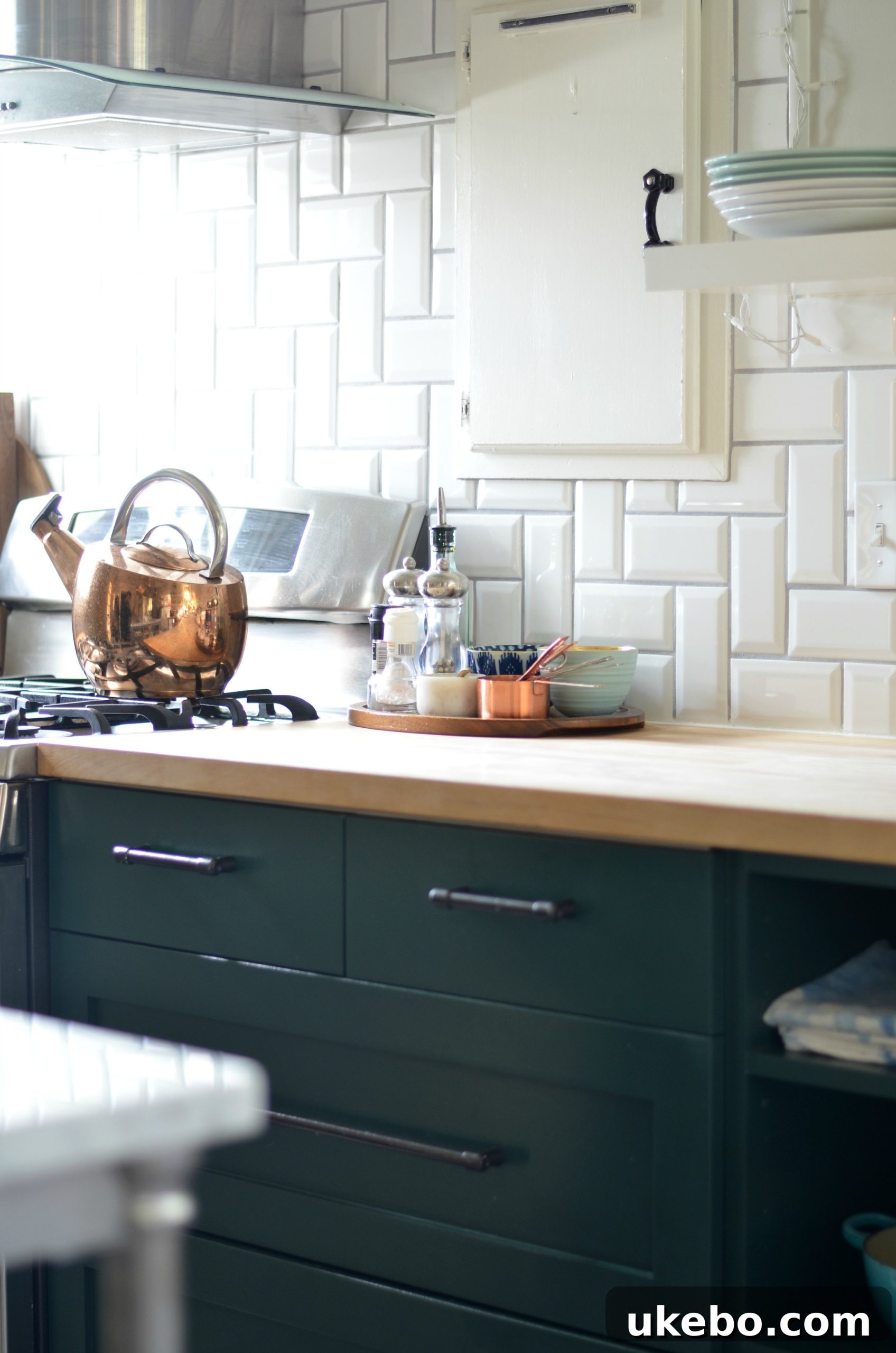
To further enhance the cabinets’ new aesthetic and tie the entire design together, I opted for a simple yet effective hardware refresh. Instead of investing in new pulls and knobs, I decided to spray paint our existing hardware. I had some black hammered finish spray paint readily available in the garage, which turned out to be the perfect solution. This not only saved on cost but also allowed us to maintain a consistent style while introducing a modern, industrial touch. The hammered texture added an interesting dimension, and the black finish beautifully complemented the deep green cabinets and black hex floor tiles.
The Power of Green: A Kitchen’s New Soul
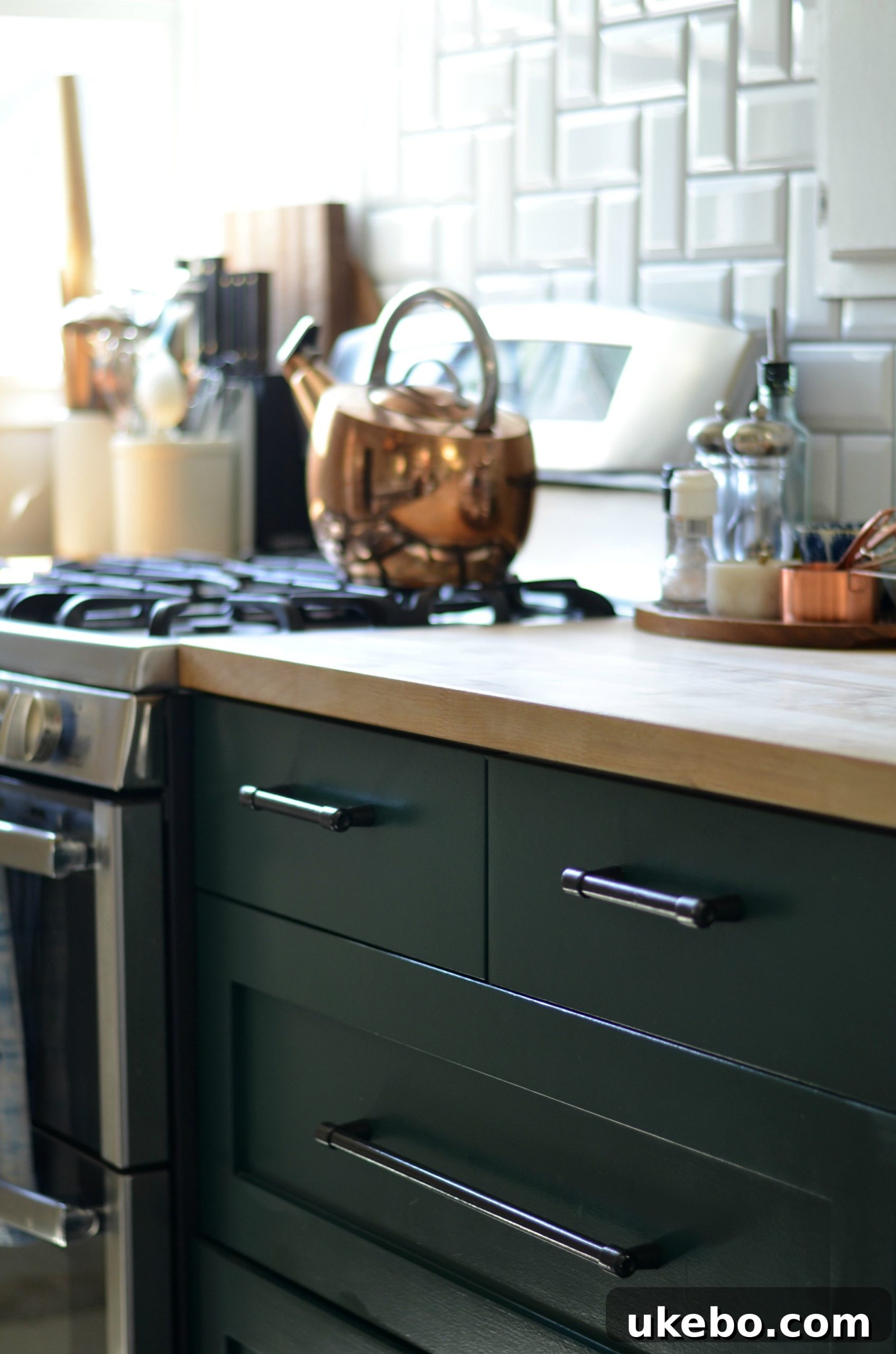
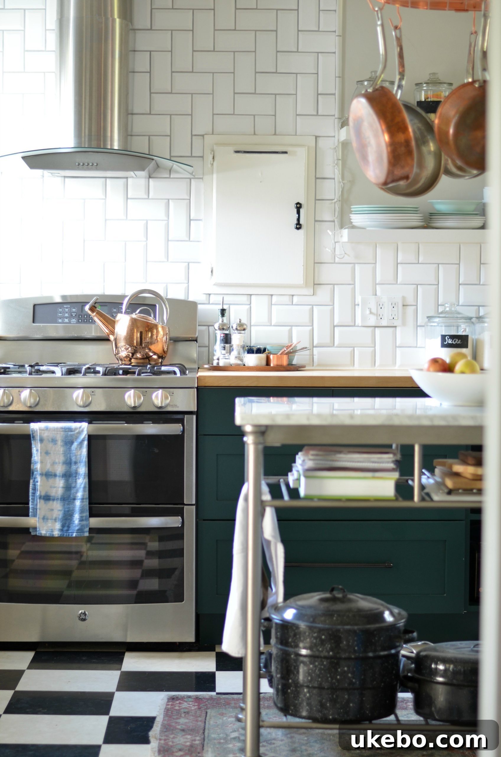
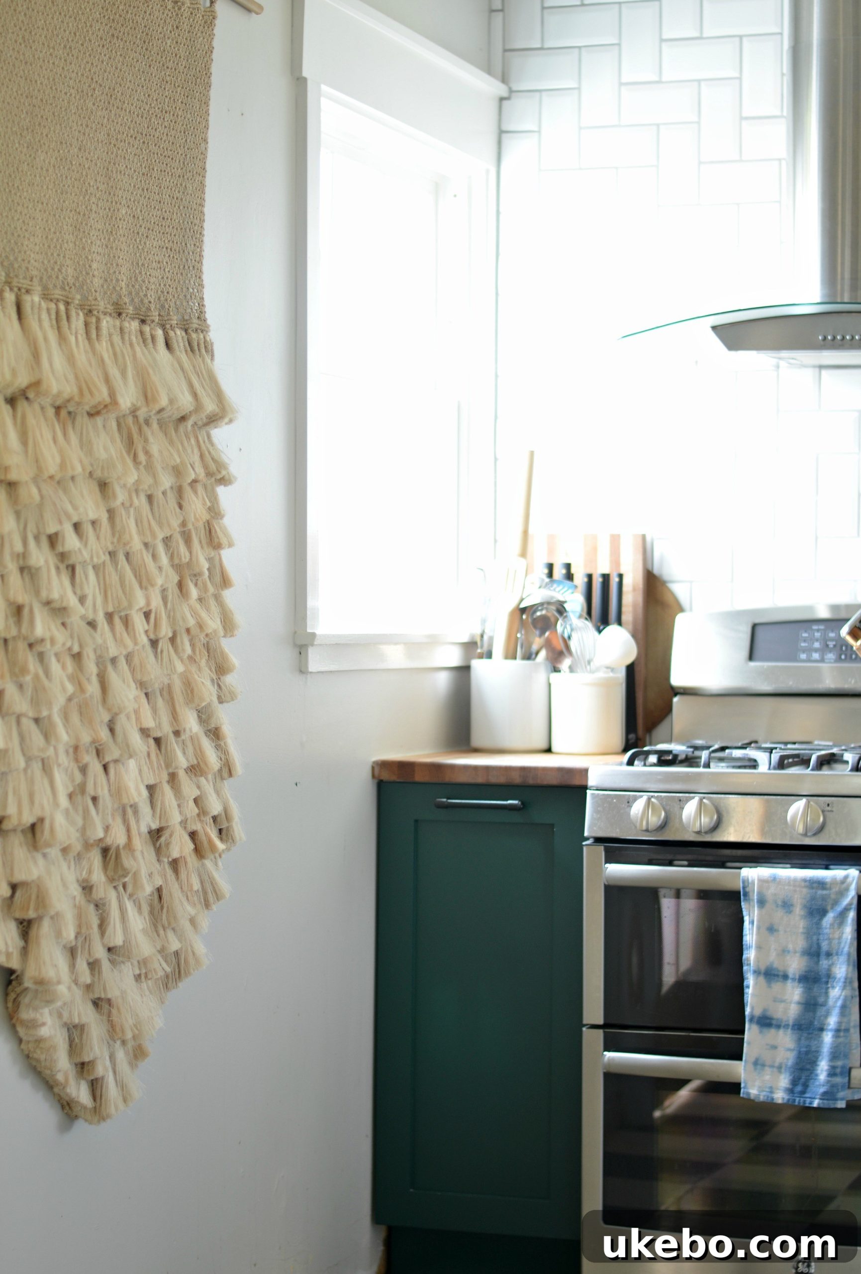
I genuinely couldn’t be happier with the final outcome. The cabinets are simply gorgeous, and I absolutely adore the Hunter Green! This color possesses such incredible depth and versatility. Depending on the shifting light throughout the day, it subtly transforms, offering a dynamic visual experience. Sometimes, it appears almost black, exuding a deep, mysterious elegance. At other moments, it softens to a captivating emerald, revealing its vibrant, natural undertones. This chameleon-like quality adds immense character and ensures the kitchen always feels alive and inviting.
The choice of Hunter Green wasn’t just about aesthetics; it was about creating a feeling. Green, especially a deep, earthy shade like Hunter Green, evokes a sense of tranquility, nature, and timeless elegance. It’s a color that grounds the space, making it feel both sophisticated and incredibly welcoming. It allows other elements, like our wooden countertops and the natural light streaming in, to truly shine without competing, creating a harmonious and balanced environment.
Adding Layers: Copper Accents and Smart Storage Solutions
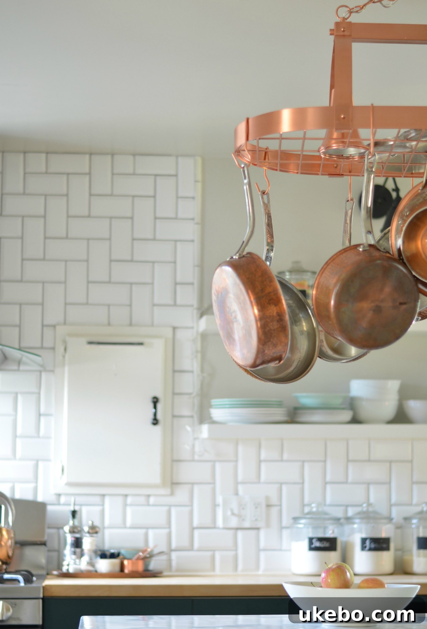
The beauty of a thoughtfully designed space is its ability to evolve with new additions. Over the holidays, I received a truly wonderful surprise from Naomi: a set of long-coveted copper pots. I cannot adequately express how utterly fabulous they look against the rich green cabinets. The warm, lustrous glow of the copper creates a stunning contrast with the cool, deep green, adding a layer of warmth and rustic elegance. These aren’t just decorative pieces; I use them every single day, and they bring such joy to my cooking experience. I genuinely don’t mind the beautiful patina they develop over time—it’s a testament to their loving use and a sign of their character. However, when I desire to restore their initial gleam, a quick wash with Bar Keepers Friend makes them sparkle like new.
Further enhancing both the aesthetics and functionality, we also upgraded our overhead storage. I exchanged the existing copper sputnik light fixture for a lighted copper pot rack. This brilliant addition not only provides excellent illumination but also offers invaluable storage for our growing collection of cookware. It keeps essential items within easy reach, declutters countertops, and contributes to the overall charming and efficient design of the kitchen.
The Evolution of a Home: Intentional Design and Functionality
Our kitchen, much like the rest of our home, has undergone a slow but deliberate evolution over the almost four years we’ve resided here. This gradual approach, adding and removing elements as our needs and tastes solidify, has been incredibly rewarding. It has allowed us to create an exceptionally intentional space that is not only visually appealing but also highly functional and tailor-made for how we genuinely live and use our home. We’ve learned that design is a journey, not a destination, and that the most personal and beloved spaces are often those that are allowed to breathe and grow organically.
Every decision, from the choice of cabinet color to the placement of a pot rack, has been considered with our daily routines and overall lifestyle in mind. This iterative process has prevented rushed decisions and fostered a deeper connection to our surroundings. While this major update marks a significant milestone, we have just a few more small touches to complete, and then our kitchen will truly be “done” – at least for now! The beauty of home design is that there’s always room for growth and subtle refinements.
A Sincere Apology and Future Inspirations
I sincerely apologize again for the considerable delay in sharing this kitchen update with all of you! Life, as it often does, got in the way, but I hope the wait was worthwhile. Sharing this transformation, from a design misstep to a space we genuinely adore, has been a joy. It’s a testament to the power of perseverance, good planning, and the courage to course-correct when necessary in the world of home design. Until next time, my friends, may your homes be filled with beauty, functionality, and endless inspiration!
Sources
Paint: Hunter Green by Benjamin Moore
Hardware: IKEA (Refreshed with black hammered spray paint)
Countertops: IKEA (No longer available, but a solid birch option exists)
Floating Shelves: SemiHandmade (DIY slab, hand-painted)
Marble Top Island: Target (No longer available. A great alternative can be found HERE)
Copper Kettle: Amazon
Pot Rack: Wayfair
Copper Pots: Lagostina via Macy’s
Wall Hanging: The Dharma Door
Rug: Kaya Kilims
Evil Eye Tea Towel: Uriel Home